| # | sample_id | image | image_media_type | question | answer | generator_model | prompt_version |
|---|
1
|
astro-ph0001011_000
|
|
image/jpeg
|
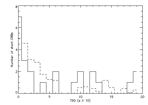
Based on the histogram, compare the distribution of the number of short GRBs for the two different data series (solid line vs. dashed line) in the T90 range of 0 to 5 (x 10). Which series shows a higher frequency in the very first bin (0 to 1)?
|
<think>1. Identify the axes: The x-axis is 'T90 (s X 10)' and the y-axis is 'Number of short GRBs'.
2. Locate the range of interest: The x-axis range from 0 to 5.
3. Identify the two series: One is represented by a solid line and the other by a dashed line.
4. Examine the first bin (0 to 1 on the x-axis):
   - The solid line starts at a height of 7.
   - The dashed line starts at a height of approximately 4.5.
5. Compare the two: The solid line has a significantly higher value in the first bin.
6. Observe the trend in the 0-5 range:
   - The solid line starts high (7) and drops sharply (to 3, then 2, then 1).
   - The dashed line starts lower (4.5) and decreases more gradually (to 3, then 2.8, then 1.5).
7. Conclusion: The solid line series shows a higher frequency in the first bin (0 to 1) compared to the dashed line series.</think>In the T90 range of 0 to 5, the solid line series shows a higher frequency in the first bin (0 to 1), reaching a value of 7, whereas the dashed line series reaches a value of approximately 4.5 in that same bin.
|
google/gemma-4-26B-A4B-it
|
gemma4_reasoning_qa_v3
|
2
|
astro-ph0001016_000
|
|
image/jpeg
|
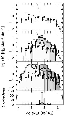
Based on the provided plots, how does the relationship between the log density $\Phi(\Theta)$ and $\log(M_{\text{HI}})$ change from the top panel to the third panel down?
|
<think>The image contains four vertically stacked panels.
- The top panel shows data points (black dots with error bars) and a dashed line that stays relatively flat near 0 before dropping off sharply after $\log(M_{\text{HI}}) \approx 9$.
- The second panel shows a shaded histogram that peaks around $\log(M_{\text{HI}}) \approx 7.5$ and a solid line that follows a similar trend, with data points scattered around it.
- The third panel shows a much more irregular, noisy shaded histogram that spans a wider range of $\log(\Theta)$ values, with a dashed line that is generally decreasing from $\log(M_{\text{HI}}) \approx 4$ to $10$.
- The fourth panel is a histogram of '# detections' peaking around $\log(M_{\text{HI}}) \approx 7.5$.

Comparing the top panel to the third panel:
In the top panel, the data points and the dashed line represent a relatively smooth, high-value distribution that only drops at the very high mass end.
In the third panel, the shaded histogram represents a distribution that is much more irregular and has a different shape, with a dashed line that shows a continuous downward trend across the entire mass range shown. The data points in the third panel are also lower in value on the y-axis compared to the top panel for most of the mass range.

Wait, let's look closer at the y-axis. The y-axis is $\log(\Theta) [h_{65}^3 \text{ Mpc}^{-3} \text{ dex}^{-1}]$.
Top panel: points are around 0.
Second panel: points are around -0.5, histogram peaks around 1.
Third panel: points are around -0.5, histogram is very noisy and peaks around 1 but is much more spread out.

Actually, the question asks for the change in the relationship.
In the top panel, the trend is relatively flat until high masses.
In the third panel, the trend (represented by the dashed line) is a steady decline from $\log(M_{\text{HI}}) \approx 4$ to $10$. The shaded area (histogram) in the third panel is much more volatile and covers a larger range of $\log(\Theta)$ values compared to the more structured histogram in the second panel.</think>In the top panel, the distribution (represented by the data points and dashed line) remains relatively flat near $\log(\Theta) \approx 0$ until $\log(M_{\text{HI}})$ exceeds 9, where it drops sharply. In contrast, the third panel shows a distribution where the dashed line follows a continuous downward trend from $\log(M_{\text{HI}}) \approx 4$ to $10$, and the shaded histogram is significantly more irregular and noisy across the mass range.
|
google/gemma-4-26B-A4B-it
|
gemma4_reasoning_qa_v3
|
3
|
astro-ph0001016_001
|
|
image/jpeg
|
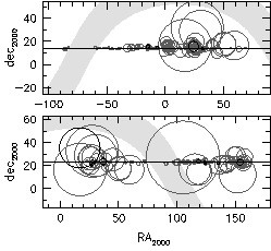
Comparing the two panels, in which panel are the larger circles concentrated at lower RA values (closer to 0)?
|
<think>The image contains two panels, both plotting dec_2000 against RA_2000.
- In the top panel, the RA axis ranges from approximately -100 to 75. The larger circles are concentrated at higher RA values, roughly between 0 and 60.
- In the bottom panel, the RA axis ranges from 0 to approximately 175. The larger circles are distributed across the range, but there is a significant cluster of large circles at low RA values, specifically between 0 and 50.
Therefore, the larger circles are concentrated at lower RA values in the bottom panel.</think>The larger circles are concentrated at lower RA values in the bottom panel.
|
google/gemma-4-26B-A4B-it
|
gemma4_reasoning_qa_v3
|
4
|
astro-ph0001018_000
|
|
image/jpeg
|
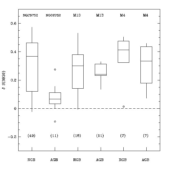
Based on the box plots provided, compare the median values of delta S(3639) for the RGB and AGB populations within the M13 cluster. Which population has a higher median, and approximately what is the difference between their medians?
|
<think>1. Identify the relevant data for M13: The third and fourth box plots from the left correspond to M13 (labeled 'M13' at the top). The third plot is 'RGB' and the fourth is 'AGB'.
2. Locate the median for M13 RGB: The median is represented by the horizontal line inside the box. For M13 RGB, this line is at approximately 0.3.
3. Locate the median for M13 AGB: For M13 AGB, the horizontal line inside the box is at approximately 0.25.
4. Compare the values: 0.3 (RGB) is greater than 0.25 (AGB).
5. Calculate the difference: 0.3 - 0.25 = 0.05.
6. Formulate the final answer: The RGB population has a higher median value than the AGB population in M13, with a difference of approximately 0.05.</think>The RGB population in M13 has a higher median value than the AGB population, with the RGB median at approximately 0.3 and the AGB median at approximately 0.25, resulting in a difference of about 0.05.
|
google/gemma-4-26B-A4B-it
|
gemma4_reasoning_qa_v3
|
5
|
astro-ph0001018_001
|
|
image/jpeg
|
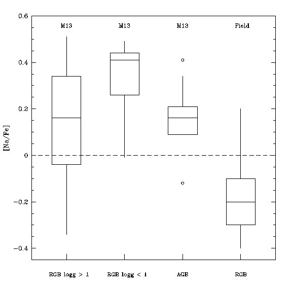
Based on the box plots provided, how does the median [Na/Fe] value of the 'RGB logg < 1' group in M13 compare to the median [Na/Fe] value of the 'RGB' group in the Field?
|
<think>1. Identify the 'RGB logg < 1' group in M13: This is the second box plot from the left. The median is represented by the horizontal line inside the box. For this group, the median line is at approximately 0.4.
2. Identify the 'RGB' group in the Field: This is the fourth box plot from the left. The median line inside this box is at approximately -0.2.
3. Compare the two values: 0.4 is significantly higher than -0.2.
4. Formulate the answer: The median [Na/Fe] for the 'RGB logg < 1' group in M13 is much higher than the median [Na/Fe] for the 'RGB' group in the Field.</think>The median [Na/Fe] value for the 'RGB logg < 1' group in M13 (approximately 0.4) is significantly higher than the median [Na/Fe] value for the 'RGB' group in the Field (approximately -0.2).
|
google/gemma-4-26B-A4B-it
|
gemma4_reasoning_qa_v3
|
6
|
astro-ph0001028_000
|
|
image/jpeg
|
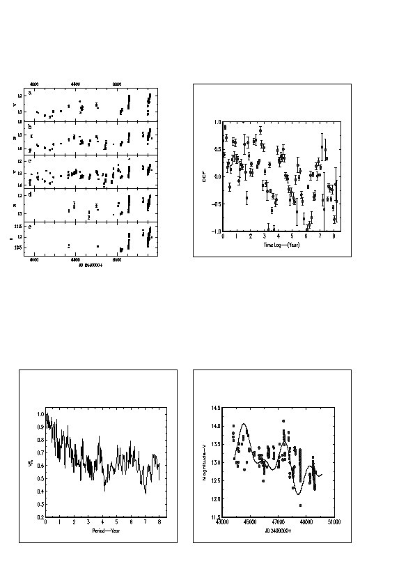
Based on the bottom-right plot, what is the approximate range of the 'Magnitude-V' values shown on the y-axis, and what is the approximate value of the highest peak in the plotted data?
|
<think>1. Identify the bottom-right plot: The y-axis is labeled 'Magnitude-V' and the x-axis is 'JD 2400000+'.
2. Determine the y-axis range: The tick marks on the y-axis go from 11.5 to 14.5.
3. Locate the highest peak in the data: Looking at the data points and the smoothed curve, there is a prominent peak near the beginning of the time series (around JD 44000).
4. Estimate the value of the highest peak: The highest point on the curve/data cluster occurs around JD 44000 and reaches a value slightly below 14.0, approximately 13.9 or 14.0. Looking closer at the y-axis, the highest peak of the curve is just below the 14.0 mark, around 13.9.</think>The y-axis for 'Magnitude-V' ranges from 11.5 to 14.5, and the highest peak in the plotted data reaches approximately 13.9.
|
google/gemma-4-26B-A4B-it
|
gemma4_reasoning_qa_v3
|
7
|
astro-ph0001042_000
|
|
image/jpeg
|
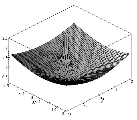
Based on the provided 3D plot, what is the approximate value of the function at the origin (x=0, y=0), and how does the surface behave as it moves away from the origin in the x-y plane?
|
<think>1. Identify the axes: The x-axis ranges from -1.5 to 2, and the y-axis ranges from -2 to 2. The vertical axis represents the function value, ranging from 0 to 2.5.
2. Locate the origin: The origin (x=0, y=0) is at the center of the x-y plane.
3. Determine the value at the origin: Looking at the surface at (0,0), there is a sharp, narrow peak. The tip of this peak reaches a value of approximately 2.5 on the vertical axis.
4. Analyze the behavior away from the origin: As we move away from (0,0) in any direction on the x-y plane, the surface drops sharply from the peak and then forms a broad, bowl-shaped depression (a valley) that gradually rises towards the edges of the plotted area. The surface at the edges (e.g., near x=2 or y=2) appears to be around 1.5.
5. Synthesize the answer: The value at the origin is approximately 2.5, and the surface exhibits a sharp central peak followed by a wide, upward-sloping valley as it moves away from the center.</think>At the origin (x=0, y=0), the function reaches a sharp peak with a value of approximately 2.5. As the coordinates move away from the origin in the x-y plane, the surface drops rapidly from this peak into a broad, bowl-shaped valley that gradually rises towards the edges of the plot.
|
google/gemma-4-26B-A4B-it
|
gemma4_reasoning_qa_v3
|
8
|
astro-ph0001042_001
|
|
image/jpeg
|
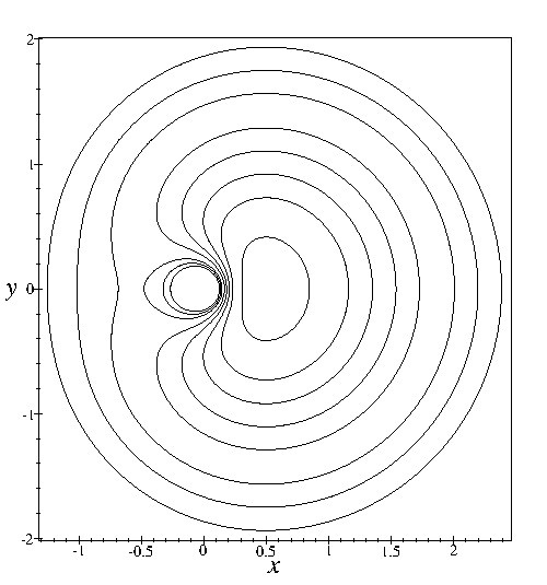
Based on the contour plot, describe the spatial relationship between the center of the innermost closed loop and the origin (0,0) of the coordinate system.
|
<think>1. Identify the origin (0,0) on the provided axes. The x-axis is horizontal and the y-axis is vertical. The intersection of the 0 marks on both axes is the origin.
2. Locate the innermost closed loop. This is the smallest circle-like shape near the center.
3. Observe the position of this innermost loop relative to the origin. The center of this loop is shifted along the x-axis. It is located to the left of the y-axis (where x=0).
4. Estimate the x-coordinate of the center of the innermost loop. It appears to be around x = -0.2 or -0.3.
5. The y-coordinate of the center of the innermost loop appears to be approximately 0, as it is centered vertically on the x-axis.
6. Conclusion: The center of the innermost closed loop is located to the left of the origin on the x-axis, specifically at a negative x-value near the y=0 line.</think>The center of the innermost closed loop is located to the left of the origin, positioned at a negative x-value along the line y = 0.
|
google/gemma-4-26B-A4B-it
|
gemma4_reasoning_qa_v3
|
9
|
astro-ph0001042_002
|
|
image/jpeg
|
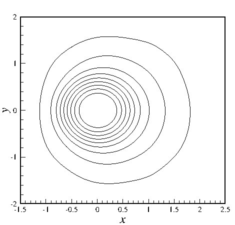
Based on the contour plot, what can be inferred about the shape and center of the distribution represented by the lines?
|
<think>The image is a contour plot with x and y axes ranging from approximately -1.5 to 2.5 on the x-axis and -2 to 2 on the y-axis. The contour lines form concentric, roughly elliptical shapes. The innermost contour is centered near the origin (0,0). As the contours move outward, they expand. The shape is not perfectly circular; it appears slightly elongated or asymmetrical, particularly in the upper right quadrant where the contours seem to bulge slightly more. The density of the lines is highest near the center, suggesting a peak in the value being plotted at (0,0).</think>The contour lines form concentric, roughly elliptical shapes centered near the origin (0,0), indicating a peak at that location. The distribution is not perfectly circular, showing slight asymmetry as the contours expand outward.
|
google/gemma-4-26B-A4B-it
|
gemma4_reasoning_qa_v3
|
10
|
astro-ph0001042_003
|
|
image/jpeg
|
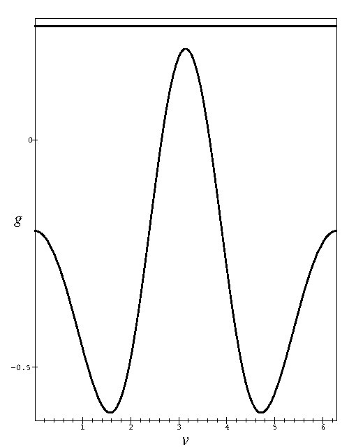
Based on the provided graph, what is the approximate value of the function g when the variable v is equal to 3, and what is the approximate value of g at its lowest points?
|
<think>1. Identify the axes: The horizontal axis is labeled 'v' and the vertical axis is labeled 'g'.
2. Locate v = 3 on the horizontal axis: The value 3 is marked on the x-axis. Moving vertically from v = 3 to the curve, the point is at the peak of the central oscillation.
3. Determine the value of g at v = 3: Looking at the vertical axis, the peak is above the '0' mark. The distance from 0 to the peak is roughly equivalent to the distance from 0 to -0.5, but in the positive direction. However, looking closer at the scale, the peak is significantly higher than 0. If we assume the distance from 0 to -0.5 is a unit, the peak appears to be around 0.8 or 0.9. Let's re-examine. The tick marks are at 1, 2, 3, 4, 5, 6. The vertical axis has 0 and -0.5. The peak is roughly at g ≈ 0.8.
4. Locate the lowest points: The curve reaches its minimum values at approximately v = 1.5 and v = 4.5.
5. Determine the value of g at these minima: The minima are below the -0.5 mark. They appear to be around -0.7 or -0.75.
6. Synthesize the answer: At v = 3, g is approximately 0.8. The lowest points of the function are approximately -0.7.</think>At v = 3, the value of g is approximately 0.8, and the lowest points of the function are approximately -0.7.
|
google/gemma-4-26B-A4B-it
|
gemma4_reasoning_qa_v3
|