| # | image | text | llm_generated_idea |
|---|
1
|
|
<html>
<link href="https://cdn.jsdelivr.net/npm/[email protected]/dist/tailwind.min.css" rel="stylesheet">
<body class="bg-gray-100">
  <div class="flex flex-col items-center justify-center h-screen">
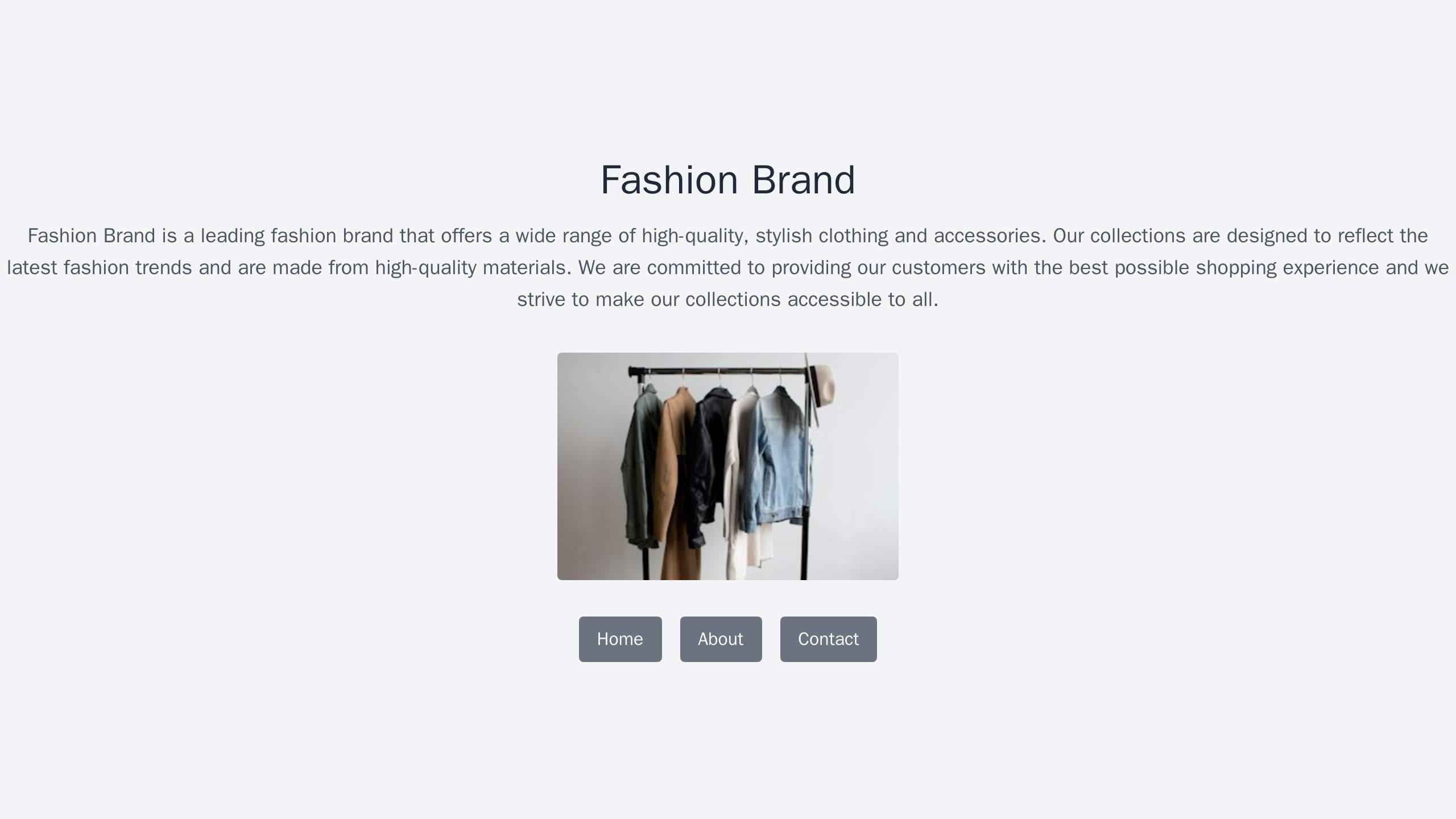
    <h1 class="text-4xl font-bold text-center text-gray-800">Fashion Brand</h1>
    <p class="mt-4 text-lg text-center text-gray-600">
      Fashion Brand is a leading fashion brand that offers a wide range of high-quality, stylish clothing and accessories. Our collections are designed to reflect the latest fashion trends and are made from high-quality materials. We are committed to providing our customers with the best possible shopping experience and we strive to make our collections accessible to all.
    </p>
    <div class="mt-8">
      <img src="https://source.unsplash.com/random/300x200/?fashion" alt="Fashion Brand" class="rounded">
    </div>
    <div class="mt-8">
      <nav class="flex justify-center space-x-4">
        <a href="#" class="px-4 py-2 text-white bg-gray-500 rounded hover:bg-gray-600">Home</a>
        <a href="#" class="px-4 py-2 text-white bg-gray-500 rounded hover:bg-gray-600">About</a>
        <a href="#" class="px-4 py-2 text-white bg-gray-500 rounded hover:bg-gray-600">Contact</a>
      </nav>
    </div>
  </div>
</body>
</html>
|
Fashion Brand: A visually stunning layout with a full-width, rotating image carousel showcasing their latest collections, a bold, center-aligned logo, and a bottom navigation menu. The color palette is inspired by the latest fashion trends.
|
2
|
|
<html>
<link href="https://cdn.jsdelivr.net/npm/[email protected]/dist/tailwind.min.css" rel="stylesheet">
<body class="bg-gray-100 font-sans leading-normal tracking-normal">
    <nav class="flex items-center justify-between flex-wrap bg-teal-500 p-6">
        <div class="flex items-center flex-shrink-0 text-white mr-6">
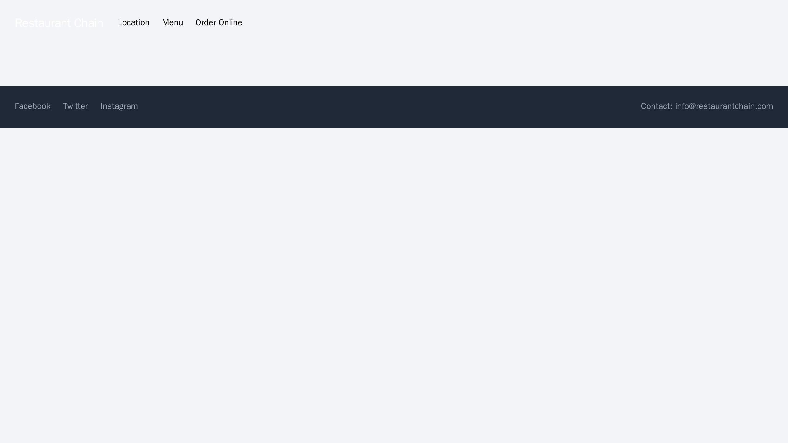
            <span class="font-semibold text-xl tracking-tight">Restaurant Chain</span>
        </div>
        <div class="w-full block flex-grow lg:flex lg:items-center lg:w-auto">
            <div class="text-sm lg:flex-grow">
                <a href="#location" class="block mt-4 lg:inline-block lg:mt-0 text-teal-200 hover:text-white mr-4">
                    Location
                </a>
                <a href="#menu" class="block mt-4 lg:inline-block lg:mt-0 text-teal-200 hover:text-white mr-4">
                    Menu
                </a>
                <a href="#order" class="block mt-4 lg:inline-block lg:mt-0 text-teal-200 hover:text-white">
                    Order Online
                </a>
            </div>
        </div>
    </nav>

    <main class="container mx-auto px-4 py-8">
        <!-- Your content here -->
    </main>

    <footer class="bg-gray-800 text-white p-6">
        <div class="flex items-center justify-between flex-wrap">
            <div class="w-full block flex-grow lg:flex lg:items-center lg:w-auto">
                <div class="text-sm lg:flex-grow">
                    <a href="#" class="block mt-4 lg:inline-block lg:mt-0 text-gray-400 hover:text-white mr-4">
                        Facebook
                    </a>
                    <a href="#" class="block mt-4 lg:inline-block lg:mt-0 text-gray-400 hover:text-white mr-4">
                        Twitter
                    </a>
                    <a href="#" class="block mt-4 lg:inline-block lg:mt-0 text-gray-400 hover:text-white">
                        Instagram
                    </a>
                </div>
            </div>
            <div class="text-sm text-gray-400">
                Contact: [email protected]
            </div>
        </div>
    </footer>
</body>
</html>
|
Restaurant Chain: A design with a mouth-watering header image of a popular dish, a top navigation menu with pages for location, menu, and order online. The footer displays social media icons, a newsletter sign-up form, and contact information.
|
3
|
|
<html>
<link href="https://cdn.jsdelivr.net/npm/[email protected]/dist/tailwind.min.css" rel="stylesheet">
<body class="bg-gray-100 font-sans leading-normal tracking-normal">
    <nav class="flex items-center justify-between flex-wrap bg-teal-500 p-6">
        <div class="flex items-center flex-shrink-0 text-white mr-6">
            <span class="font-semibold text-xl tracking-tight">Consulting Firm</span>
        </div>
        <div class="w-full block flex-grow lg:flex lg:items-center lg:w-auto">
            <div class="text-sm lg:flex-grow">
                <a href="#responsive-header" class="block mt-4 lg:inline-block lg:mt-0 text-teal-200 hover:text-white mr-4">
                    Home
                </a>
                <a href="#responsive-header" class="block mt-4 lg:inline-block lg:mt-0 text-teal-200 hover:text-white mr-4">
                    About
                </a>
                <a href="#responsive-header" class="block mt-4 lg:inline-block lg:mt-0 text-teal-200 hover:text-white">
                    Contact
                </a>
            </div>
        </div>
    </nav>
    <div class="container mx-auto">
        <section class="flex flex-col md:flex-row">
            <div class="md:w-1/2 p-4">
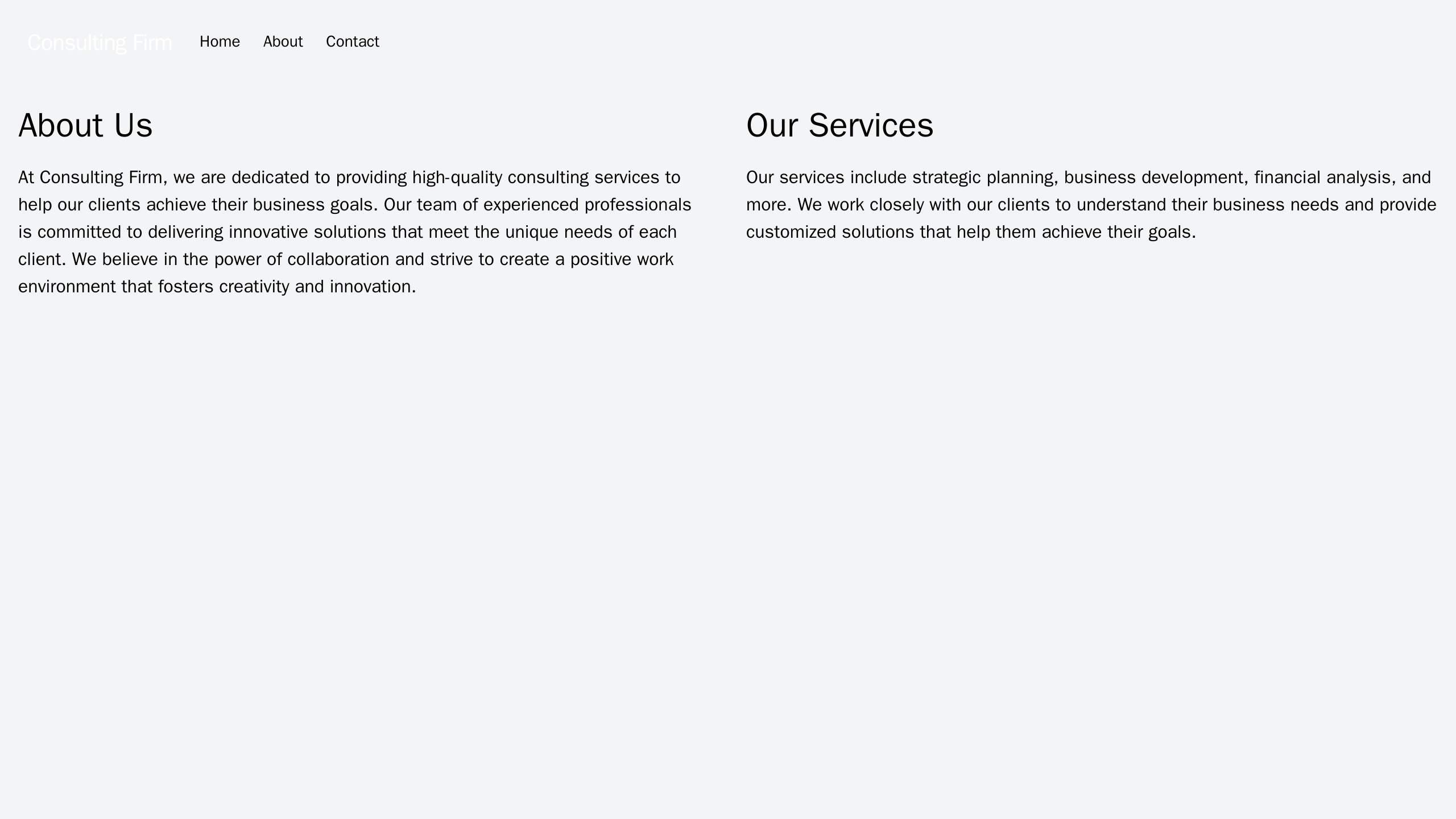
                <h2 class="text-3xl font-bold">About Us</h2>
                <p class="mt-4">
                    At Consulting Firm, we are dedicated to providing high-quality consulting services to help our clients achieve their business goals. Our team of experienced professionals is committed to delivering innovative solutions that meet the unique needs of each client. We believe in the power of collaboration and strive to create a positive work environment that fosters creativity and innovation.
                </p>
            </div>
            <div class="md:w-1/2 p-4">
                <h2 class="text-3xl font-bold">Our Services</h2>
                <p class="mt-4">
                    Our services include strategic planning, business development, financial analysis, and more. We work closely with our clients to understand their business needs and provide customized solutions that help them achieve their goals.
                </p>
            </div>
        </section>
    </div>
</body>
</html>
|
Consulting Firm: A clean, professional design with a full-width image and a tagline, a left column for the main navigation menu, and a right column for featuring key staff members and their service offerings. A muted color palette evokes trust and expertise.
|
4
|
|
<html>
<link href="https://cdn.jsdelivr.net/npm/[email protected]/dist/tailwind.min.css" rel="stylesheet">
<body class="bg-gray-100 font-sans leading-normal tracking-normal">
    <header class="bg-white text-gray-800">
        <div class="container mx-auto flex flex-wrap p-5 flex-col md:flex-row items-center">
            <a class="flex title-font font-medium items-center text-gray-900 mb-4 md:mb-0">
                <img src="https://source.unsplash.com/random/300x200/?real-estate" alt="Real Estate Logo" class="w-10 h-10">
                <span class="ml-3 text-xl">Real Estate Agency</span>
            </a>
            <nav class="md:ml-auto flex flex-wrap items-center text-base justify-center">
                <a href="#" class="mr-5 hover:text-gray-900">Home</a>
                <a href="#" class="mr-5 hover:text-gray-900">Properties</a>
                <a href="#" class="mr-5 hover:text-gray-900">About Us</a>
                <a href="#" class="mr-5 hover:text-gray-900">Contact Us</a>
            </nav>
        </div>
    </header>
    <main class="container mx-auto px-4 py-8">
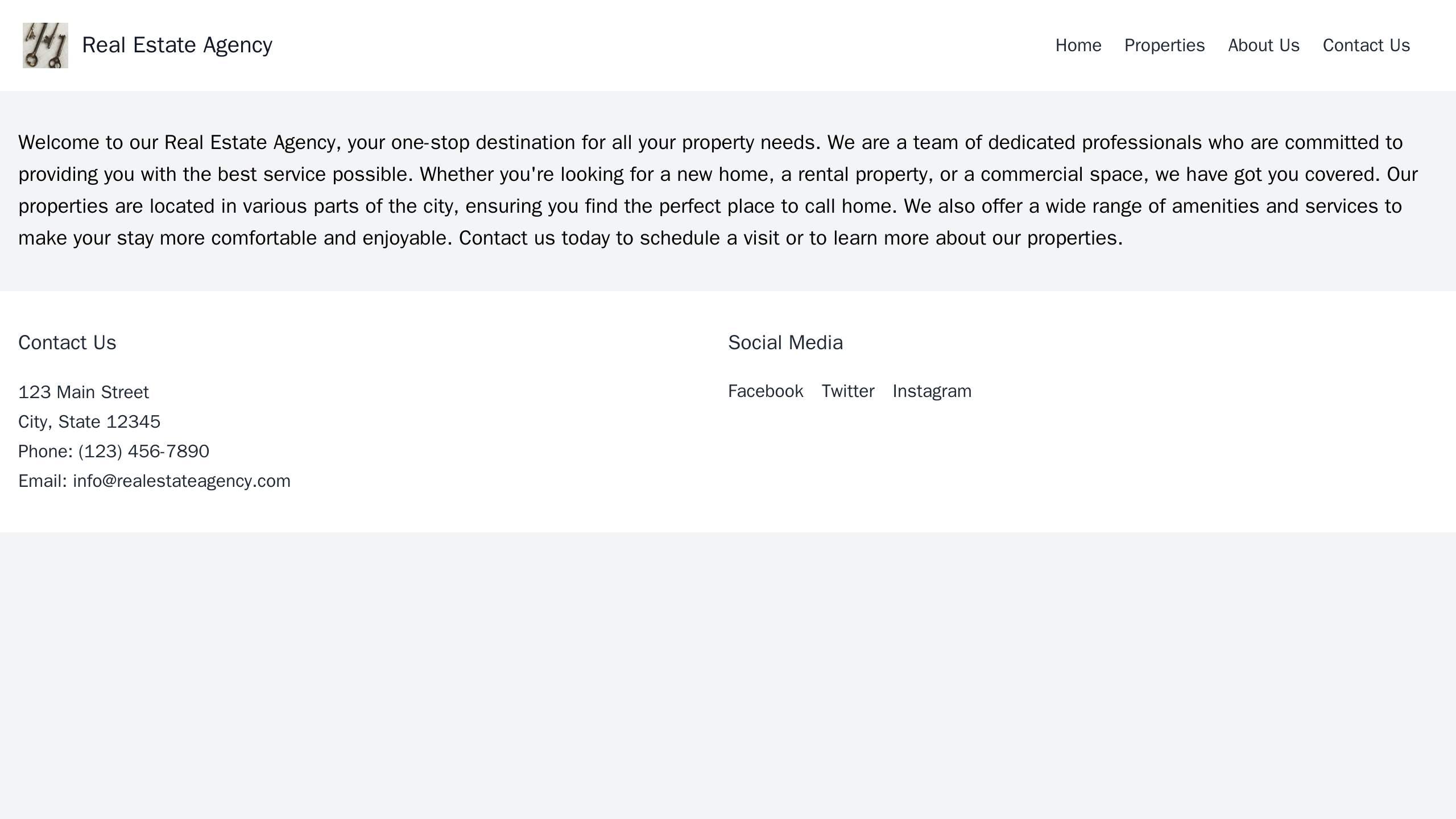
        <p class="text-lg">Welcome to our Real Estate Agency, your one-stop destination for all your property needs. We are a team of dedicated professionals who are committed to providing you with the best service possible. Whether you're looking for a new home, a rental property, or a commercial space, we have got you covered. Our properties are located in various parts of the city, ensuring you find the perfect place to call home. We also offer a wide range of amenities and services to make your stay more comfortable and enjoyable. Contact us today to schedule a visit or to learn more about our properties.</p>
    </main>
    <footer class="bg-white text-gray-800 py-8">
        <div class="container mx-auto px-4">
            <div class="flex flex-wrap">
                <div class="w-full md:w-1/2">
                    <h2 class="title-font font-medium text-lg mb-4">Contact Us</h2>
                    <p class="leading-relaxed">123 Main Street<br>City, State 12345<br>Phone: (123) 456-7890<br>Email: [email protected]</p>
                </div>
                <div class="w-full md:w-1/2">
                    <h2 class="title-font font-medium text-lg mb-4">Social Media</h2>
                    <div class="flex">
                        <a href="#" class="mr-4">Facebook</a>
                        <a href="#" class="mr-4">Twitter</a>
                        <a href="#">Instagram</a>
                    </div>
                </div>
            </div>
        </div>
    </footer>
</body>
</html>
|
Real Estate Agency: A user-friendly design with a header featuring a property image and search functionality, a top navigation menu with links to the various property listings. The page includes a grid layout for listing images, and a footer with contact information and social media icons.
|
5
|
|
<html>
<link href="https://cdn.jsdelivr.net/npm/[email protected]/dist/tailwind.min.css" rel="stylesheet">
<body class="bg-gray-100 font-sans leading-normal tracking-normal">
    <header class="bg-cover bg-center h-screen" style="background-image: url('https://source.unsplash.com/random/1600x900/?education')">
        <div class="container mx-auto px-6 md:px-12 relative z-10 flex items-center h-full">
            <div class="w-full">
                <div class="flex flex-col items-center justify-center h-full">
                    <img src="https://source.unsplash.com/random/300x300/?logo" alt="Logo" class="w-1/3 md:w-1/6 mb-10">
                    <nav class="flex items-center justify-center w-full">
                        <a href="#" class="text-white px-3 py-2 rounded mx-2">Courses</a>
                        <a href="#" class="text-white px-3 py-2 rounded mx-2">Pricing</a>
                        <a href="#" class="text-white px-3 py-2 rounded mx-2">About</a>
                    </nav>
                </div>
            </div>
        </div>
    </header>
    <section class="container mx-auto px-6 md:px-12 py-10">
        <h2 class="text-4xl text-center font-bold mb-10">About Us</h2>
        <p class="text-lg text-center mb-10">
            At our education platform, we believe that education is the key to unlocking a brighter future. We are committed to providing high-quality, affordable education to all. Our courses are designed to help you reach your full potential, no matter where you are in your career. Whether you're just starting out or looking to advance your skills, we have something for everyone.
        </p>
    </section>
</body>
</html>
|
Education Platform: A design with a wide, hero image, a centered logo, and a top navigation menu featuring links for courses, pricing, and about the company. The site includes a feature section where students can share testimonials and success stories. A warm, approachable color palette is used to inspire confidence and engagement.
|
6
|
|
<html>
<link href="https://cdn.jsdelivr.net/npm/[email protected]/dist/tailwind.min.css" rel="stylesheet">
<body class="bg-gray-100">
  <header class="bg-white p-4 flex items-center justify-between">
    <img src="https://source.unsplash.com/random/100x50/?logo" alt="Logo" class="h-10">
    <nav>
      <ul class="flex space-x-4">
        <li><a href="#vacation-packages" class="text-gray-600 hover:text-gray-900">Vacation Packages</a></li>
        <li><a href="#destinations" class="text-gray-600 hover:text-gray-900">Destinations</a></li>
        <li><a href="#customer-reviews" class="text-gray-600 hover:text-gray-900">Customer Reviews</a></li>
      </ul>
    </nav>
  </header>

  <main class="container mx-auto p-4">
    <section id="vacation-packages" class="my-8">
      <h2 class="text-2xl font-bold mb-4">Vacation Packages</h2>
      <!-- Add your vacation packages here -->
    </section>

    <section id="destinations" class="my-8">
      <h2 class="text-2xl font-bold mb-4">Destinations</h2>
      <!-- Add your destinations here -->
    </section>

    <section id="customer-reviews" class="my-8">
      <h2 class="text-2xl font-bold mb-4">Customer Reviews</h2>
      <!-- Add your customer reviews here -->
    </section>
  </main>

  <footer class="bg-white p-4 text-center text-gray-600">
    <p>© 2022 Travel Agency. All rights reserved.</p>
  </footer>
</body>
</html>
|
Travel Agency: A visually immersive design with high-resolution images, a center-aligned logo, and a top navigation menu with links for vacation packages, destinations, and customer reviews. The design includes scrolling sections for showcasing destinations and highlighting the latest discount offers.
|
7
|
|
<html>
<link href="https://cdn.jsdelivr.net/npm/[email protected]/dist/tailwind.min.css" rel="stylesheet">
<body class="bg-gray-100">
  <header class="bg-red-500 text-white p-4 flex justify-between items-center">
    <h1 class="text-2xl font-bold">Gaming Company</h1>
    <nav>
      <ul class="flex space-x-4">
        <li><a href="#" class="hover:underline">Games</a></li>
        <li><a href="#" class="hover:underline">News</a></li>
        <li><a href="#" class="hover:underline">Community</a></li>
      </ul>
    </nav>
  </header>

  <main class="container mx-auto p-4">
    <section class="my-8">
      <h2 class="text-3xl font-bold mb-4">Welcome to Gaming Company</h2>
      <p class="text-lg">
        We are a leading provider of innovative and exciting gaming experiences. Our mission is to bring the joy of gaming to everyone, no matter where they are. We believe in the power of games to inspire, engage, and connect people from all walks of life.
      </p>
    </section>

    <section class="my-8">
      <h2 class="text-3xl font-bold mb-4">Our Games</h2>
      <p class="text-lg">
        At Gaming Company, we are constantly working on new and exciting games. From fast-paced action to relaxing puzzle games, we have something for everyone. Check out our latest releases and stay tuned for future updates.
      </p>
    </section>

    <section class="my-8">
      <h2 class="text-3xl font-bold mb-4">Join Our Community</h2>
      <p class="text-lg">
        We believe in the power of community. That's why we have a vibrant and active community of gamers who are always ready to share their experiences, ask questions, and help each other out. Join us today and become a part of our community.
      </p>
    </section>
  </main>
</body>
</html>
|
Gaming Company: A modern, vibrant design with a bold, center-aligned logo and a top navigation menu for games, news, and community. The site features a scrolling banner for displaying game trailers, and a footer for social media links and contact information.
|
8
|
|
<html>
<link href="https://cdn.jsdelivr.net/npm/[email protected]/dist/tailwind.min.css" rel="stylesheet">
<body class="font-sans leading-normal tracking-normal">
    <header class="bg-cover bg-center h-screen" style="background-image: url('https://source.unsplash.com/random/1600x900/?nature')">
        <div class="container mx-auto px-6 md:px-12 relative z-10 flex items-center h-full">
            <div class="w-full">
                <img src="https://source.unsplash.com/random/200x200/?logo" alt="Logo" class="mx-auto">
                <nav class="flex justify-center mt-8">
                    <a href="#" class="px-4 py-2 text-white hover:text-gray-300">About</a>
                    <a href="#" class="px-4 py-2 text-white hover:text-gray-300">Get Involved</a>
                    <a href="#" class="px-4 py-2 text-white hover:text-gray-300">Stories</a>
                </nav>
            </div>
        </div>
    </header>
    <main class="container mx-auto px-6 md:px-12 py-12">
        <div class="flex flex-wrap -mx-2">
            <div class="w-full md:w-1/2 px-2">
                <h2 class="text-2xl font-bold mb-4">Recent Projects</h2>
                <!-- Add your recent projects here -->
            </div>
            <div class="w-full md:w-1/2 px-2">
                <h2 class="text-2xl font-bold mb-4">Fundraising Events</h2>
                <!-- Add your fundraising events here -->
            </div>
        </div>
    </main>
    <footer class="bg-gray-800 text-white py-12">
        <div class="container mx-auto px-6 md:px-12">
            <div class="flex flex-wrap -mx-2">
                <div class="w-full md:w-1/2 px-2">
                    <h2 class="text-2xl font-bold mb-4">Donate</h2>
                    <!-- Add your donate options here -->
                </div>
                <div class="w-full md:w-1/2 px-2">
                    <h2 class="text-2xl font-bold mb-4">Volunteer</h2>
                    <!-- Add your volunteer options here -->
                </div>
            </div>
            <div class="mt-8">
                <h2 class="text-2xl font-bold mb-4">Follow Us</h2>
                <!-- Add your social media links here -->
            </div>
        </div>
    </footer>
</body>
</html>
|
Non-profit Organization: A design with a header image, a centered logo, and a top navigation menu for About, Get Involved, and Stories. A two-column layout showcases recent projects and fundraising events, and a footer includes links for donating, volunteering, and social media.
|
9
|
|
<html>
<link href="https://cdn.jsdelivr.net/npm/[email protected]/dist/tailwind.min.css" rel="stylesheet">
<body class="bg-gray-100">
  <header class="bg-white p-4 flex justify-center">
    <img src="https://source.unsplash.com/random/300x100/?construction" alt="Construction Company Logo" class="h-10">
  </header>

  <nav class="bg-pink-500 text-white p-4">
    <ul class="flex justify-center space-x-4">
      <li><a href="#">Home</a></li>
      <li><a href="#">About</a></li>
      <li><a href="#">Services</a></li>
      <li><a href="#">Projects</a></li>
      <li><a href="#">Contact</a></li>
    </ul>
  </nav>

  <section class="bg-cover bg-center h-96" style="background-image: url('https://source.unsplash.com/random/1600x900/?construction')">
    <!-- Full-width header image of a construction project -->
  </section>

  <footer class="bg-pink-500 text-white p-4">
    <div class="flex justify-between">
      <div>
        <p>Construction Company</p>
        <p>123 Main St, Anytown, USA</p>
        <p>Phone: (123) 456-7890</p>
        <p>Email: [email protected]</p>
      </div>
      <div>
        <p>Follow us on:</p>
        <!-- Social media icons -->
      </div>
      <div>
        <!-- Newsletter sign-up form -->
      </div>
    </div>
  </footer>
</body>
</html>
|
Construction Company: A professional design with a centered logo, a top navigation menu, and a full-width header image of a construction project. An image carousel showscasing completed projects is placed above a grid layout for displaying client testimonials and team member profiles. A footer includes contact information, social media icons, and a Newsletter sign-up form.
|
10
|
|
<html>
<link href="https://cdn.jsdelivr.net/npm/[email protected]/dist/tailwind.min.css" rel="stylesheet">
<body class="bg-gray-200">
  <header class="bg-pink-500 text-white p-4">
    <h1 class="text-2xl font-bold">Technology Company</h1>
    <nav class="hidden md:block">
      <ul class="flex space-x-4">
        <li><a href="#">Home</a></li>
        <li><a href="#">About</a></li>
        <li><a href="#">Services</a></li>
        <li><a href="#">Contact</a></li>
      </ul>
    </nav>
    <button class="md:hidden">
      <!-- Hamburger icon -->
    </button>
  </header>
  <main class="flex flex-col items-center justify-center h-screen">
    <img src="https://source.unsplash.com/random/1200x800/?technology" alt="Hero Image" class="w-full h-full object-cover">
    <h2 class="text-4xl font-bold mt-8">Welcome to our Technology Company</h2>
    <p class="text-lg mt-4">We are a leading provider of cutting-edge technology solutions. Our team of experts is dedicated to delivering innovative and efficient solutions to meet your business needs. Whether you're looking for a new software, a custom hardware solution, or a complete IT infrastructure, we've got you covered.</p>
  </main>
</body>
</html>
|
Technology Company: A minimalistic design with a large, central hero image and a navigational menu hidden behind a hamburger icon. The color scheme consists of shades of gray and blue. A dynamic animation effects add an interactive touch.
|