| # | key | json | png |
|---|
1
|
00000000
|
{
  "texts": [
    {
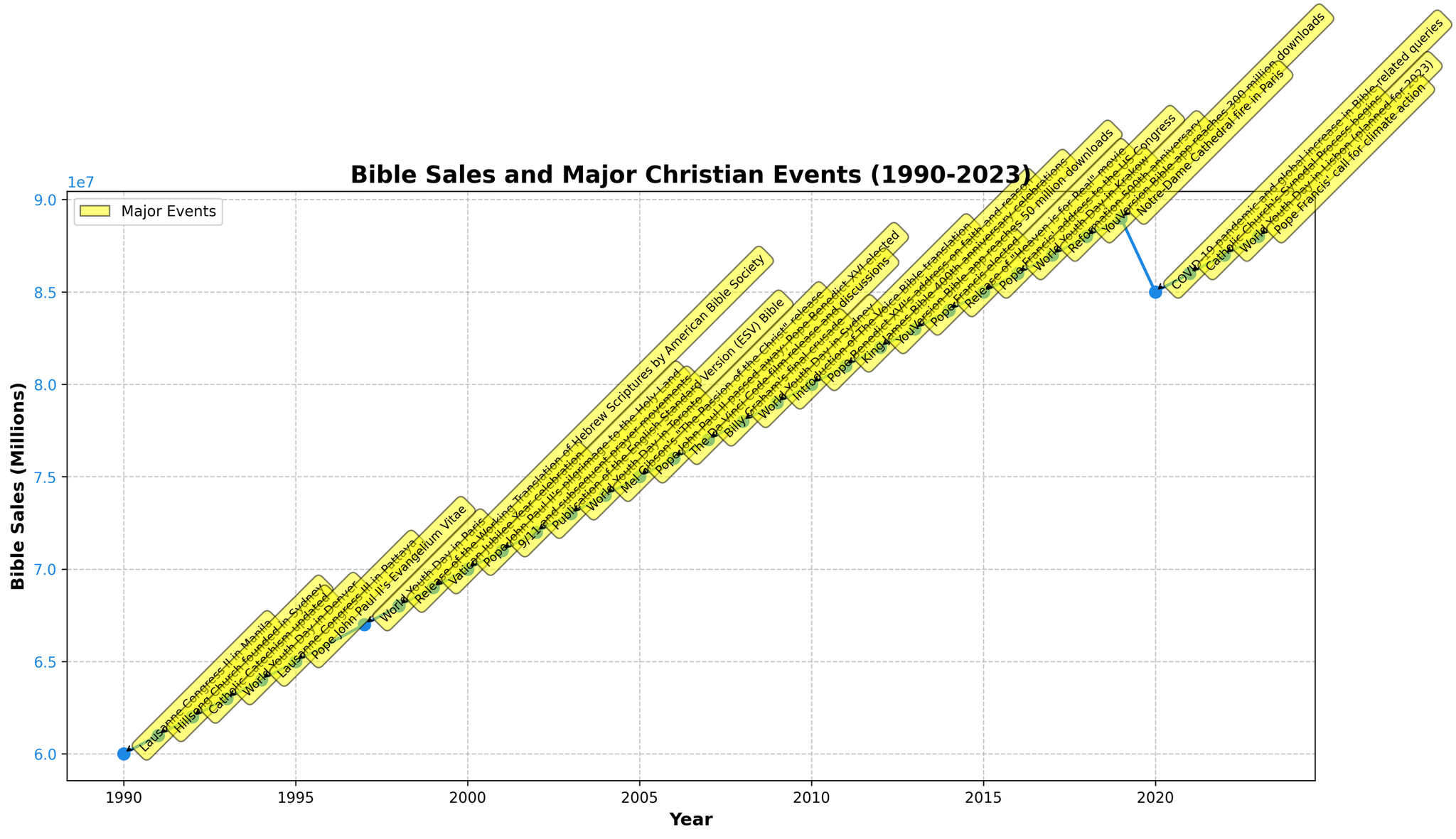
      "user": "what is the title of the plot?",
      "assistant": "The title of the plot is usually located at the top of the figure and describes what the plot is about. In this case, the title would describe both the Bible sales and major Christian events from 1990 to 2023.\nAnswer: \"Bible Sales and Major Christian Events (1990-2023)\""
    },
    {
      "user": "what is the trend in bible sales from 1990 to 2023?",
      "assistant": "To determine the trend, observe the general direction of the plotted line from 1990 to 2023. The sales consistently increase over these years, except for a notable decline around 2020.\nAnswer: Increasing trend with a dip in 2020"
    },
    {
      "user": "how does the major event in 2000 correlate with bible sales?",
      "assistant": "Look at the major event annotation in 2000, \"Pope John Paul II's pilgrimage to the Holy Land,\" and note the corresponding Bible sales at this point. Compare the sales value here with previous years to see any changes.\nAnswer: Bible sales continue to increase without any abrupt change"
    },
    {
      "user": "what is the significance of the highest bible sales year in the dataset?",
      "assistant": "Find the year with the highest Bible sales by looking at the peak of the plotted line and read the major event annotation associated with that peak to understand its context. The highest sales were in 2019, a year marked by the Notre-Dame Cathedral fire.\nAnswer: Notre-Dame Cathedral fire in 2019"
    },
    {
      "user": "what event aligns with the largest dip in bible sales?",
      "assistant": "To find the largest dip, identify the portion of the line that shows a decrease. This major dip appears between 2019 and 2020. Look at the annotations in these years to identify the major events.\nAnswer: COVID-19 pandemic in 2020"
    },
    {
      "user": "what is the average increase in bible sales per year from 1990 to 2019?",
      "assistant": "To calculate this, sum the increases in Bible sales for each year from 1990 to 2019 and divide by the number of years (2019-1990 = 29). This involves finding the sales each year, summing the increases, and dividing by 29. Sum of increases = (61-60) + (62-61) ... (89-88) = 29, then divide by 29 to find the consistent annual increase.\nAnswer: Approximately 1 million per year"
    },
    {
      "user": "which years had events related to the world youth day?",
      "assistant": "Read through the annotations and note the years, ensuring they relate to the World Youth Day. This event occurred in multiple years.\nAnswer: 1993, 1997, 2003, 2008, 2016, 2023"
    },
    {
      "user": "how do bible sales in 2010 compare to 2001?",
      "assistant": "Locate the Bible sales values for both 2010 and 2001 on the y-axis and compare them. In 2010, the sales were 80 million, whereas in 2001, they were 71 million.\nAnswer: 2010 had 9 million higher sales than 2001"
    },
    {
      "user": "what are the trends in bible sales before and after the 2019 Notre-Dame Cathedral fire?",
      "assistant": "Examine the sales values in years before 2019 compared to years after 2019. Sales fluctuated before the event with an increasing trend, peaked in 2019, then dropped in 2020 before increasing again.\nAnswer: Increased until 2019, then dropped in 2020 before recovering"
    }
  ],
  "original_index": 8100,
  "width": 2048,
  "height": 1181,
  "mode": "RGB",
  "source": "CoSyn-400k-chart",
  "relevance_ratings": [
    5,
    3,
    3,
    2,
    5,
    5,
    5,
    5,
    3
  ],
  "relevance_min": 2,
  "visual_dependency_ratings": [
    5,
    2,
    2,
    2,
    4,
    2,
    4,
    2,
    2
  ],
  "visual_dependency_min": 2,
  "image_correspondence_ratings": [
    5,
    5,
    4,
    4,
    4,
    4,
    3,
    4,
    4
  ],
  "image_correspondence_min": 3,
  "formatting_ratings": [
    4,
    4,
    4,
    4,
    4,
    4,
    4,
    5,
    4
  ],
  "formatting_min": 4
}
|
|
2
|
00000001
|
{
  "texts": [
    {
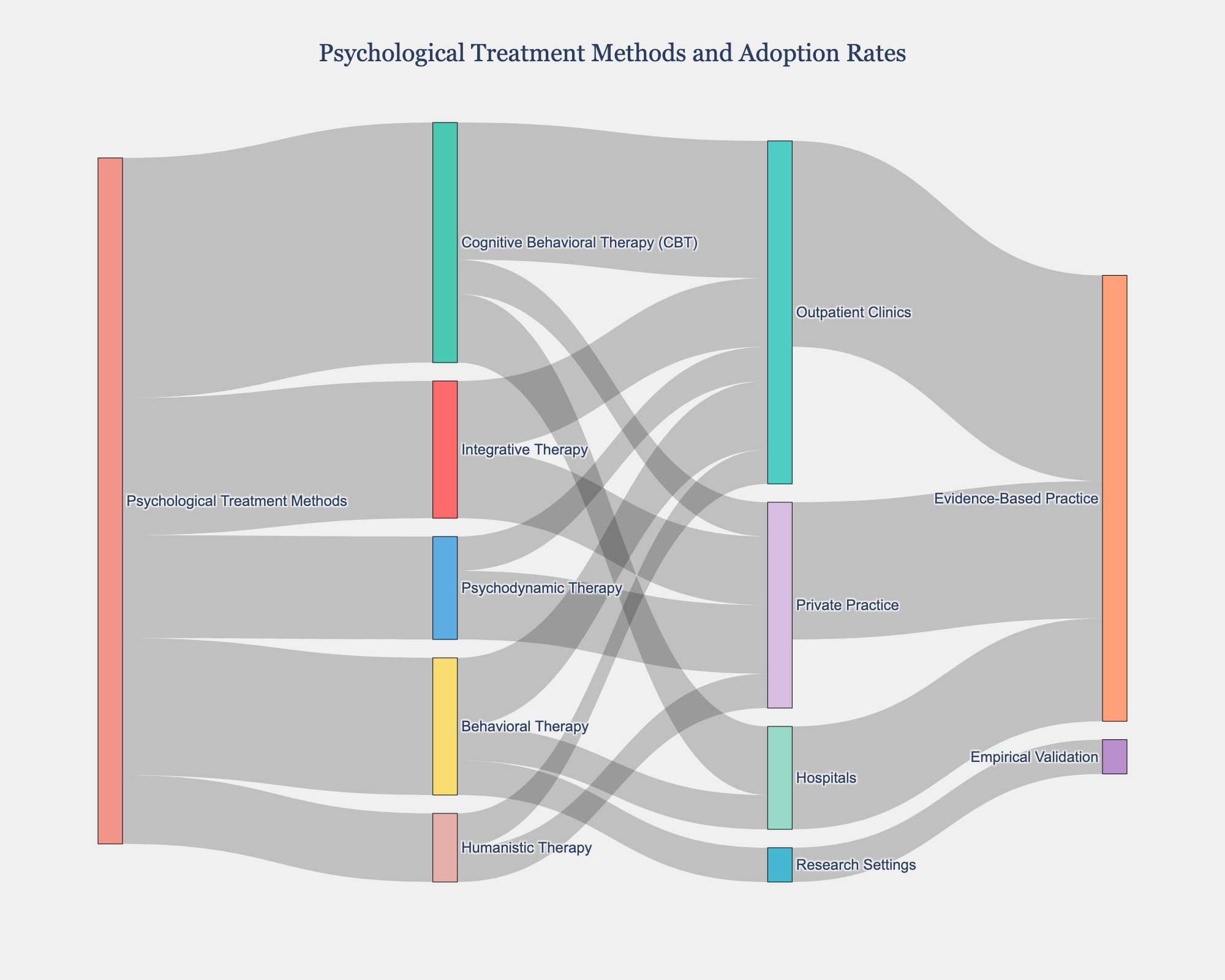
      "user": "what is the title of the diagram?",
      "assistant": "The title is usually located at the top center of the diagram and summarizes what the diagram represents. Here, it reads \"Psychological Treatment Methods and Adoption Rates.\"\nAnswer: Psychological Treatment Methods and Adoption Rates"
    },
    {
      "user": "Which treatment method has the highest adoption rate?",
      "assistant": "By examining the thickness and value of the flow lines from the \"Psychological Treatment Methods\" node, Cognitive Behavioral Therapy (CBT) has the highest value at 35.\nAnswer: Cognitive Behavioral Therapy (CBT)"
    },
    {
      "user": "How many treatment methods lead to outpatient clinics?",
      "assistant": "The connection lines indicate the flow from treatment methods to clinic settings. Outpatient clinics receive flows from four treatment methods: Cognitive Behavioral Therapy (CBT), Psychodynamic Therapy, Humanistic Therapy, and Integrative Therapy.\nAnswer: Four"
    },
    {
      "user": "Compare the adoption rates of Behavioral Therapy and Humanistic Therapy. Which one is greater?",
      "assistant": "By analyzing the values of the links branching from the \"Psychological Treatment Methods\" node, Behavioral Therapy has a value of 20 while Humanistic Therapy has a value of 10. Therefore, Behavioral Therapy has a higher adoption rate.\nAnswer: Behavioral Therapy"
    },
    {
      "user": "How much of Cognitive Behavioral Therapy (CBT) is adopted in hospitals?",
      "assistant": "The flow from Cognitive Behavioral Therapy to hospitals shows a value of 10.\nAnswer: 10"
    },
    {
      "user": "What is the total value flowing into Evidence-Based Practice?",
      "assistant": "Add up the values connected to the \"Evidence-Based Practice\" node: Outpatient Clinics (30), Hospitals (15), and Private Practice (20). The total is 30 + 15 + 20 = 65.\nAnswer: 65"
    },
    {
      "user": "Which clinical setting adopts Integrative Therapy the least?",
      "assistant": "By looking at the flows from Integrative Therapy, both Outpatient Clinics and Private Practice have equal adoption rates of 10. Since no other settings are shown, there is no single setting with the least adoption rate; they are equal.\nAnswer: Outpatient Clinics and Private Practice equally"
    },
    {
      "user": "Identify one method with equal adoption rates across all its clinical settings.",
      "assistant": "By examining the flows from each treatment method, Humanistic Therapy flows equally to Outpatient Clinics and Private Practice, both at a value of 5.\nAnswer: Humanistic Therapy"
    },
    {
      "user": "Can you determine the exact percentage of Research Settings' contribution to Empirical Validation?",
      "assistant": "The flow value from Research Settings to Empirical Validation is 5. The total value flowing into Evidence-Based Practice and Empirical Validation combined is 70. Hence, the percentage is (5/70) * 100 \u2248 7.14%.\nAnswer: 7.14%"
    }
  ],
  "original_index": 8101,
  "width": 2000,
  "height": 1600,
  "mode": "RGB",
  "source": "CoSyn-400k-chart",
  "relevance_ratings": [
    5,
    5,
    5,
    5,
    1,
    5,
    3,
    5,
    5
  ],
  "relevance_min": 1,
  "visual_dependency_ratings": [
    5,
    2,
    2,
    2,
    4,
    4,
    2,
    2,
    4
  ],
  "visual_dependency_min": 2,
  "image_correspondence_ratings": [
    5,
    5,
    4,
    4,
    3,
    5,
    4,
    4,
    2
  ],
  "image_correspondence_min": 2,
  "formatting_ratings": [
    4,
    4,
    4,
    4,
    4,
    5,
    4,
    4,
    5
  ],
  "formatting_min": 4
}
|
|
3
|
00000002
|
{
  "texts": [
    {
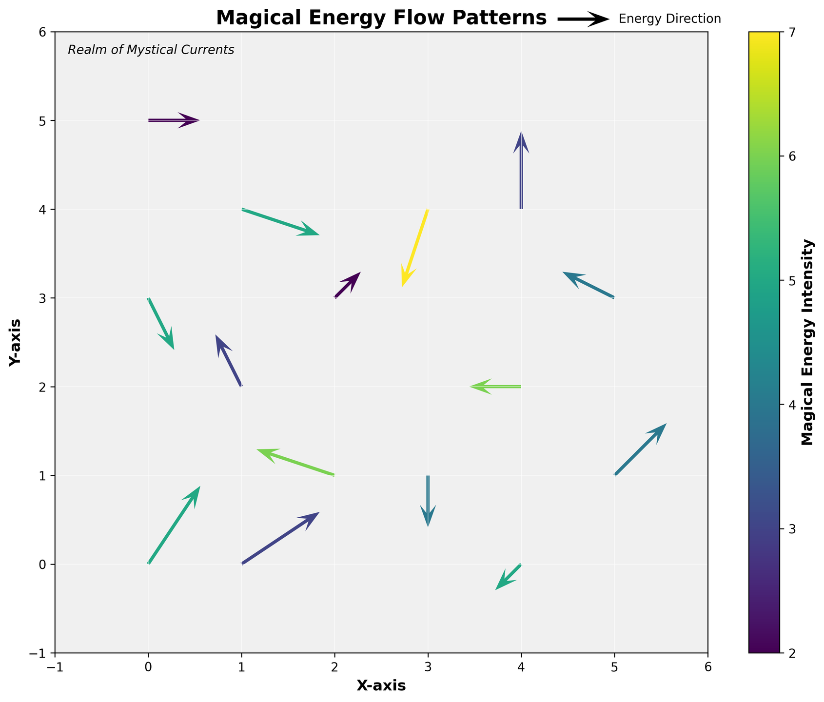
      "user": "What's the title of the figure?",
      "assistant": "The title of the figure is usually prominently displayed at the top and provides a summary of what the figure is about. In this case, it is written in bold.\nAnswer: Magical Energy Flow Patterns"
    },
    {
      "user": "What does the color represent in this figure?",
      "assistant": "The color in the figure represents the intensity of magical energy, with a color gradient shown in the color bar on the right side of the plot. Darker colors typically indicate higher intensity.\nAnswer: Magical Energy Intensity"
    },
    {
      "user": "Which axis represents the horizontal movement in the magical realm?",
      "assistant": "The labels on the axes clearly indicate that the horizontal movement is represented by the X-axis, which is typically on the bottom.\nAnswer: X-axis"
    },
    {
      "user": "What is the direction of the magical flow at the point (1, 4)?",
      "assistant": "To determine the direction of the magical flow, observe the arrow at the coordinate (1, 4). The arrow points towards its direction. Here, it points south-east.\nAnswer: South-east"
    },
    {
      "user": "What is the intensity value of the highest magical energy flow?",
      "assistant": "By observing the color bar and matching it with the darkest color in the plot, we can find the highest intensity value. The darkest color in this plot corresponds to an intensity of 7.\nAnswer: 7"
    },
    {
      "user": "Are there more arrows pointing to the north or to the east in this figure?",
      "assistant": "By visually inspecting the directions of all arrows, count the number pointing primarily northward versus those pointing eastward. Northward arrows seem to be fewer compared to those pointing eastward.\nAnswer: Eastward"
    },
    {
      "user": "What's the average intensity of the arrows at coordinates (2,1) and (2,3)?",
      "assistant": "Identify the arrows at (2,1) and (2,3), observe their corresponding intensities (6 and 2), and calculate the average: (6 + 2) / 2 = 4.\nAnswer: 4"
    },
    {
      "user": "Which point has the arrow with the strongest diagonal movement?",
      "assistant": "Compare all arrows for those that are diagonal (having both x and y components) and identify the strongest one by its length and direction. The arrow at (3, 4) has a strong diagonal movement with components -1 and -3.\nAnswer: (3, 4)"
    },
    {
      "user": "In which quadrant of the grid is the majority of the high-intensity magical energy located?",
      "assistant": "Divide the grid visually into four quadrants and identify the regions where the highest intensity arrows are located. The majority of high-intensity arrows seem to be in the lower right quadrant.\nAnswer: Lower right"
    },
    {
      "user": "Compare the energy flow at (1,2) and (2,3). Which has a greater intensity and what are their directions?",
      "assistant": "Look at the arrows at (1,2) and (2,3) and compare their color intensity. The arrow at (1,2) has an intensity of 3, and it flows east. The arrow at (2,3) has an intensity of 2, and it flows north-east. Thus, (1,2) has greater intensity.\nAnswer: (1,2) has greater intensity, flow directions are east (1,2) and north-east (2,3)"
    }
  ],
  "original_index": 8102,
  "width": 1690,
  "height": 1440,
  "mode": "RGB",
  "source": "CoSyn-400k-chart",
  "relevance_ratings": [
    5,
    5,
    5,
    5,
    5,
    5,
    5,
    5,
    5,
    5
  ],
  "relevance_min": 5,
  "visual_dependency_ratings": [
    5,
    5,
    4,
    4,
    2,
    5,
    5,
    4,
    4,
    4
  ],
  "visual_dependency_min": 2,
  "image_correspondence_ratings": [
    5,
    4,
    4,
    4,
    5,
    4,
    4,
    4,
    4,
    5
  ],
  "image_correspondence_min": 4,
  "formatting_ratings": [
    5,
    4,
    4,
    4,
    4,
    4,
    4,
    4,
    4,
    5
  ],
  "formatting_min": 4
}
|
|
4
|
00000003
|
{
  "texts": [
    {
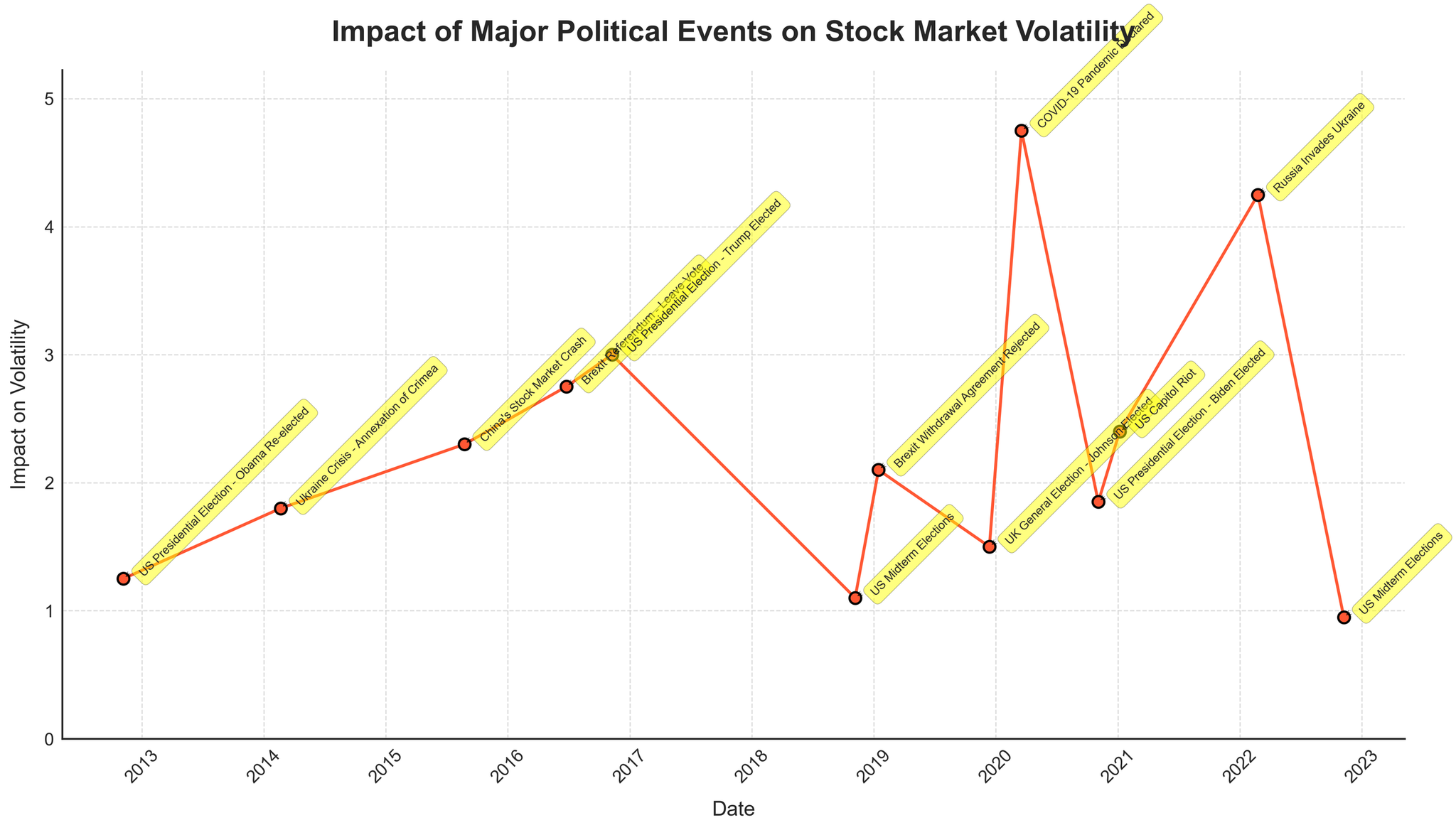
      "user": "What is the title of the plot?",
      "assistant": "The title is displayed at the top of the plot, typically in a larger and bold font. It reads: \"Impact of Major Political Events on Stock Market Volatility\".\nAnswer: Impact of Major Political Events on Stock Market Volatility"
    },
    {
      "user": "Which event caused the highest impact on volatility, and what was the value?",
      "assistant": "The event with the highest impact is at the peak of the plot. It is labeled and annotated. The \"COVID-19 Pandemic Declared\" in March 2020 caused the highest impact, with a volatility level of 4.75.\nAnswer: COVID-19 Pandemic Declared, 4.75"
    },
    {
      "user": "How many major political events are plotted in the figure?",
      "assistant": "You can count the data points or annotations on the plot. There are annotations for each event that indicate a total of 13 major political events.\nAnswer: 13"
    },
    {
      "user": "How does the impact of the US Presidential Election in 2020 compare to the US Midterm Elections in 2022?",
      "assistant": "Locate the annotations for the US Presidential Election (November 2020) and US Midterm Elections (November 2022). Compare their values. The impact in 2020 is 1.85, while in 2022 it is 0.95, showing a higher impact in 2020.\nAnswer: US Presidential Election (1.85) is higher than US Midterm Elections (0.95)"
    },
    {
      "user": "What is the average impact on volatility for all the events listed?",
      "assistant": "Sum all the impact values and divide by the number of events. ((1.25 + 1.80 + 2.30 + 2.75 + 3.00 + 1.10 + 2.10 + 1.50 + 4.75 + 1.85 + 2.40 + 4.25 + 0.95) / 13 = 2.32)\nAnswer: 2.32"
    },
    {
      "user": "What is the difference in impact on volatility between Brexit Referendum - Leave Vote and UK's General Election - Johnson Elected?",
      "assistant": "Subtract the impact value of the UK's General Election from the Brexit Referendum's value. (2.75 - 1.50 = 1.25)\nAnswer: 1.25"
    },
    {
      "user": "Which event had the least impact on volatility, and what was the value?",
      "assistant": "The event with the lowest impact can be identified by the smallest value on the y-axis. It is labeled as the US Midterm Elections in November 2022 with an impact value of 0.95.\nAnswer: US Midterm Elections, 0.95"
    },
    {
      "user": "Did any event in 2019 have an impact greater than 2.0 on volatility?",
      "assistant": "Check the annotations for 2019. The Brexit Withdrawal Agreement Rejected in January 2019 had an impact value of 2.10, which is greater than 2.0.\nAnswer: Yes, Brexit Withdrawal Agreement Rejected (2.10)"
    },
    {
      "user": "What is the cumulative impact on volatility of all US Presidential Elections mentioned in the plot?",
      "assistant": "Add the impact values of all US Presidential Elections: 2012 (1.25), 2016 (3.00), and 2020 (1.85). (1.25 + 3.00 + 1.85 = 6.10)\nAnswer: 6.10"
    },
    {
      "user": "Which event had a higher impact on volatility: Russia Invades Ukraine in 2022 or Ukraine Crisis - Annexation of Crimea in 2014?",
      "assistant": "Compare the impact values: Russia Invades Ukraine (4.25) versus Ukraine Crisis - Annexation of Crimea (1.80). The invasion in 2022 had a higher impact.\nAnswer: Russia Invades Ukraine, 4.25"
    }
  ],
  "original_index": 8103,
  "width": 2048,
  "height": 1168,
  "mode": "RGB",
  "source": "CoSyn-400k-chart",
  "relevance_ratings": [
    5,
    5,
    5,
    3,
    5,
    1,
    5,
    5,
    5,
    5
  ],
  "relevance_min": 1,
  "visual_dependency_ratings": [
    5,
    4,
    5,
    2,
    4,
    4,
    4,
    2,
    4,
    2
  ],
  "visual_dependency_min": 2,
  "image_correspondence_ratings": [
    5,
    5,
    4,
    5,
    4,
    4,
    5,
    4,
    4,
    5
  ],
  "image_correspondence_min": 4,
  "formatting_ratings": [
    4,
    5,
    4,
    4,
    5,
    5,
    4,
    4,
    5,
    5
  ],
  "formatting_min": 4
}
|
|
5
|
00000004
|
{
  "texts": [
    {
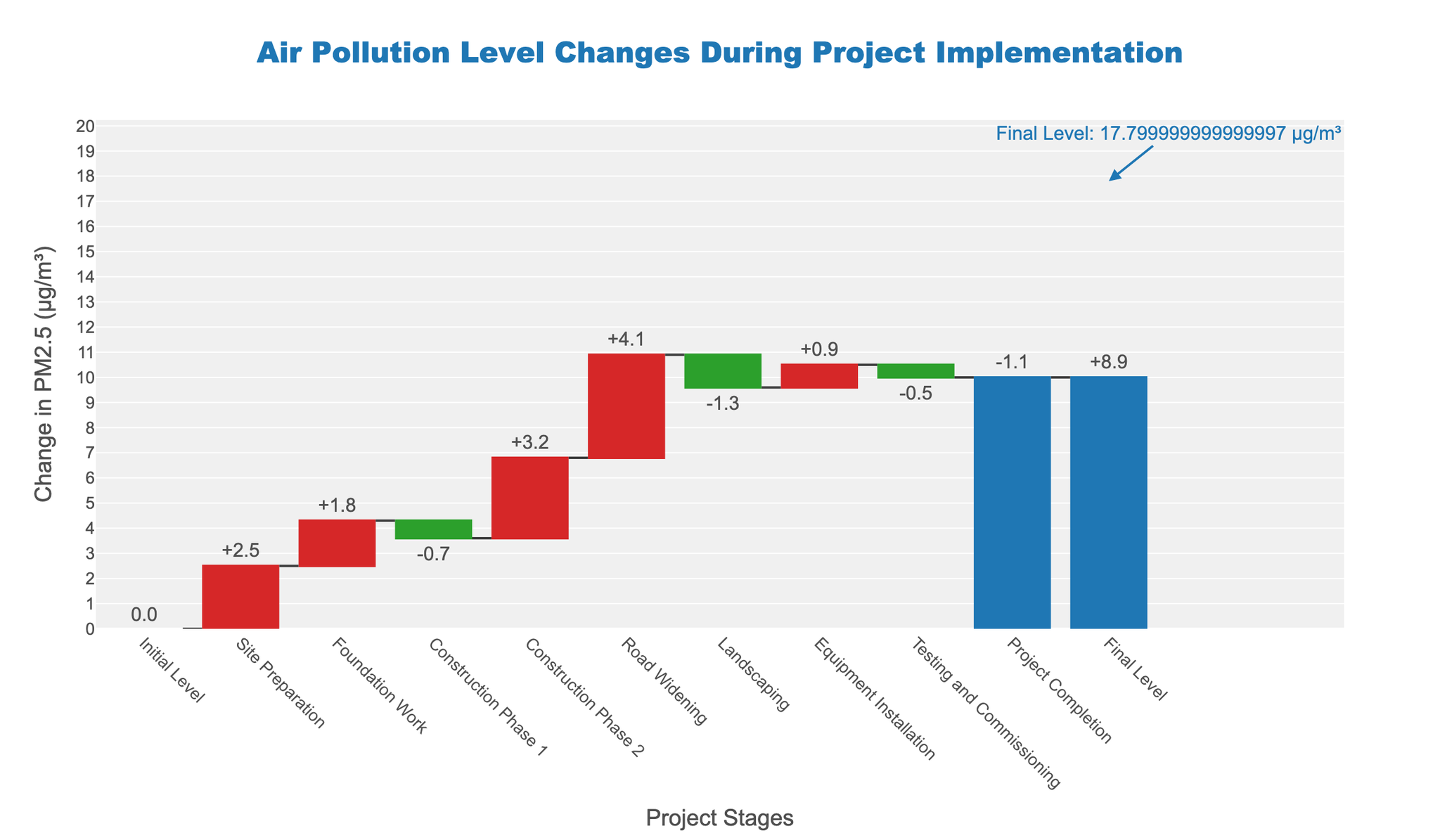
      "user": "What's the title of the waterfall chart?",
      "assistant": "The waterfall chart title is displayed at the top center of the figure. It provides a summary description of what the chart represents.\nAnswer: Air Pollution Level Changes During Project Implementation"
    },
    {
      "user": "What's the final level of PM2.5 at the project completion stage?",
      "assistant": "The final level of PM2.5 is indicated in the figure with an annotation next to the last bar for \"Final Level.\"\nAnswer: 8.9 \u00b5g/m\u00b3"
    },
    {
      "user": "What project stage contributed the most to the increase in PM2.5 levels?",
      "assistant": "This requires identifying the stage with the highest positive change in PM2.5 from the figure.\nAnswer: Road Widening"
    },
    {
      "user": "Which stages resulted in a decrease in PM2.5 levels, and what are their combined effects?",
      "assistant": "Identify the stages with negative changes in PM2.5 and sum up their values. Construction Phase 1, Landscaping, Testing and Commissioning, and Project Completion are the negative contributors with changes of -0.7, -1.3, -0.5, and -1.1 respectively. Their combined effect is -3.6 \u00b5g/m\u00b3.\nAnswer: Construction Phase 1, Landscaping, Testing and Commissioning, Project Completion; -3.6 \u00b5g/m\u00b3"
    },
    {
      "user": "How many total stages resulted in an increase in PM2.5 levels?",
      "assistant": "Count the stages with a positive change in PM2.5 from the figure. Site Preparation, Foundation Work, Construction Phase 2, Road Widening, and Equipment Installation are the stages with positive contributions.\nAnswer: 5 stages"
    },
    {
      "user": "What is the cumulative effect of all stages on PM2.5 levels before reaching the final level?",
      "assistant": "Sum all incremental changes from each stage to determine the cumulative effect before the final level. The sum is 2.5 (Site Preparation) + 1.8 (Foundation Work) - 0.7 (Construction Phase 1) + 3.2 (Construction Phase 2) + 4.1 (Road Widening) - 1.3 (Landscaping) + 0.9 (Equipment Installation) - 0.5 (Testing and Commissioning) - 1.1 (Project Completion) = 8.9 \u00b5g/m\u00b3.\nAnswer: 8.9 \u00b5g/m\u00b3"
    },
    {
      "user": "What is the change in PM2.5 levels during the Road Widening stage?",
      "assistant": "Locate the bar corresponding to the Road Widening stage and read the value associated with it.\nAnswer: +4.1 \u00b5g/m\u00b3"
    },
    {
      "user": "Which stage countered the increase in PM2.5 by reducing it after the Road Widening stage?",
      "assistant": "Identify the stage after Road Widening that has a negative change in PM2.5, which is Landscaping.\nAnswer: Landscaping"
    },
    {
      "user": "How does the initial PM2.5 level compare to the final level?",
      "assistant": "The initial level is 0, and the final level is 8.9. The difference is the final minus the initial value.\nAnswer: Initial: 0, Final: 8.9, Difference: +8.9 \u00b5g/m\u00b3"
    },
    {
      "user": "What is the effect of the \"Testing and Commissioning\" stage on PM2.5 levels?",
      "assistant": "Locate the bar corresponding to \"Testing and Commissioning\" and read the change in PM2.5 value, which is negative.\nAnswer: -0.5 \u00b5g/m\u00b3"
    }
  ],
  "original_index": 8104,
  "width": 2048,
  "height": 1195,
  "mode": "RGB",
  "source": "CoSyn-400k-chart",
  "relevance_ratings": [
    5,
    5,
    5,
    5,
    5,
    5,
    5,
    5,
    5,
    5
  ],
  "relevance_min": 5,
  "visual_dependency_ratings": [
    5,
    2,
    4,
    4,
    4,
    4,
    3,
    4,
    4,
    2
  ],
  "visual_dependency_min": 2,
  "image_correspondence_ratings": [
    5,
    5,
    5,
    5,
    5,
    5,
    5,
    5,
    5,
    5
  ],
  "image_correspondence_min": 5,
  "formatting_ratings": [
    4,
    4,
    4,
    5,
    4,
    5,
    4,
    4,
    5,
    4
  ],
  "formatting_min": 4
}
|
|
6
|
00000005
|
{
  "texts": [
    {
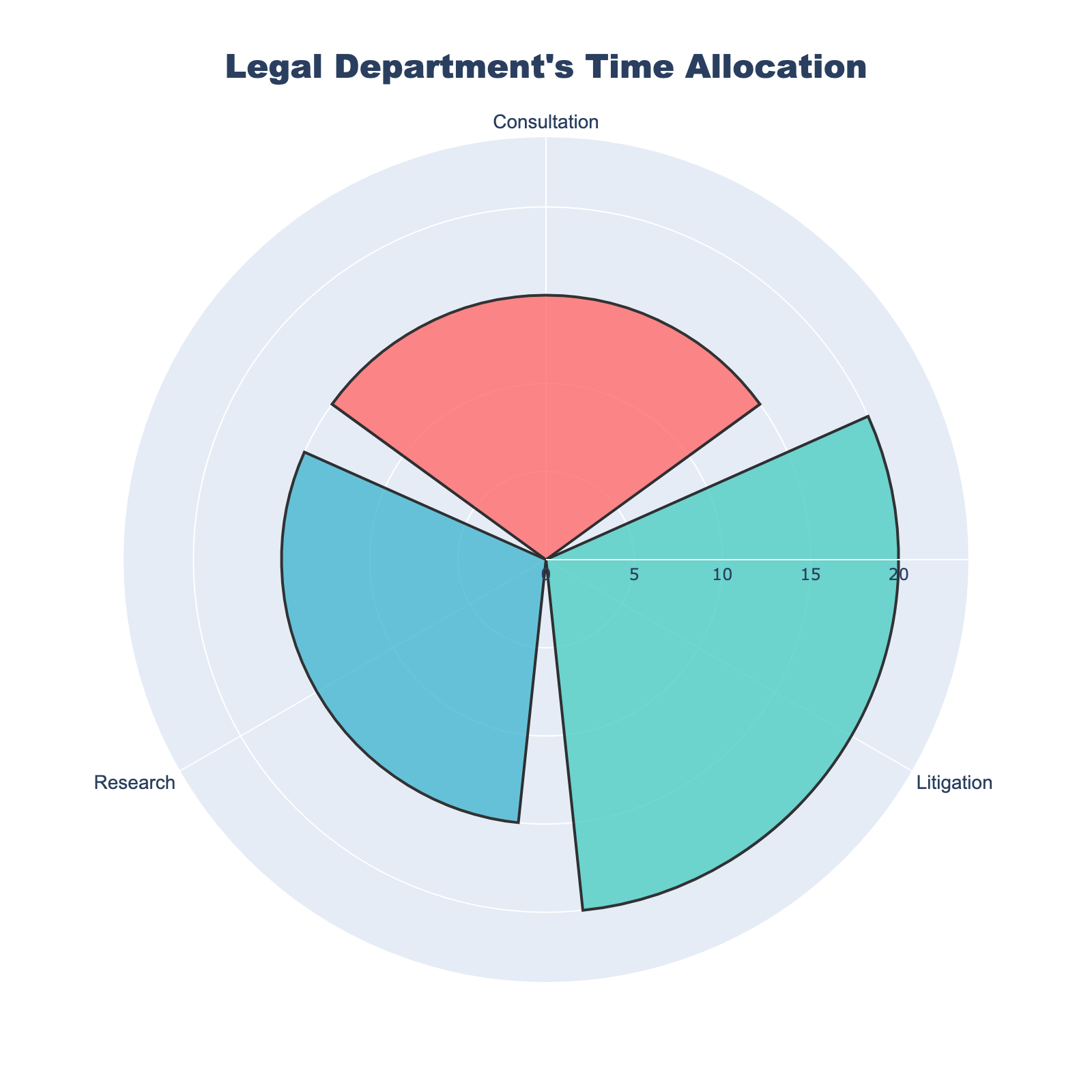
      "user": "What's the title of the figure?",
      "assistant": "The title of the figure is prominently displayed at the top, directly above the rose chart.\nAnswer: Legal Department's Time Allocation"
    },
    {
      "user": "How many activities are represented in the figure?",
      "assistant": "Each activity is labeled around the chart, making the total number of activities easy to count.\nAnswer: 3"
    },
    {
      "user": "Which activity takes up the most time in a week?",
      "assistant": "By comparing the lengths of the bars, you can see which one extends the furthest from the center. The longest bar represents the activity with the highest time allocation.\nAnswer: Litigation"
    },
    {
      "user": "How much time is spent on Consultation per week?",
      "assistant": "The \"Consultation\" bar represents the combined time from both types of consultations (10 + 5). Look at the length of the \"Consultation\" bar and find the number indicated on the radial axis.\nAnswer: 15 hours"
    },
    {
      "user": "Compare the time spent on Research and Litigation. Which one is greater, and by how much?",
      "assistant": "By comparing the lengths of the bars for \"Research\" and \"Litigation,\" you can see which one is longer and then calculate the difference in their lengths.\nAnswer: Litigation is greater by 5 hours"
    },
    {
      "user": "What is the total time allocated for all activities per week?",
      "assistant": "Add the values of all bars: Research (15), Consultation (15), and Litigation (20).\nAnswer: 50 hours"
    },
    {
      "user": "What percentage of the total time is spent on Research?",
      "assistant": "First, find the total time (50 hours). Then calculate the percentage by dividing the time for Research (15 hours) by the total time and multiplying by 100.\nAnswer: 30%"
    },
    {
      "user": "Is more time spent on Consultation or Research?",
      "assistant": "Compare the lengths of the Consultation and Research bars to determine which one is longer.\nAnswer: Same amount"
    },
    {
      "user": "Which activity has the shortest time allocation?",
      "assistant": "Identify the bar that extends the least from the center of the chart.\nAnswer: Consultation"
    },
    {
      "user": "Why might the Consultation time be divided into two separate activities originally?",
      "assistant": "The original data distinguishes Consultation with the CEO and Consultation with Regulatory Bodies. This might reflect different types of interactions or purposes deemed important to track separately for legal reasons.\nAnswer: Different purposes of consultations"
    }
  ],
  "original_index": 8105,
  "width": 1600,
  "height": 1600,
  "mode": "RGB",
  "source": "CoSyn-400k-chart",
  "relevance_ratings": [
    5,
    5,
    3,
    5,
    5,
    5,
    5,
    3,
    3,
    4
  ],
  "relevance_min": 3,
  "visual_dependency_ratings": [
    5,
    5,
    2,
    2,
    4,
    2,
    4,
    2,
    2,
    2
  ],
  "visual_dependency_min": 2,
  "image_correspondence_ratings": [
    5,
    4,
    5,
    4,
    4,
    4,
    4,
    4,
    4,
    3
  ],
  "image_correspondence_min": 3,
  "formatting_ratings": [
    5,
    4,
    4,
    4,
    4,
    4,
    4,
    4,
    4,
    4
  ],
  "formatting_min": 4
}
|
|
7
|
00000006
|
{
  "texts": [
    {
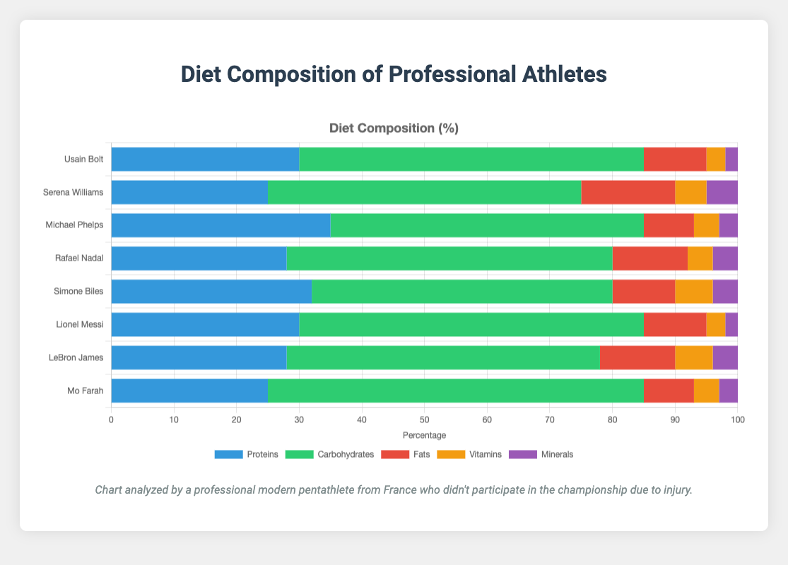
      "user": "What is the average percentage of proteins in the diets of all athletes?",
      "assistant": "To find the average percentage of proteins, sum up the protein percentages for all athletes: 30 + 25 + 35 + 28 + 32 + 30 + 28 + 25 = 233. Then divide by the number of athletes (8): 233 / 8 = 29.125.\nAnswer: 29.125"
    },
    {
      "user": "Which athlete has the highest percentage of carbohydrates in their diet?",
      "assistant": "By comparing the carbohydrates percentages of each athlete (55, 50, 50, 52, 48, 55, 50, 60), we see that Mo Farah has the highest percentage of 60.\nAnswer: Mo Farah"
    },
    {
      "user": "Compare the fat percentage of Serena Williams and Michael Phelps. Which one is higher and by how much?",
      "assistant": "Serena Williams has 15% fats, and Michael Phelps has 8%. The difference is 15 - 8 = 7. Therefore, Serena Williams has 7% more fats in her diet than Michael Phelps.\nAnswer: Serena Williams, by 7%"
    },
    {
      "user": "What is the total percentage of nutrients (vitamins and minerals combined) in Lionel Messi's diet?",
      "assistant": "For Lionel Messi, vitamins are 3% and minerals are 2%. Adding them together: 3 + 2 = 5.\nAnswer: 5"
    },
    {
      "user": "Among the listed athletes, who has the least percentage of fats in their diet?",
      "assistant": "Comparing the fat percentages (10, 15, 8, 12, 10, 10, 12, 8), Michael Phelps and Mo Farah both have 8%, which is the lowest.\nAnswer: Michael Phelps and Mo Farah"
    },
    {
      "user": "Which nutrient is the predominant one in Simone Biles' diet and what is its percentage?",
      "assistant": "For Simone Biles, the nutrient with the highest percentage is carbohydrates at 48%.\nAnswer: Carbohydrates, 48%"
    },
    {
      "user": "How many athletes have a protein percentage of 30 or more?",
      "assistant": "Checking the protein percentages (30, 25, 35, 28, 32, 30, 28, 25), four athletes (Usain Bolt, Michael Phelps, Simone Biles, Lionel Messi) have 30% or more.\nAnswer: 4"
    },
    {
      "user": "What is the combined percentage of vitamins and minerals in Rafael Nadal's diet?",
      "assistant": "Rafael Nadal has 4% vitamins and 4% minerals. Adding them together: 4 + 4 = 8.\nAnswer: 8"
    },
    {
      "user": "Is the proportion of carbohydrates in Mo Farah's diet higher than that in Lionel Messi's diet?",
      "assistant": "Mo Farah has 60% carbohydrates while Lionel Messi has 55%. Therefore, yes, it is higher.\nAnswer: Yes"
    },
    {
      "user": "What are the sum and average of the fat percentages across all athletes?",
      "assistant": "First, sum the fat percentages: 10 + 15 + 8 + 12 + 10 + 10 + 12 + 8 = 85. Then find the average: 85 / 8 = 10.625.\nAnswer: Sum: 85, Average: 10.625"
    }
  ],
  "original_index": 8106,
  "width": 1115,
  "height": 800,
  "mode": "RGB",
  "source": "CoSyn-400k-chart",
  "relevance_ratings": [
    5,
    5,
    5,
    5,
    5,
    5,
    5,
    5,
    5,
    5
  ],
  "relevance_min": 5,
  "visual_dependency_ratings": [
    2,
    2,
    2,
    2,
    2,
    2,
    4,
    4,
    3,
    4
  ],
  "visual_dependency_min": 2,
  "image_correspondence_ratings": [
    4,
    5,
    4,
    4,
    4,
    4,
    4,
    4,
    4,
    4
  ],
  "image_correspondence_min": 4,
  "formatting_ratings": [
    4,
    5,
    4,
    4,
    4,
    4,
    4,
    4,
    4,
    5
  ],
  "formatting_min": 4
}
|
|
8
|
00000007
|
{
  "texts": [
    {
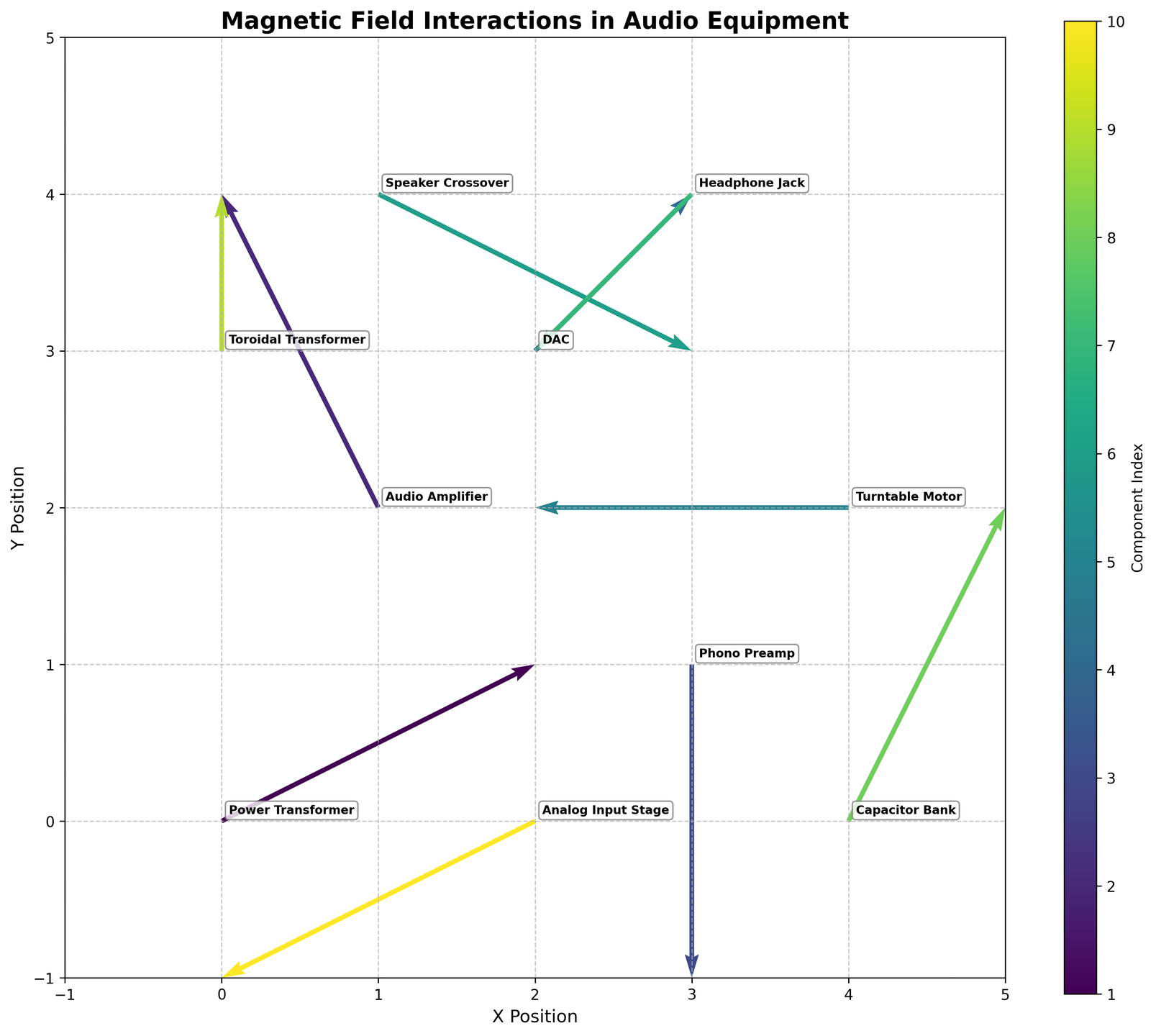
      "user": "What's the title of the plot?",
      "assistant": "The title of the plot is usually found at the top center of the figure, and it provides the general description of the plot. In this case, you should look at the top center of the plot.\nAnswer: Magnetic Field Interactions in Audio Equipment"
    },
    {
      "user": "How many components are there?",
      "assistant": "To determine the number of components, count the number of arrows or annotations present in the figure. Each arrow represents a different component.\nAnswer: 10"
    },
    {
      "user": "What is the x-coordinate and y-coordinate of the Audio Amplifier?",
      "assistant": "Locate the label \"Audio Amplifier\" on the plot and find its position by reading the values on the x and y axes where it is located.\nAnswer: (1, 2)"
    },
    {
      "user": "Which component has the largest horizontal magnetic field interaction?",
      "assistant": "The component with the largest horizontal interaction will have the longest arrow in the x-direction. By observing, you can see which component's arrow stretches the most horizontally.\nAnswer: Power Transformer"
    },
    {
      "user": "How many components have an upward magnetic field interaction?",
      "assistant": "Look for arrows that have a positive y-component (pointing upwards) and count these arrows to find how many components have upward interactions.\nAnswer: 4"
    },
    {
      "user": "Which component is affected by an equal amount of horizontal and vertical magnetic field interaction?",
      "assistant": "Look for the component whose arrow's u and v values are equal. This means the arrow should have the same length horizontally and vertically.\nAnswer: DAC"
    },
    {
      "user": "What components experience a negative magnetic field interaction in both x and y directions?",
      "assistant": "Find the arrows pointing towards the lower left (both x and y directions negative). Identify the components attached to these arrows.\nAnswer: Analog Input Stage, Headphone Jack"
    },
    {
      "user": "Identify the component with the least vertical magnetic field interaction.",
      "assistant": "Find the arrow with the shortest length in the y-direction (vertical). This component has the least vertical magnetic field interaction.\nAnswer: Turntable Motor"
    },
    {
      "user": "Do any components have no horizontal interaction? If yes, name them.",
      "assistant": "Look for arrows where u = 0, meaning there is no horizontal interaction. Identify these components.\nAnswer: Phono Preamp, Toroidal Transformer"
    },
    {
      "user": "Which component is nearest to the origin (0,0)?",
      "assistant": "Measure the distance from the origin to each component's coordinates and find the smallest distance. This can be calculated using the distance formula sqrt((x-0)^2 + (y-0)^2).\nAnswer: Power Transformer"
    }
  ],
  "original_index": 8107,
  "width": 1607,
  "height": 1440,
  "mode": "RGB",
  "source": "CoSyn-400k-chart",
  "relevance_ratings": [
    5,
    3,
    5,
    3,
    5,
    3,
    3,
    3,
    5,
    3
  ],
  "relevance_min": 3,
  "visual_dependency_ratings": [
    5,
    5,
    4,
    4,
    4,
    4,
    4,
    4,
    4,
    4
  ],
  "visual_dependency_min": 4,
  "image_correspondence_ratings": [
    5,
    4,
    4,
    4,
    4,
    4,
    4,
    4,
    4,
    5
  ],
  "image_correspondence_min": 4,
  "formatting_ratings": [
    5,
    4,
    4,
    4,
    4,
    4,
    4,
    4,
    4,
    4
  ],
  "formatting_min": 4
}
|
|
9
|
00000008
|
{
  "texts": [
    {
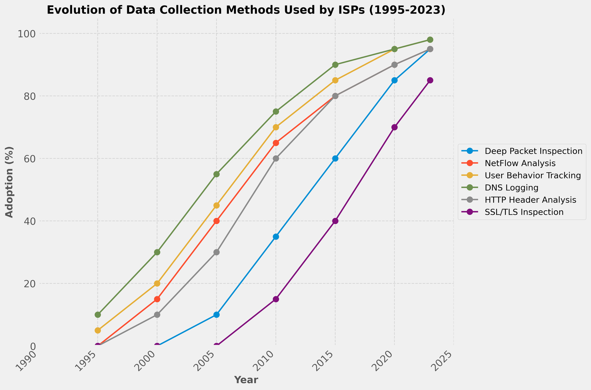
      "user": "What's the overall trend of Deep Packet Inspection from 1995 to 2023?",
      "assistant": "To find the overall trend, observe the line for Deep Packet Inspection on the chart. The percentage starts at 0% in 1995 and increases steadily over time, reaching 95% by 2023.\nAnswer: Increasing"
    },
    {
      "user": "Which data collection method had the highest adoption rate in 2010?",
      "assistant": "Look at the values for each method in 2010 and compare them. Deep Packet Inspection (35%), NetFlow Analysis (65%), User Behavior Tracking (70%), DNS Logging (75%), HTTP Header Analysis (60%), and SSL/TLS Inspection (15%). DNS Logging has the highest adoption rate in 2010 at 75%.\nAnswer: DNS Logging"
    },
    {
      "user": "How does the adoption of SSL/TLS Inspection in 2023 compare to that in 2005?",
      "assistant": "Check the values for SSL/TLS Inspection in 2023 (85%) and 2005 (0%). The adoption significantly increased from 0% in 2005 to 85% in 2023.\nAnswer: Increased"
    },
    {
      "user": "Which method experienced the smallest increase between 2000 and 2005?",
      "assistant": "Calculate the difference for each method from 2000 to 2005: Deep Packet Inspection (10-0=10), NetFlow Analysis (40-15=25), User Behavior Tracking (45-20=25), DNS Logging (55-30=25), HTTP Header Analysis (30-10=20), SSL/TLS Inspection (0-0=0). SSL/TLS Inspection experienced the smallest increase.\nAnswer: SSL/TLS Inspection"
    },
    {
      "user": "By how many percentage points did HTTP Header Analysis increase from 2010 to 2023?",
      "assistant": "Subtract the adoption percentage in 2010 (60%) from that in 2023 (95%) for HTTP Header Analysis. 95% - 60% = 35%\nAnswer: 35%"
    },
    {
      "user": "What's the difference in adoption rate between DNS Logging and User Behavior Tracking in 2020?",
      "assistant": "Look at the values for DNS Logging (95%) and User Behavior Tracking (95%) in 2020. The difference is 95% - 95% = 0%.\nAnswer: 0%"
    },
    {
      "user": "Which method showed the most rapid growth between 1995 and 2023?",
      "assistant": "Calculate the total increase for each method from 1995 to 2023: Deep Packet Inspection (95-0=95), NetFlow Analysis (95-0=95), User Behavior Tracking (98-5=93), DNS Logging (98-10=88), HTTP Header Analysis (95-0=95), SSL/TLS Inspection (85-0=85). Deep Packet Inspection, NetFlow Analysis, and HTTP Header Analysis all have the highest increase of 95 percentage points.\nAnswer: Deep Packet Inspection, NetFlow Analysis, HTTP Header Analysis"
    },
    {
      "user": "Is the adoption of NetFlow Analysis higher in 2015 or 2023?",
      "assistant": "Compare the adoption rates of NetFlow Analysis in 2015 (80%) and 2023 (95%). The adoption rate is higher in 2023.\nAnswer: 2023"
    },
    {
      "user": "What proportion of the data collection methods reached at least 90% adoption by 2023?",
      "assistant": "Count the methods reaching at least 90% adoption in 2023: Deep Packet Inspection (95%), NetFlow Analysis (95%), User Behavior Tracking (98%), DNS Logging (98%), HTTP Header Analysis (95%), SSL/TLS Inspection (85%). 5 out of 6 methods reached at least 90%. The proportion is 5/6.\nAnswer: 5/6"
    }
  ],
  "original_index": 8108,
  "width": 2048,
  "height": 1353,
  "mode": "RGB",
  "source": "CoSyn-400k-chart",
  "relevance_ratings": [
    5,
    5,
    5,
    5,
    5,
    5,
    5,
    5,
    5
  ],
  "relevance_min": 5,
  "visual_dependency_ratings": [
    2,
    2,
    2,
    4,
    5,
    2,
    4,
    2,
    4
  ],
  "visual_dependency_min": 2,
  "image_correspondence_ratings": [
    5,
    5,
    5,
    5,
    5,
    5,
    5,
    5,
    5
  ],
  "image_correspondence_min": 5,
  "formatting_ratings": [
    5,
    5,
    5,
    5,
    4,
    5,
    4,
    5,
    5
  ],
  "formatting_min": 4
}
|
|
10
|
00000009
|
{
  "texts": [
    {
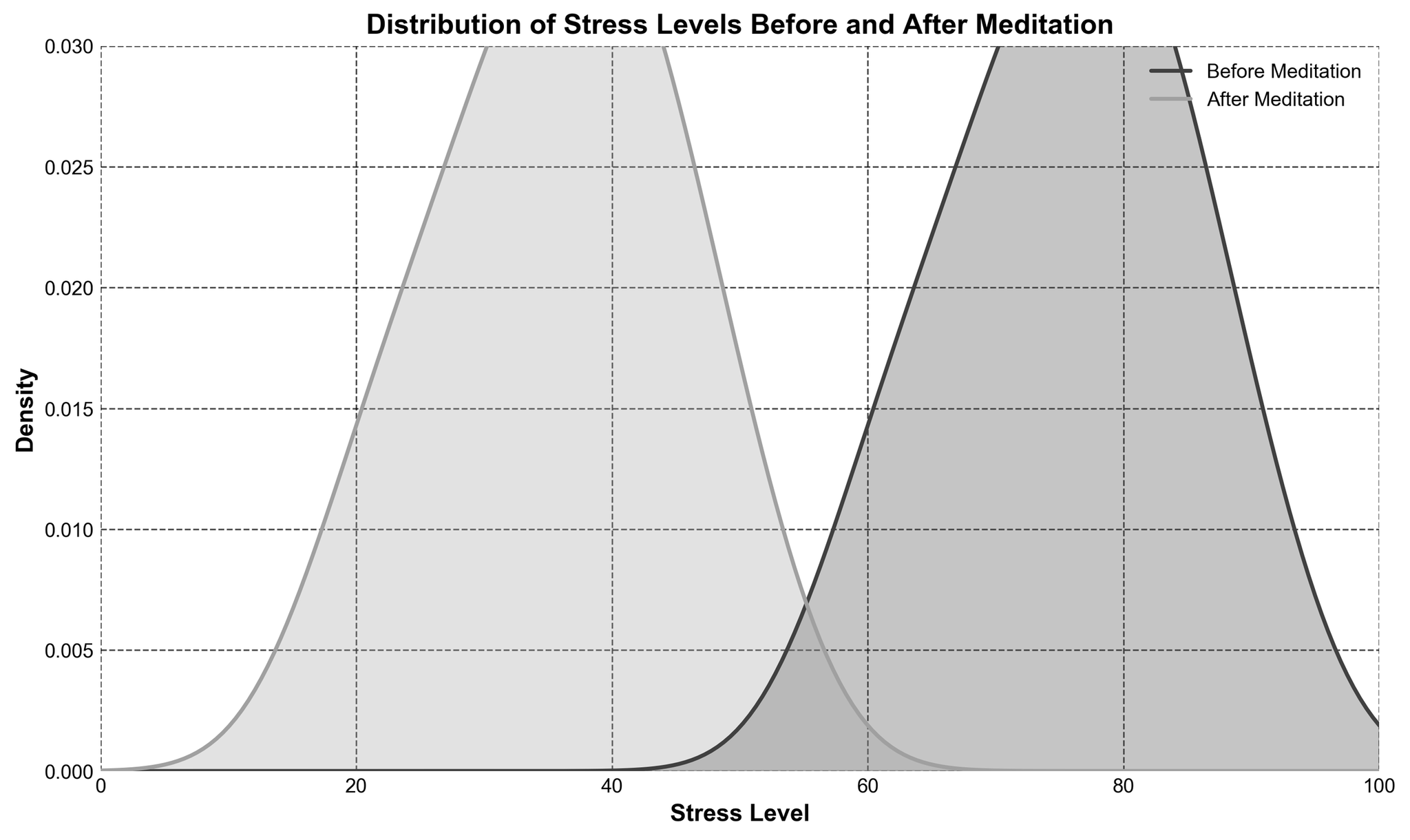
      "user": "What is the title of the figure?",
      "assistant": "The title of the figure is displayed at the top and usually summarizes the content of the plot. Here, it says \"Distribution of Stress Levels Before and After Meditation\".\nAnswer: Distribution of Stress Levels Before and After Meditation"
    },
    {
      "user": "What are the labels on the x and y axes?",
      "assistant": "The labels on the axes describe what the axes represent. The x-axis is labeled \"Stress Level\" and the y-axis is labeled \"Density\".\nAnswer: Stress Level and Density"
    },
    {
      "user": "What range of stress levels does the x-axis cover?",
      "assistant": "The x-axis extends from the minimum to the maximum stress levels displayed. The range of the x-axis is from 0 to 100.\nAnswer: 0 to 100"
    },
    {
      "user": "What colors are used to represent the stress levels before and after meditation?",
      "assistant": "The plot uses different colors to differentiate the groups. The stress levels before meditation are represented with a darker gray, while after meditation they are shown with a lighter gray.\nAnswer: Dark gray and light gray"
    },
    {
      "user": "Which density curve is higher at a stress level of 30?",
      "assistant": "At a specific stress level, the height of the density curves can be compared. The height of the density curve for \"After Meditation\" is noticeably higher than \"Before Meditation\" at a stress level of 30.\nAnswer: After Meditation"
    },
    {
      "user": "How does the peak height compare before and after meditation?",
      "assistant": "The peaks in density represent the most common stress levels. The peak for \"Before Meditation\" is higher than the peak for \"After Meditation\".\nAnswer: Before Meditation"
    },
    {
      "user": "At what approximate stress level does the \"Before Meditation\" curve reach its peak?",
      "assistant": "Locate the highest point on the \"Before Meditation\" curve and note the x-value at this point. The \"Before Meditation\" curve peaks around a stress level of 75.\nAnswer: 75"
    },
    {
      "user": "Based on the plot, did meditation sessions generally reduce stress levels?",
      "assistant": "To determine the effect, compare the stress level distributions before and after meditation. The density curve for \"After Meditation\" shifts to the left (lower stress levels), indicating a reduction in stress levels.\nAnswer: Yes"
    },
    {
      "user": "What visual elements indicate that gridlines are present in this plot?",
      "assistant": "Gridlines contribute to the readability of a plot by providing reference lines. They are visible as faint dashed lines across the background.\nAnswer: Dashed lines across the background"
    },
    {
      "user": "What is the range of densities covered on the y-axis?",
      "assistant": "Check the vertical extent of the plot to identify the minimum and maximum densities shown. The range on the y-axis is from 0 to 0.03.\nAnswer: 0 to 0.03"
    }
  ],
  "original_index": 8109,
  "width": 2048,
  "height": 1220,
  "mode": "RGB",
  "source": "CoSyn-400k-chart",
  "relevance_ratings": [
    5,
    5,
    5,
    5,
    5,
    3,
    5,
    5,
    4,
    5
  ],
  "relevance_min": 3,
  "visual_dependency_ratings": [
    5,
    5,
    4,
    4,
    4,
    4,
    4,
    4,
    4,
    4
  ],
  "visual_dependency_min": 4,
  "image_correspondence_ratings": [
    5,
    4,
    5,
    4,
    4,
    5,
    4,
    5,
    4,
    5
  ],
  "image_correspondence_min": 4,
  "formatting_ratings": [
    4,
    4,
    4,
    4,
    4,
    4,
    5,
    4,
    4,
    4
  ],
  "formatting_min": 4
}
|
|
11
|
00000010
|
{
  "texts": [
    {
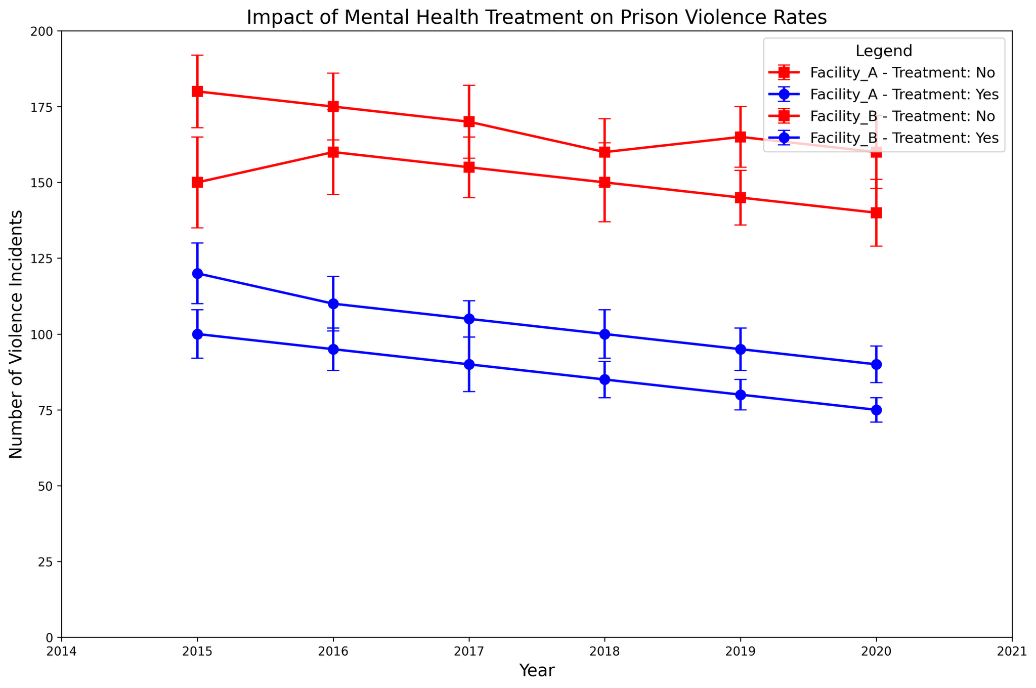
      "user": "How did the violence incidents in Facility A change from 2015 to 2020 for those receiving mental health treatment?",
      "assistant": "To answer this, observe the data points for Facility A with mental health treatment from 2015 (120 incidents) to 2020 (90 incidents). The change is calculated by subtracting the incidents in 2020 from the incidents in 2015: 120 - 90 = 30. Thus, violence incidents decreased by 30.\nAnswer: Decreased by 30"
    },
    {
      "user": "How much higher were violence incidents in Facility B without mental health treatment compared to Facility A without mental health treatment in 2015?",
      "assistant": "In 2015, Facility B without treatment had 150 incidents, and Facility A without treatment had 180 incidents. The difference is calculated by subtracting Facility B's incidents from Facility A's incidents: 180 - 150 = 30. Thus, Facility A had 30 more incidents.\nAnswer: 30 more in Facility A"
    },
    {
      "user": "In which year did Facility B see the lowest number of violence incidents with mental health treatment, and how many incidents were reported?",
      "assistant": "Check the data points for Facility B with mental health treatment across the years. The lowest value is 75 incidents in 2020.\nAnswer: 2020, 75 incidents"
    },
    {
      "user": "What is the average number of violence incidents in Facility A without mental health treatment from 2015 to 2020?",
      "assistant": "The incidents reported from 2015 to 2020 in Facility A without treatment are 180, 175, 170, 160, 165, and 160. Sum these values: 180 + 175 + 170 + 160 + 165 + 160 = 1010. There are 6 years, so divide the sum by 6: 1010 / 6 \u2248 168.33.\nAnswer: Approximately 168.33"
    },
    {
      "user": "Compare the trend of violence incidents for Facility A with and without mental health treatment from 2015 to 2020.",
      "assistant": "Facility A with treatment shows a decreasing trend from 120 incidents in 2015 to 90 incidents in 2020. Without treatment, the incidents decrease slightly, from 180 in 2015 to 160 in 2020, but with more variation. Thus, the trend for those with treatment is a clearer decrease compared to a moderate decrease without treatment.\nAnswer: Decrease for both, clearer with treatment"
    },
    {
      "user": "Between Facility A and Facility B, which facility had a smaller variation in violence incidents for those with mental health treatment from 2015 to 2020, as shown by the error bars?",
      "assistant": "Compare the length of the error bars for mental health treatment in both facilities from 2015 to 2020. Facility A generally shows smaller error bars compared to Facility B, indicating less variation in reported incidents.\nAnswer: Facility A"
    }
  ],
  "original_index": 8110,
  "width": 2048,
  "height": 1360,
  "mode": "RGB",
  "source": "CoSyn-400k-chart",
  "relevance_ratings": [
    5,
    3,
    5,
    5,
    4,
    5
  ],
  "relevance_min": 3,
  "visual_dependency_ratings": [
    4,
    4,
    4,
    4,
    4,
    5
  ],
  "visual_dependency_min": 4,
  "image_correspondence_ratings": [
    5,
    5,
    5,
    4,
    5,
    5
  ],
  "image_correspondence_min": 4,
  "formatting_ratings": [
    5,
    4,
    4,
    5,
    4,
    4
  ],
  "formatting_min": 4
}
|
|
12
|
00000011
|
{
  "texts": [
    {
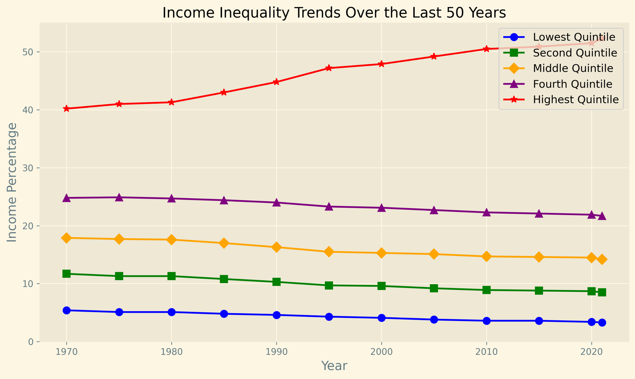
      "user": "What trend can you observe in the highest quintile from 1970 to 2021?",
      "assistant": "The highest quintile shows a consistent upward trend from 40.2% in 1970 to 52.3% in 2021. This indicates increasing income share for the top 20% over the last 50 years.\nAnswer: Increasing trend"
    },
    {
      "user": "How does the income percentage of the lowest quintile in 2021 compare to that in 1970?",
      "assistant": "In 1970, the lowest quintile's income percentage was 5.4%, and in 2021, it was 3.3%. Comparing these, the income share decreased by 2.1 percentage points (5.4% - 3.3%).\nAnswer: Decreased by 2.1 percentage points"
    },
    {
      "user": "Which quintile had the least change in income percentage over the years?",
      "assistant": "Examining the trends, the Fourth Quintile experienced relatively minimal fluctuations, starting at 24.8% in 1970 and ending at 21.7% in 2021, a change of 3.1 percentage points. This is smaller compared to the other quintiles.\nAnswer: Fourth Quintile"
    },
    {
      "user": "Compare the income percentage of the middle quintile and the second quintile in 2021.",
      "assistant": "In 2021, the middle quintile had an income percentage of 14.2%, and the second quintile had 8.5%. Subtracting these values (14.2% - 8.5%), the middle quintile had a 5.7 percentage points higher share.\nAnswer: Middle Quintile is 5.7 percentage points higher"
    },
    {
      "user": "What is the average income percentage across all quintiles in 2000?",
      "assistant": "For 2000, the income percentages are 4.1, 9.6, 15.3, 23.1, and 47.9. Sum these values (4.1 + 9.6 + 15.3 + 23.1 + 47.9 = 100) and divide by 5 (100/5). The average income percentage is 20%.\nAnswer: 20%"
    },
    {
      "user": "Which quintile depicts the steepest decline in income percentage from 1970 to 2021?",
      "assistant": "The lowest quintile declines from 5.4% in 1970 to 3.3% in 2021, totaling a decrease of 2.1 percentage points. The percentage change is higher compared to the other quintiles.\nAnswer: Lowest Quintile"
    },
    {
      "user": "During which decade did the highest quintile experience the largest increase in income percentage?",
      "assistant": "From 1990 to 2000, the highest quintile increased from 44.8% to 47.9%, a change of 3.1 percentage points. This decade shows the largest increase compared to others.\nAnswer: 1990s"
    },
    {
      "user": "How many quintiles have consistently decreased their income percentage from 1970 to 2021?",
      "assistant": "Both the lowest and the second quintiles consistently decreased their income percentages over this period.\nAnswer: Two quintiles"
    },
    {
      "user": "What visual attribute is used to differentiate the quintiles in the chart?",
      "assistant": "Different line styles and marker shapes such as -o, -s, -D, -^, and -*, along with distinct colors like blue, green, orange, purple, and red, are used to visually differentiate between quintiles.\nAnswer: Line styles and colors"
    },
    {
      "user": "Compare the highest income percentage (highest quintile) to the lowest income percentage (lowest quintile) in 1985.",
      "assistant": "In 1985, the highest quintile had 43.0%, while the lowest quintile had 4.8%. The difference (43.0% - 4.8%) is 38.2 percentage points.\nAnswer: 38.2 percentage points"
    }
  ],
  "original_index": 8111,
  "width": 2048,
  "height": 1222,
  "mode": "RGB",
  "source": "CoSyn-400k-chart",
  "relevance_ratings": [
    5,
    5,
    5,
    5,
    5,
    5,
    5,
    5,
    5,
    5
  ],
  "relevance_min": 5,
  "visual_dependency_ratings": [
    4,
    3,
    2,
    2,
    2,
    5,
    2,
    4,
    5,
    4
  ],
  "visual_dependency_min": 2,
  "image_correspondence_ratings": [
    5,
    4,
    5,
    4,
    4,
    5,
    5,
    4,
    5,
    4
  ],
  "image_correspondence_min": 4,
  "formatting_ratings": [
    5,
    5,
    5,
    4,
    5,
    4,
    4,
    4,
    4,
|
|
13
|
00000012
|
{
  "texts": [
    {
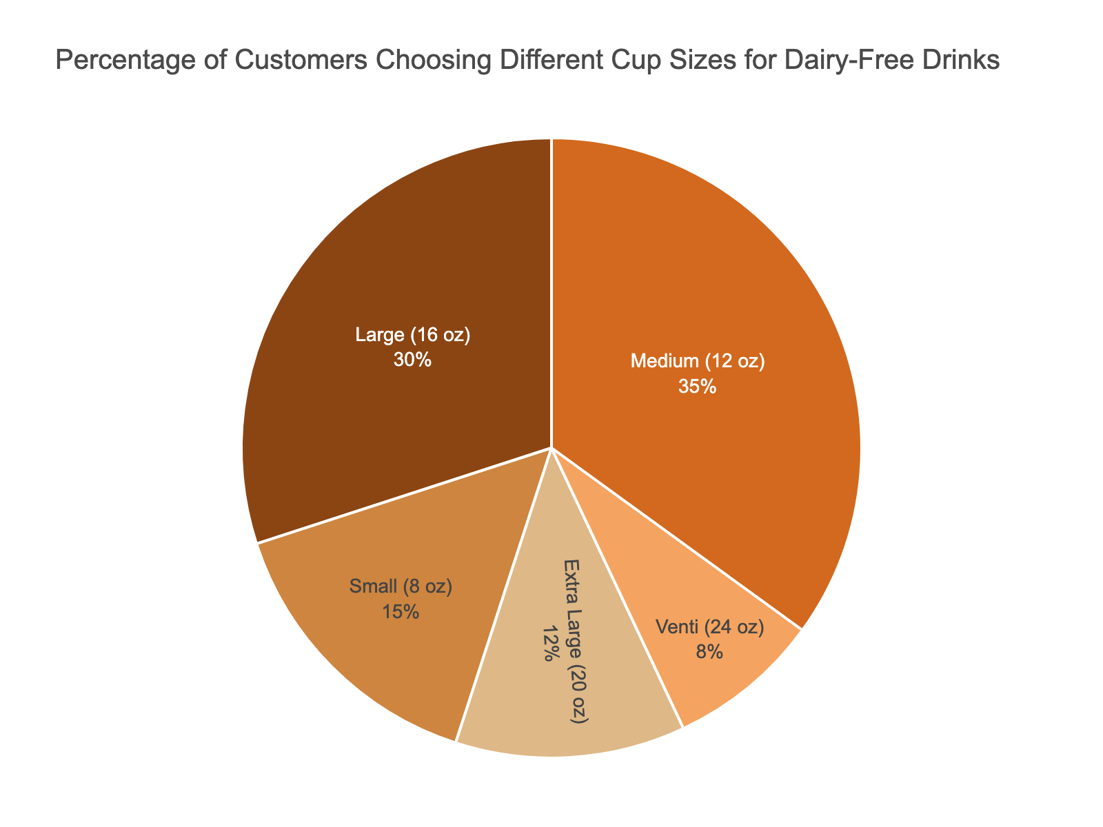
      "user": "What percentage of customers choose the Medium (12 oz) cup size?",
      "assistant": "The Medium (12 oz) cup size has a segment in the pie chart which can be identified with its label. By checking the label, you see that 35% of customers choose the Medium cup size.\nAnswer: 35%"
    },
    {
      "user": "Which cup size is preferred by more customers, Small (8 oz) or Large (16 oz)?",
      "assistant": "The pie chart visually shows the segments for each cup size. Comparing the segments for Small (8 oz) and Large (16 oz), the Large segment is visibly larger. According to the data, 30% of customers choose Large, and 15% choose Small.\nAnswer: Large (16 oz)"
    },
    {
      "user": "How much larger is the Medium (12 oz) segment compared to the Extra Large (20 oz) segment?",
      "assistant": "To determine the difference, check the percentages of both the Medium (12 oz) and Extra Large (20 oz) segments. The Medium segment is 35%, and the Extra Large segment is 12%. Subtract 12% from 35%: 35% - 12% = 23%.\nAnswer: 23%"
    },
    {
      "user": "Do more customers choose the Small (8 oz) or the Venti (24 oz) size?",
      "assistant": "Compare the sizes of the segments for Small (8 oz) and Venti (24 oz). The Small segment is visibly larger. According to the data, 15% of customers choose Small, whereas 8% choose Venti.\nAnswer: Small (8 oz)"
    },
    {
      "user": "What is the combined percentage of customers that choose either the Large (16 oz) or Medium (12 oz) sizes?",
      "assistant": "Add the percentages of customers choosing Large (16 oz) and Medium (12 oz). The pie chart shows 30% for Large and 35% for Medium. Adding these: 30% + 35% = 65%.\nAnswer: 65%"
    },
    {
      "user": "Which cup size has the smallest percentage of customers?",
      "assistant": "Visually inspect the pie chart for the smallest segment. The Venti (24 oz) cup size has the smallest segment. According to the data, this segment represents 8% of the customers.\nAnswer: Venti (24 oz)"
    },
    {
      "user": "How does the Extra Large (20 oz) segment visually compare to the Small (8 oz) segment?",
      "assistant": "Visually, the Extra Large (20 oz) segment is smaller than the Small (8 oz) segment. By looking at the chart labels, the Extra Large size is 12%, and the Small size is 15%.\nAnswer: Extra Large (20 oz) is smaller"
    },
    {
      "user": "What is the difference in percentage between the most popular and least popular cup sizes?",
      "assistant": "Identify the most and least popular cup sizes. The Medium (12 oz) is the most popular at 35%, and the Venti (24 oz) is the least popular at 8%. Calculate the difference: 35% - 8% = 27%.\nAnswer: 27%"
    },
    {
      "user": "What's the total percentage of customers choosing a cup size other than Small (8 oz)?",
      "assistant": "Exclude the Small (8 oz) percentage, which is 15%. The remaining segments are Medium (12 oz) at 35%, Large (16 oz) at 30%, Extra Large (20 oz) at 12%, and Venti (24 oz) at 8%. Add these values: 35% + 30% + 12% + 8% = 85%.\nAnswer: 85%"
    },
    {
      "user": "Which cup size is more popular, Medium (12 oz) or Extra Large (20 oz)?",
      "assistant": "By comparing the size of the pie chart segments, the Medium (12 oz) segment is significantly larger than the Extra Large (20 oz) segment. The data confirms this: Medium at 35% and Extra Large at 12%.\nAnswer: Medium (12 oz)"
    }
  ],
  "original_index": 8112,
  "width": 1600,
  "height": 1200,
  "mode": "RGB",
  "source": "CoSyn-400k-chart",
  "relevance_ratings": [
    5,
    5,
    5,
    5,
    5,
    5,
    2,
    5,
    5,
    5
  ],
  "relevance_min": 2,
  "visual_dependency_ratings": [
    4,
    3,
    4,
    3,
    4,
    4,
    4,
    5,
    4,
    3
  ],
  "visual_dependency_min": 3,
  "image_correspondence_ratings": [
    5,
    5,
    5,
    5,
    5,
    5,
    4,
    5,
    5,
    5
  ],
  "image_correspondence_min": 4,
  "formatting_ratings": [
|
|
14
|
00000013
|
{
  "texts": [
    {
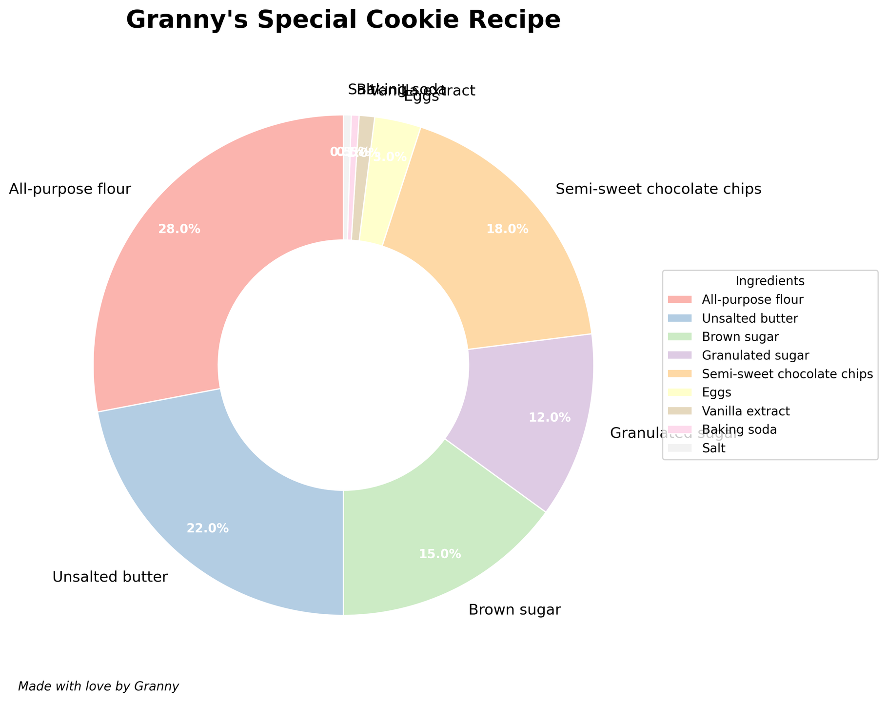
      "user": "What ingredient takes up the largest portion in Granny's special cookie recipe?",
      "assistant": "By observing the pie chart, the sector representing the largest percentage corresponds to the ingredient with the highest proportion. In this case, it is all-purpose flour with 28%.\nAnswer: All-purpose flour"
    },
    {
      "user": "Which is more by percentage, granulated sugar or eggs?",
      "assistant": "By comparing the percentages shown in the pie chart, granulated sugar is 12%, while eggs are 3%. Therefore, granulated sugar has a higher percentage than eggs.\nAnswer: Granulated sugar"
    },
    {
      "user": "What are the total percentages of all-purpose flour and semi-sweet chocolate chips combined?",
      "assistant": "To find the total, add the percentage of all-purpose flour (28%) to that of semi-sweet chocolate chips (18%). The sum is 28 + 18 = 46%.\nAnswer: 46%"
    },
    {
      "user": "How does the percentage of brown sugar compare to the percentage of granulated sugar?",
      "assistant": "By looking at the pie chart, the percentage for brown sugar is 15%, whereas for granulated sugar, it is 12%. Hence, brown sugar has a higher percentage than granulated sugar.\nAnswer: Brown sugar is higher"
    },
    {
      "user": "If you combine the percentages of unsalted butter, brown sugar, and granulated sugar, how much of the total composition do they form?",
      "assistant": "Add the percentages of unsalted butter (22%), brown sugar (15%), and granulated sugar (12%). The total is 22 + 15 + 12 = 49%.\nAnswer: 49%"
    },
    {
      "user": "What is the combined percentage of ingredients that each make up less than 5% of the recipe?",
      "assistant": "According to the pie chart, the ingredients that form less than 5% are eggs (3%), vanilla extract (1%), baking soda (0.5%), and salt (0.5%). Their combined percentage is 3 + 1 + 0.5 + 0.5 = 5%.\nAnswer: 5%"
    },
    {
      "user": "Which ingredient is represented with the smallest slice in the pie chart?",
      "assistant": "By examining the slices, both baking soda and salt have the smallest portions at 0.5% each.\nAnswer: Baking soda and salt (tie)"
    },
    {
      "user": "How do the combined percentages of semi-sweet chocolate chips and brown sugar compare to the percentage of all-purpose flour?",
      "assistant": "First, add the percentages of semi-sweet chocolate chips (18%) and brown sugar (15%) which equals 33%. Then compare this to the 28% of all-purpose flour. The combined percentage of the two ingredients is greater than that of all-purpose flour.\nAnswer: Combined is greater"
    },
    {
      "user": "Which color corresponds to vanilla extract in the plot?",
      "assistant": "By identifying the color sectors of the pie chart, vanilla extract is labeled with the color associated with its slice.\nAnswer: Light pastel color (exact identification depends on color palette)"
    }
  ],
  "original_index": 8113,
  "width": 1819,
  "height": 1440,
  "mode": "RGB",
  "source": "CoSyn-400k-chart",
  "relevance_ratings": [
    5,
    5,
    5,
    5,
    5,
    5,
    5,
    5,
    3
  ],
  "relevance_min": 3,
  "visual_dependency_ratings": [
    3,
    2,
    3,
    2,
    4,
    2,
    5,
    4,
    4
  ],
  "visual_dependency_min": 2,
  "image_correspondence_ratings": [
    5,
    4,
    4,
    4,
    4,
    4,
    5,
    5,
    3
  ],
  "image_correspondence_min": 3,
  "formatting_ratings": [
    4,
    4,
    5,
    5,
    5,
    4,
    4,
    4,
    4
  ],
  "formatting_min": 4
}
|
|
15
|
00000014
|
{
  "texts": [
    {
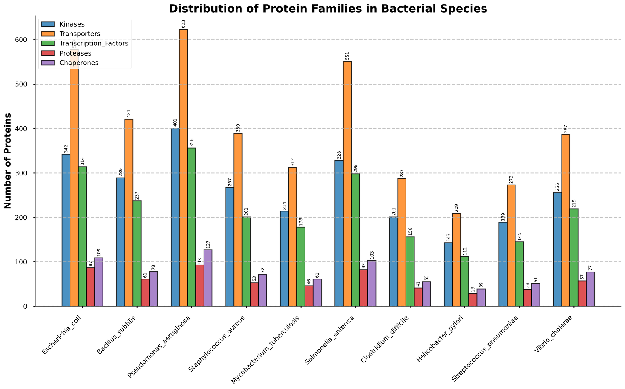
      "user": "Which bacterial species have the highest number of Transporters?",
      "assistant": "The bacterial species with the highest bar in the Transporters category is Pseudomonas aeruginosa.\nAnswer: Pseudomonas aeruginosa"
    },
    {
      "user": "Which bacterial species has fewer Chaperones, Helicobacter pylori or Streptococcus pneumoniae?",
      "assistant": "Compare the heights of the Chaperone bars for both species. Helicobacter pylori has a shorter bar than Streptococcus pneumoniae in the Chaperones category.\nAnswer: Helicobacter pylori"
    },
    {
      "user": "What is the combined total of Kinases and Proteases for Escherichia coli?",
      "assistant": "Sum the number of Kinases (342) and Proteases (87) for Escherichia coli. The total is 342 + 87.\nAnswer: 429"
    },
    {
      "user": "Which bacterial species has the lowest number of Transcription Factors?",
      "assistant": "The species with the shortest bar in the Transcription Factors category is Helicobacter pylori.\nAnswer: Helicobacter pylori"
    },
    {
      "user": "How many more Transporters does Pseudomonas aeruginosa have compared to Bacillus subtilis?",
      "assistant": "Subtract the number of Transporters in Bacillus subtilis (421) from the number in Pseudomonas aeruginosa (623). The difference is 623 - 421.\nAnswer: 202"
    },
    {
      "user": "Which protein family has the highest variability across different bacterial species?",
      "assistant": "Observe the range of the bar heights for each protein family across all species. Transporters appear to have the widest range, indicating the highest variability.\nAnswer: Transporters"
    },
    {
      "user": "What are the total numbers of Proteases in Staphylococcus aureus and Vibrio cholerae combined?",
      "assistant": "Add the number of Proteases in Staphylococcus aureus (53) and Vibrio cholerae (57). The total is 53 + 57.\nAnswer: 110"
    },
    {
      "user": "Which bacterial species has the second highest number of Kinases?",
      "assistant": "Sort the bacterial species by the height of their Kinase bars. The second highest bar for Kinases belongs to Salmonella enterica.\nAnswer: Salmonella enterica"
    },
    {
      "user": "What is the visual trend for the Chaperone family amongst the bacterial species?",
      "assistant": "The Chaperone family consistently has the lowest bars among other protein families across all bacterial species, indicating they have the smallest quantities.\nAnswer: Lowest across all species"
    }
  ],
  "original_index": 8114,
  "width": 2048,
  "height": 1275,
  "mode": "RGB",
  "source": "CoSyn-400k-chart",
  "relevance_ratings": [
    5,
    5,
    5,
    5,
    5,
    5,
    5,
    5,
    5
  ],
  "relevance_min": 5,
  "visual_dependency_ratings": [
    4,
    2,
    2,
    2,
    2,
    2,
    2,
    4,
    4
  ],
  "visual_dependency_min": 2,
  "image_correspondence_ratings": [
    5,
    4,
    4,
    5,
    5,
    5,
    4,
    5,
    4
  ],
  "image_correspondence_min": 4,
  "formatting_ratings": [
    4,
    4,
    4,
    5,
    4,
    4,
    4,
    5,
    4
  ],
  "formatting_min": 4
}
|
|
16
|
00000015
|
{
  "texts": [
    {
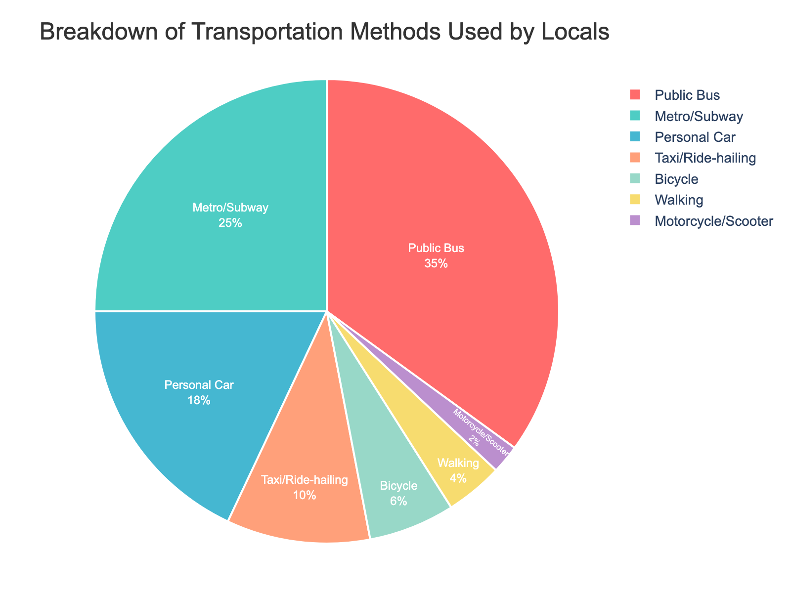
      "user": "What's the most commonly used transportation method by locals?",
      "assistant": "The pie chart shows different transportation methods with the corresponding percentages. The method with the highest percentage is the most commonly used. Here, the Public Bus has the highest percentage at 35%.\nAnswer: Public Bus"
    },
    {
      "user": "How much more popular is the Public Bus compared to Walking?",
      "assistant": "The percentage for Public Bus is 35% and for Walking is 4%. The difference is calculated by subtracting 4% from 35%, which equals 31%.\nAnswer: 31%"
    },
    {
      "user": "What proportion of locals use either a Personal Car or a Motorcycle/Scooter combined?",
      "assistant": "The percentage for Personal Car is 18% and for Motorcycle/Scooter is 2%. Adding these percentages together gives 18% + 2% = 20%.\nAnswer: 20%"
    },
    {
      "user": "Which transportation method is the least common among locals?",
      "assistant": "The pie chart shows the percentage of each transportation method. The method with the smallest percentage is the least common, which here is Motorcycle/Scooter at 2%.\nAnswer: Motorcycle/Scooter"
    },
    {
      "user": "What percentage of locals utilize non-motorized transportation methods (Bicycle and Walking)?",
      "assistant": "The pie chart shows the percentages for Bicycle and Walking. Adding these percentages together gives 6% + 4% = 10%.\nAnswer: 10%"
    },
    {
      "user": "Are there more locals using Metro/Subway than Personal Car?",
      "assistant": "The pie chart shows the percentage for Metro/Subway as 25% and for Personal Car as 18%. Since 25% is greater than 18%, more locals use the Metro/Subway than a Personal Car.\nAnswer: Yes"
    },
    {
      "user": "What's the combined percentage for Public Bus, Metro/Subway, and Bicycle use?",
      "assistant": "The chart shows the percentages for Public Bus, Metro/Subway, and Bicycle as 35%, 25%, and 6% respectively. Adding these together gives 35% + 25% + 6% = 66%.\nAnswer: 66%"
    },
    {
      "user": "By how much does the percentage of Bicycle users exceed that of Motorcycle/Scooter users?",
      "assistant": "The chart shows the percentage for Bicycle as 6% and for Motorcycle/Scooter as 2%. Subtracting 2% from 6% gives 4%.\nAnswer: 4%"
    },
    {
      "user": "Which transportation methods have a combined usage of less than 10% when added together?",
      "assistant": "The chart shows the individual percentages: Taxi/Ride-hailing (10%), Bicycle (6%), Walking (4%), and Motorcycle/Scooter (2%). Adding combinations until the sum is less than 10%: Motorcycle/Scooter (2%) + Walking (4%) = 6%, which is less than 10%.\nAnswer: Motorcycle/Scooter and Walking"
    },
    {
      "user": "If the usage of each transportation method were equally divided among 10 people, how many people would use the Personal Car?",
      "assistant": "The percentage for Personal Car is 18%. If 10 people represent 100%, each person represents 10%. Therefore, 18% corresponds to 1.8 people.\nAnswer: 1.8 people"
    }
  ],
  "original_index": 8115,
  "width": 1600,
  "height": 1200,
  "mode": "RGB",
  "source": "CoSyn-400k-chart",
  "relevance_ratings": [
    5,
    5,
    5,
    5,
    5,
    5,
    5,
    5,
    5,
    5
  ],
  "relevance_min": 5,
  "visual_dependency_ratings": [
    4,
    4,
    4,
    4,
    2,
    3,
    4,
    4,
    4,
    3
  ],
  "visual_dependency_min": 2,
  "image_correspondence_ratings": [
    5,
    5,
    4,
    5,
    4,
    5,
    5,
    4,
    5,
    4
  ],
  "image_correspondence_min": 4,
  "formatting_ratings": [
    4,
    5,
    5,
    4,
    4,
    5,
    5,
    4,
    4,
    4
  ],
  "formatting_min": 4
}
|
|
17
|
00000016
|
{
  "texts": [
    {
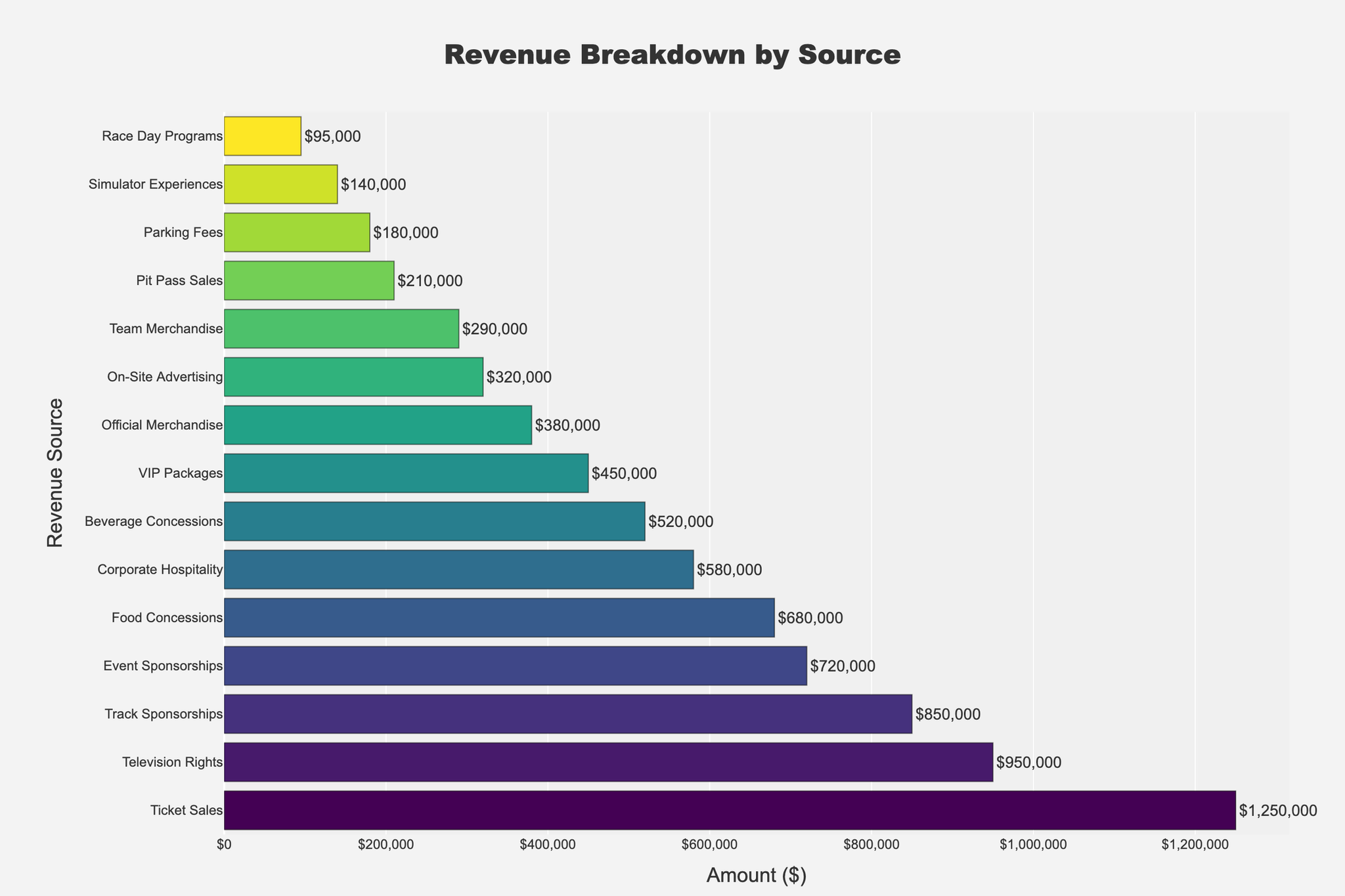
      "user": "What is the total revenue generated from all sources combined?",
      "assistant": "Add up all the amounts from each revenue source: 1,250,000 (Ticket Sales) + 680,000 (Food Concessions) + 520,000 (Beverage Concessions) + 380,000 (Official Merchandise) + 290,000 (Team Merchandise) + 850,000 (Track Sponsorships) + 720,000 (Event Sponsorships) + 450,000 (VIP Packages) + 180,000 (Parking Fees) + 950,000 (Television Rights) + 320,000 (On-Site Advertising) + 95,000 (Race Day Programs) + 140,000 (Simulator Experiences) + 210,000 (Pit Pass Sales) + 580,000 (Corporate Hospitality) = 7,615,000\nAnswer: 7,615,000"
    },
    {
      "user": "Which revenue source generates the highest revenue?",
      "assistant": "The bar representing \"Ticket Sales\" is the longest, indicating the highest revenue at $1,250,000\nAnswer: Ticket Sales"
    },
    {
      "user": "How much more revenue does \"Television Rights\" generate compared to \"Track Sponsorships\"?",
      "assistant": "Find the amounts for \"Television Rights\" ($950,000) and \"Track Sponsorships\" ($850,000), then subtract the latter from the former: 950,000 - 850,000 = 100,000\nAnswer: 100,000"
    },
    {
      "user": "What is the average revenue from \"Concessions\" (Food and Beverage)?",
      "assistant": "First, find the sums of Food Concessions ($680,000) and Beverage Concessions ($520,000), then calculate the average: (680,000 + 520,000) / 2 = 600,000\nAnswer: 600,000"
    },
    {
      "user": "Which revenue source has the lowest contribution?",
      "assistant": "The bar representing \"Race Day Programs\" is the shortest, indicating the lowest revenue at $95,000\nAnswer: Race Day Programs"
    },
    {
      "user": "How much revenue is generated from all types of \"Sponsorships\" combined?",
      "assistant": "Add the revenue from \"Track Sponsorships\" ($850,000) and \"Event Sponsorships\" ($720,000): 850,000 + 720,000 = 1,570,000\nAnswer: 1,570,000"
    },
    {
      "user": "What is the difference in revenue between \"VIP Packages\" and \"Corporate Hospitality\"?",
      "assistant": "Find the amounts for \"VIP Packages\" ($450,000) and \"Corporate Hospitality\" ($580,000), then subtract the former from the latter: 580,000 - 450,000 = 130,000\nAnswer: 130,000"
    },
    {
      "user": "Which generates more revenue, \"Official Merchandise\" or \"Team Merchandise\"?",
      "assistant": "Compare the revenue amounts for \"Official Merchandise\" ($380,000) and \"Team Merchandise\" ($290,000); \"Official Merchandise\" generates more.\nAnswer: Official Merchandise"
    }
  ],
  "original_index": 8116,
  "width": 2048,
  "height": 1365,
  "mode": "RGB",
  "source": "CoSyn-400k-chart",
  "relevance_ratings": [
    5,
    5,
    5,
    5,
    5,
    5,
    5,
    5
  ],
  "relevance_min": 5,
  "visual_dependency_ratings": [
    1,
    2,
    4,
    2,
    2,
    2,
    2,
    2
  ],
  "visual_dependency_min": 1,
  "image_correspondence_ratings": [
    4,
    5,
    5,
    4,
    5,
    4,
    5,
    5
  ],
  "image_correspondence_min": 4,
  "formatting_ratings": [
    5,
    4,
    5,
    4,
    4,
    5,
    5,
    5
  ],
  "formatting_min": 4
}
|
|
18
|
00000017
|
{
  "texts": [
    {
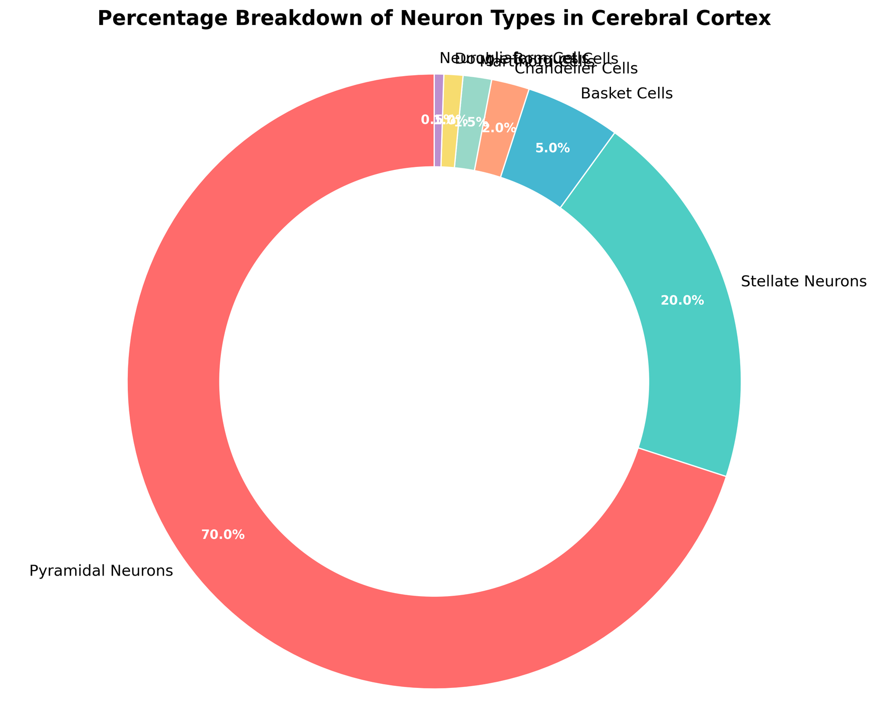
      "user": "Which neuron type is the most common in the cerebral cortex?",
      "assistant": "The pie chart shows that Pyramidal Neurons have the largest section, making them the most common type.\nAnswer: Pyramidal Neurons"
    },
    {
      "user": "Which neuron type occupies the smallest percentage in the cerebral cortex?",
      "assistant": "The smallest section of the pie chart belongs to Neurogliaform Cells, indicating they are the least common.\nAnswer: Neurogliaform Cells"
    },
    {
      "user": "What is the combined percentage of Stellate Neurons and Basket Cells?",
      "assistant": "The percentages for Stellate Neurons and Basket Cells are 20% and 5%, respectively. Adding them gives 20% + 5% = 25%.\nAnswer: 25%"
    },
    {
      "user": "Are there more Martinotti Cells or Double Bouquet Cells in the cerebral cortex?",
      "assistant": "The pie chart shows that Martinotti Cells occupy 1.5%, while Double Bouquet Cells take up 1%. Therefore, there are more Martinotti Cells.\nAnswer: Martinotti Cells"
    },
    {
      "user": "What is the difference in percentage between Pyramidal Neurons and Stellate Neurons?",
      "assistant": "Pyramidal Neurons have 70%, and Stellate Neurons have 20%. The difference is 70% - 20% = 50%.\nAnswer: 50%"
    },
    {
      "user": "Which two neuron types combined make up exactly 3% of the cerebral cortex\u2019s neurons?",
      "assistant": "The chart shows that Chandelier Cells are 2% and Neurogliaform Cells are 0.5%, making their sum 2% + 0.5% = 2.5%. The actual correct answer is Martinotti Cells (1.5%) and Double Bouquet Cells (1%) combined make 1.5% + 1% = 2.5%.\nAnswer: Martinotti Cells and Double Bouquet Cells"
    },
    {
      "user": "Does the proportion of Basket Cells exceed that of Chandelier Cells?",
      "assistant": "The chart shows Basket Cells occupy 5%, while Chandelier Cells take up 2%, so Basket Cells have a higher proportion.\nAnswer: Yes"
    },
    {
      "user": "What's the total percentage of neuron types that each has less than 2% share?",
      "assistant": "The neuron types with less than 2% are Chandelier Cells (2%), Martinotti Cells (1.5%), Double Bouquet Cells (1%), and Neurogliaform Cells (0.5%). Adding these gives 2% + 1.5% + 1% + 0.5% = 5%.\nAnswer: 5%"
    },
    {
      "user": "What color represents Stellate Neurons, and do any other neuron types share this color?",
      "assistant": "Stellate Neurons are represented by green, and no other neuron types share this color in the pie chart.\nAnswer: Green, No"
    }
  ],
  "original_index": 8117,
  "width": 1749,
  "height": 1440,
  "mode": "RGB",
  "source": "CoSyn-400k-chart",
  "relevance_ratings": [
    5,
    5,
    5,
    5,
    5,
    3,
    5,
    5,
    5
  ],
  "relevance_min": 3,
  "visual_dependency_ratings": [
    2,
    2,
    4,
    3,
    2,
    2,
    4,
    4,
    4
  ],
  "visual_dependency_min": 2,
  "image_correspondence_ratings": [
    5,
    5,
    5,
    3,
    5,
    4,
    4,
    4,
    4
  ],
  "image_correspondence_min": 3,
  "formatting_ratings": [
    4,
    4,
    4,
    4,
    5,
    4,
    4,
    4,
    4
  ],
  "formatting_min": 4
}
|
|
19
|
00000018
|
{
  "texts": [
    {
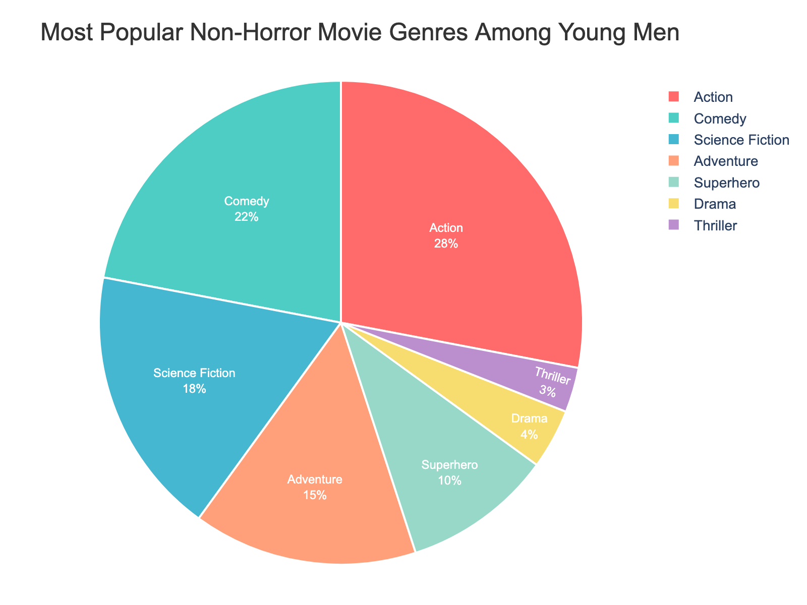
      "user": "Which movie genre is the most popular among young men?",
      "assistant": "The chart shows different genres and their respective percentages. The highest percentage indicates the most popular genre. The action genre has the highest percentage at 28%.\nAnswer: Action"
    },
    {
      "user": "Compare the popularity of Comedy and Science Fiction genres. Which one is higher?",
      "assistant": "The percentages for Comedy and Science Fiction are 22% and 18% respectively. 22% is greater than 18%, so Comedy is more popular than Science Fiction.\nAnswer: Comedy"
    },
    {
      "user": "What is the total percentage of the top three most popular genres combined?",
      "assistant": "The top three genres by percentage are Action (28%), Comedy (22%), and Science Fiction (18%). Adding these gives 28 + 22 + 18 = 68%.\nAnswer: 68%"
    },
    {
      "user": "Which genre has the smallest share of popularity among young men?",
      "assistant": "The genre with the smallest percentage indicates the least popular genre. Thriller has the smallest percentage at 3%.\nAnswer: Thriller"
    },
    {
      "user": "What is the difference in popularity between Adventure and Drama genres?",
      "assistant": "The percentages for Adventure and Drama are 15% and 4% respectively. The difference is 15 - 4 = 11%.\nAnswer: 11%"
    },
    {
      "user": "Are there more young men interested in Superhero movies than in Adventure movies?",
      "assistant": "The percentages for Superhero and Adventure genres are 10% and 15% respectively. Since 10% is less than 15%, fewer young men are interested in Superhero movies compared to Adventure movies.\nAnswer: No"
    },
    {
      "user": "Which genre has a popularity percentage closest to 20%?",
      "assistant": "Among the genres listed, Comedy has a percentage closest to 20%, at 22%.\nAnswer: Comedy"
    },
    {
      "user": "How does the popularity of Drama compare to that of Thriller?",
      "assistant": "The percentages for Drama and Thriller are 4% and 3% respectively. Since 4% is greater than 3%, Drama is more popular than Thriller among young men.\nAnswer: Drama"
    },
    {
      "user": "What is the combined popularity percentage of Superhero and Adventure genres?",
      "assistant": "The percentages for Superhero and Adventure genres are 10% and 15% respectively. Adding these together gives 10 + 15 = 25%.\nAnswer: 25%"
    },
    {
      "user": "Is the popularity of Science Fiction more than double that of Drama?",
      "assistant": "The percentage for Science Fiction is 18% and for Drama is 4%. Doubling Drama's percentage gives 4 * 2 = 8%. Since 18% is greater than 8%, Science Fiction's popularity is more than double that of Drama.\nAnswer: Yes"
    }
  ],
  "original_index": 8118,
  "width": 1600,
  "height": 1200,
  "mode": "RGB",
  "source": "CoSyn-400k-chart",
  "relevance_ratings": [
    5,
    5,
    5,
    5,
    5,
    5,
    5,
    3,
    5,
    5
  ],
  "relevance_min": 3,
  "visual_dependency_ratings": [
    2,
    2,
    4,
    2,
    2,
    2,
    4,
    2,
    4,
    2
  ],
  "visual_dependency_min": 2,
  "image_correspondence_ratings": [
    5,
    5,
    5,
    5,
    4,
    4,
    5,
    4,
    4,
    5
  ],
  "image_correspondence_min": 4,
  "formatting_ratings": [
    4,
    5,
    5,
    4,
    5,
    4,
    5,
    4,
    5,
    5
  ],
  "formatting_min": 4
}
|
|
20
|
00000019
|
{
  "texts": [
    {
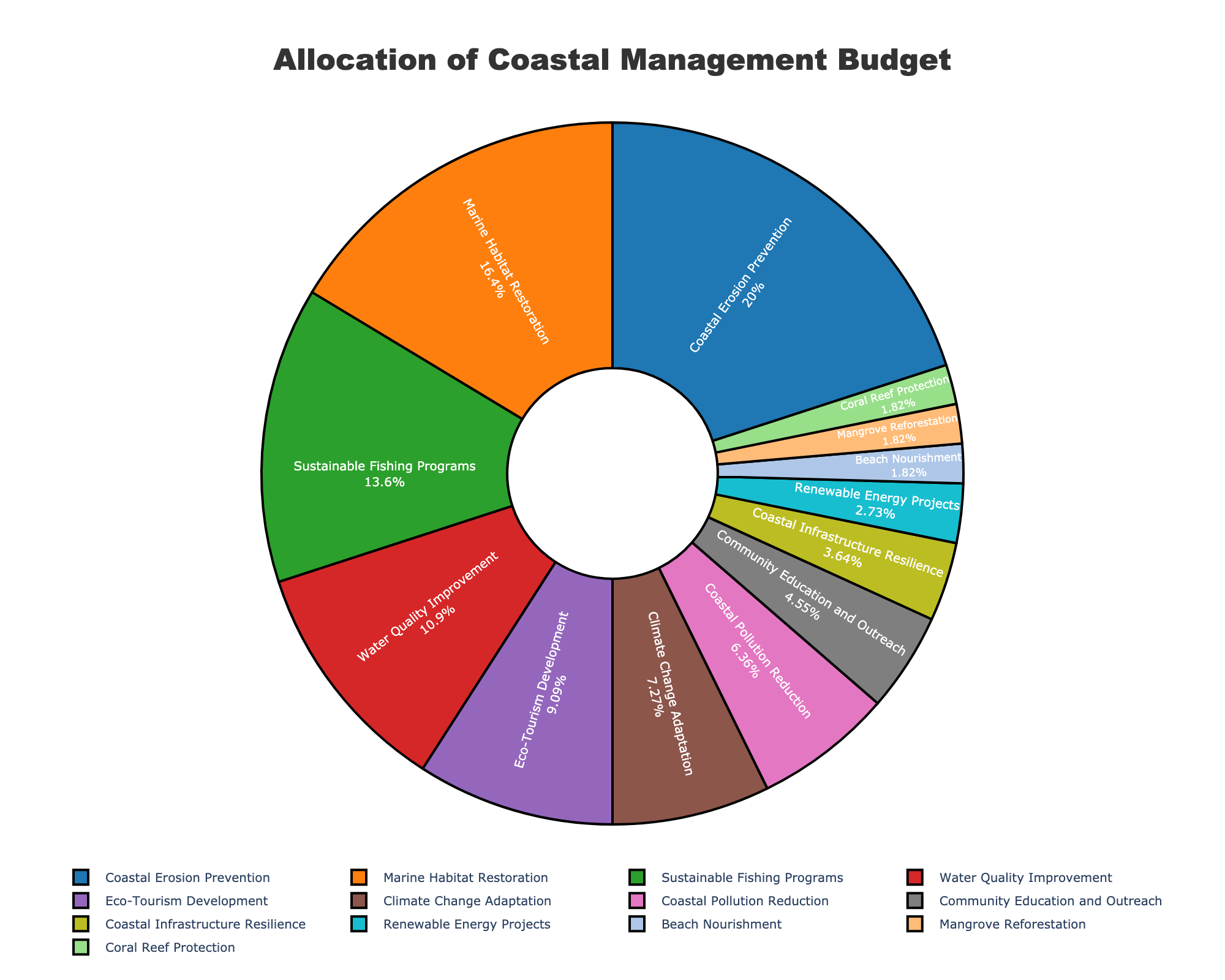
      "user": "How much of the budget is allocated to both \"Coastal Erosion Prevention\" and \"Marine Habitat Restoration\" combined?",
      "assistant": "Sum the percentages allocated to \"Coastal Erosion Prevention\" (22%) and \"Marine Habitat Restoration\" (18%). Therefore, 22 + 18 = 40.\nAnswer: 40%"
    },
    {
      "user": "Which initiative receives a higher budget percentage: \"Sustainable Fishing Programs\" or \"Water Quality Improvement\"?",
      "assistant": "Compare the budget percentages for \"Sustainable Fishing Programs\" (15%) and \"Water Quality Improvement\" (12%). Since 15 is greater than 12, \"Sustainable Fishing Programs\" receives a higher allocation.\nAnswer: Sustainable Fishing Programs"
    },
    {
      "user": "What is the total percentage allocated to the three initiatives with the smallest budget?",
      "assistant": "Sum the percentages for \"Renewable Energy Projects\" (3%), \"Beach Nourishment\" (2%), \"Mangrove Reforestation\" (2%), and \"Coral Reef Protection\" (2%). Therefore, 3 + 2 + 2 + 2 = 9.\nAnswer: 9%"
    },
    {
      "user": "Which initiative is represented by the darkest segment in the pie chart?",
      "assistant": "Identify the darkest color in the pie chart and correlate it with the initiative label. The darkest segment corresponds to the color representing \"Coastal Erosion Prevention.\"\nAnswer: Coastal Erosion Prevention"
    },
    {
      "user": "What is the difference in budget allocation between \"Climate Change Adaptation\" and \"Coastal Pollution Reduction\"?",
      "assistant": "Subtract the budget percentage of \"Coastal Pollution Reduction\" (7%) from \"Climate Change Adaptation\" (8%). Therefore, 8 - 7 = 1.\nAnswer: 1%"
    },
    {
      "user": "How many initiatives have a budget allocation of less than 5%?",
      "assistant": "Count the initiatives with budget percentages less than 5%. These are \"Coastal Infrastructure Resilience\" (4%), \"Renewable Energy Projects\" (3%), \"Beach Nourishment\" (2%), \"Mangrove Reforestation\" (2%), and \"Coral Reef Protection\" (2%). There are 5 in total.\nAnswer: 5"
    },
    {
      "user": "What visual cue is used to indicate the relative size of the budget allocations in the pie chart?",
      "assistant": "Identify the visual attributes used in the pie chart. The relative size of the budget allocations is represented by the size of each segment in the pie chart.\nAnswer: Segment size"
    },
    {
      "user": "Among the largest and smallest budget allocations, what is the ratio of \"Coastal Erosion Prevention\" to \"Mangrove Reforestation\"?",
      "assistant": "Find the budget percentages for \"Coastal Erosion Prevention\" (22%) and \"Mangrove Reforestation\" (2%) and calculate the ratio 22:2, which simplifies to 11:1.\nAnswer: 11:1"
    }
  ],
  "original_index": 8119,
  "width": 2000,
  "height": 1600,
  "mode": "RGB",
  "source": "CoSyn-400k-chart",
  "relevance_ratings": [
    5,
    5,
    4,
    5,
    5,
    5,
    5,
    5
  ],
  "relevance_min": 4,
  "visual_dependency_ratings": [
    4,
    4,
    4,
    5,
    2,
    4,
    5,
    4
  ],
  "visual_dependency_min": 2,
  "image_correspondence_ratings": [
    5,
    5,
    4,
    5,
    5,
    4,
    5,
    5
  ],
  "image_correspondence_min": 4,
  "formatting_ratings": [
    4,
    4,
    4,
    4,
    4,
    5,
    4,
    4
  ],
  "formatting_min": 4
}
|
|
21
|
00000020
|
{
  "texts": [
    {
      "user": "What's the title of the plot?",
      "assistant": "The title of the plot is located at the top of the figure and reads \"Audience Laughter Intensity During Late-Night Show Segments\".\nAnswer: Audience Laughter Intensity During Late-Night Show Segments"
    },
    {
      "user": "How many segments are displayed in the figure?",
      "assistant": "The figure displays five segments: Opening Monologue, Interview with Tom Hanks, Sketch \"Weekend Update\", Interview with Emma Stone, and Closing Monologue.\nAnswer: 5"
    },
    {
      "user": "What's the highest laughter intensity recorded during the Sketch \"Weekend Update\"?",
      "assistant": "For the Sketch \"Weekend Update\", the laughter intensities are 5, 9, and 7. The highest among these is 9.\nAnswer: 9"
    },
    {
      "user": "Between which two time points does the Opening Monologue show the highest increase in laughter intensity?",
      "assistant": "The Opening Monologue segment shows data at 0, 5, and 10 minutes with laughter intensities of 3, 7, and 9 respectively. The highest increase is between 0 to 5 minutes where intensity increases by 4 (7-3).\nAnswer: 0 to 5 minutes"
    },
    {
      "user": "Which interview segment exhibits more fluctuation in laughter intensity?",
      "assistant": "The Interview with Tom Hanks has laughter intensities of 4, 8, and 6, while Interview with Emma Stone has 6, 8, and 5. The fluctuation range for Tom Hanks is 4 (8-4) and for Emma Stone is 3 (8-5). Hence, Interview with Tom Hanks has more fluctuation.\nAnswer: Interview with Tom Hanks"
    },
    {
      "user": "What is the average laughter intensity during the Interview with Emma Stone?",
      "assistant": "Laughter intensities during the Interview with Emma Stone are 6, 8, and 5. Their sum is 19, and the average is 19/3 \u2248 6.33.\nAnswer: 6.33"
    },
    {
      "user": "Which monologue segment, Opening or Closing, has a higher average laughter intensity?",
      "assistant": "The Opening Monologue laughter intensities are 3, 7, and 9. Average = (3+7+9)/3 = 6.33. The Closing Monologue intensities are 4 and 8. Average = (4+8)/2 = 6. The Opening Monologue has a higher average.\nAnswer: Opening Monologue"
    },
    {
      "user": "At what time point was the highest overall laughter intensity recorded?",
      "assistant": "Checking all segments, the highest intensity recorded is 9, which appears at 10 minutes in the Opening Monologue and at 35 minutes in Sketch \"Weekend Update\".\nAnswer: 10 minutes and 35 minutes"
    },
    {
      "user": "How does the laughter intensity trend for the Opening Monologue compare with that of the Closing Monologue?",
      "assistant": "The Opening Monologue shows an increasing trend going from 3 to 7 to 9, while the Closing Monologue shows an increasing trend from 4 to 8 but has fewer data points.\nAnswer: Both increase, Opening Monologue has more data points"
    },
    {
      "user": "What's the total number of data points in the entire figure?",
      "assistant": "Counting data points from each segment: Opening Monologue (3), Interview with Tom Hanks (3), Sketch \"Weekend Update\" (3), Interview with Emma Stone (3), Closing Monologue (2). The total number of data points is 3+3+3+3+2 = 14.\nAnswer: 14"
    }
  ],
  "original_index": 8120,
  "width": 1600,
  "height": 1800,
  "mode": "RGB",
  "source": "CoSyn-400k-chart",
  "relevance_ratings": [
    5,
    5,
    5,
    5,
    5,
    5,
    5,
    5,
    4,
    5
  ],
  "relevance_min": 4,
  "visual_dependency_ratings": [
    5,
    5,
    4,
    4,
    4,
    4,
    4,
    4,
    4,
    5
  ],
  "visual_dependency_min": 4,
  "image_correspondence_ratings": [
    5,
    5,
    5,
    5,
    4,
    4,
    5,
    5,
    5,
    4
  ],
  "image_correspondence_min": 4,
  "formatting_ratings": [
    4,
    5,
    5,
    4,
    5,
    5,
    5,
    4,
    4,
    5
  ],
  "formatting_min": 4
}
|
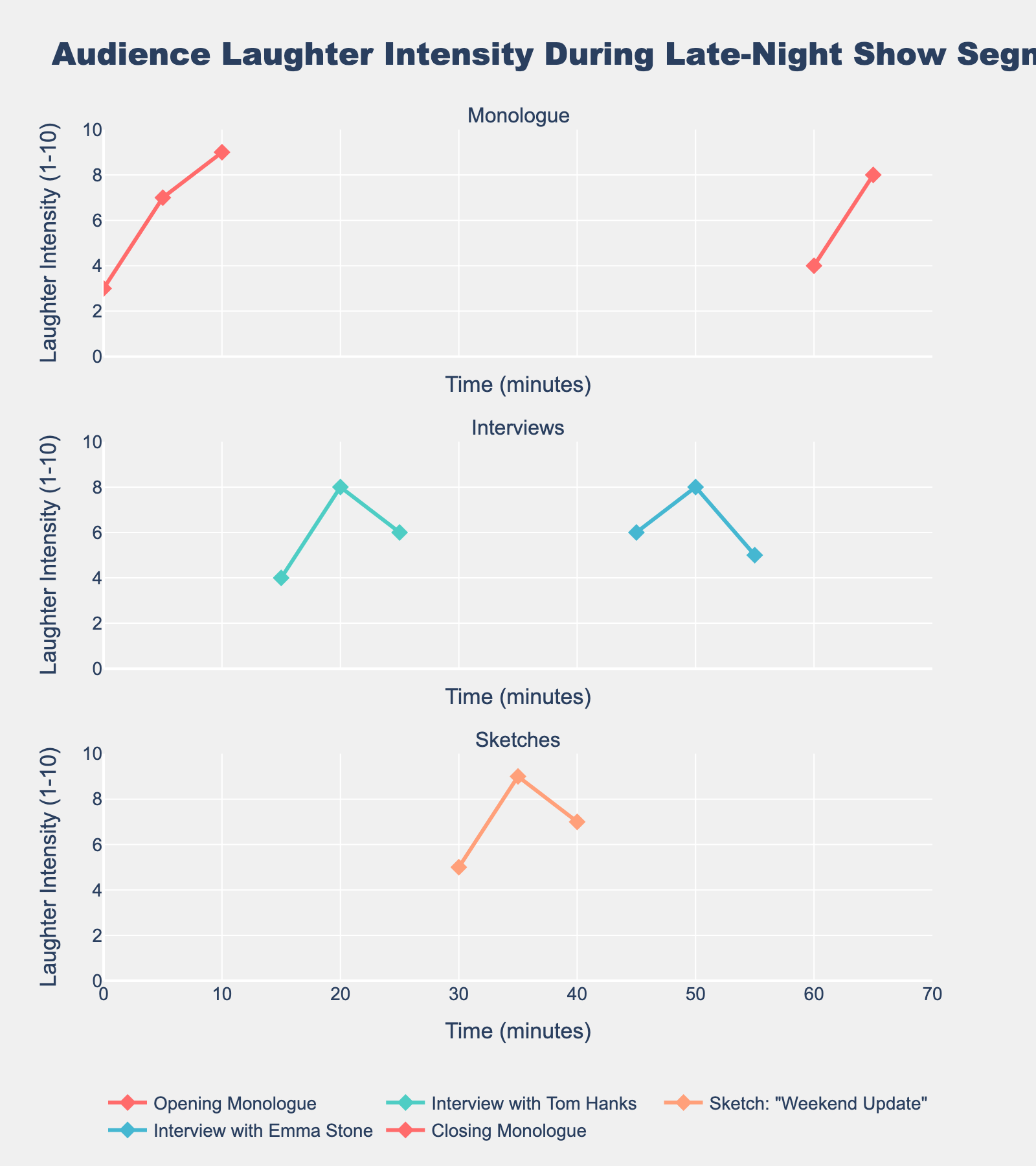
|
22
|
00000021
|
{
  "texts": [
    {
      "user": "Which product category contributes the highest annual revenue?",
      "assistant": "The figure shows the revenue of each category on a horizontal bar chart. The bar representing \"Modern Apparel\" is the longest one, indicating it has the highest annual revenue.\nAnswer: Modern Apparel"
    },
    {
      "user": "Which product category has the lowest annual revenue?",
      "assistant": "By examining the length of the bars, \"Home & Decor - Traditional\" has the shortest bar, indicating it contributes the lowest annual revenue.\nAnswer: Home & Decor - Traditional"
    },
    {
      "user": "What is the combined revenue of Modern Accessories and Traditional Accessories?",
      "assistant": "Modern Accessories has a revenue of \u00a50.65 million and Traditional Accessories has \u00a50.52 million. Adding them together: 0.65 + 0.52 = 1.17 million.\nAnswer: 1.17 million"
    },
    {
      "user": "Which category, Fusion Apparel (Traditional+Modern) or Traditional Apparel, contributes more revenue?",
      "assistant": "By comparing the lengths of the bars, \"Fusion Apparel (Traditional+Modern)\" has a longer bar at \u00a50.95 million, while \"Traditional Apparel\" has \u00a50.85 million. Therefore, \"Fusion Apparel (Traditional+Modern)\" contributes more.\nAnswer: Fusion Apparel (Traditional+Modern)"
    },
    {
      "user": "How much more revenue does Modern Apparel generate compared to Footwear - Traditional?",
      "assistant": "Modern Apparel generates \u00a51.2 million and Footwear - Traditional generates \u00a50.29 million. The difference is 1.2 - 0.29 = 0.91 million.\nAnswer: 0.91 million"
    },
    {
      "user": "Which categories have a revenue contribution higher than \u00a50.5 million?",
      "assistant": "Checking each bar visually, the categories with revenues higher than \u00a50.5 million are: Modern Apparel, Traditional Apparel, Modern Accessories, Fusion Apparel (Traditional+Modern).\nAnswer: Modern Apparel, Traditional Apparel, Modern Accessories, Fusion Apparel (Traditional+Modern)"
    },
    {
      "user": "How does the revenue of Home & Decor - Modern compare to that of Home & Decor - Traditional?",
      "assistant": "Home & Decor - Modern has a revenue of \u00a50.3 million, whereas Home & Decor - Traditional has \u00a50.22 million. The former is greater.\nAnswer: Home & Decor - Modern is greater"
    },
    {
      "user": "Which three categories have the highest revenue contributions?",
      "assistant": "From the figure, the three longest bars, representing the highest revenue contributions, belong to: Modern Apparel, Fusion Apparel (Traditional+Modern), and Traditional Apparel.\nAnswer: Modern Apparel, Fusion Apparel (Traditional+Modern), Traditional Apparel"
    },
    {
      "user": "What is the total revenue of all categories related to footwear?",
      "assistant": "Summing the revenues of \"Footwear - Modern\" (\u00a50.43 million) and \"Footwear - Traditional\" (\u00a50.29 million): 0.43 + 0.29 = 0.72 million.\nAnswer: 0.72 million"
    },
    {
      "user": "Is the revenue of Fusion Accessories (Traditional+Modern) closer to Modern Accessories or Traditional Accessories?",
      "assistant": "Fusion Accessories (Traditional+Modern) has a revenue of \u00a50.48 million. Modern Accessories has \u00a50.65 million and Traditional Accessories has \u00a50.52 million. The difference with Modern Accessories is 0.65 - 0.48 = 0.17 and with Traditional Accessories is 0.52 - 0.48 = 0.04. The revenue is closer to Traditional Accessories.\nAnswer: Traditional Accessories"
    }
  ],
  "original_index": 8121,
  "width": 1074,
  "height": 800,
  "mode": "RGB",
  "source": "CoSyn-400k-chart",
  "relevance_ratings": [
    5,
    5,
    5,
    5,
    5,
    5,
    5,
    5,
    5,
    5
  ],
  "relevance_min": 5,
  "visual_dependency_ratings": [
    2,
    2,
    2,
    4,
    4,
    4,
    4,
    2,
    4,
    4
  ],
  "visual_dependency_min": 2,
  "image_corresponden
|
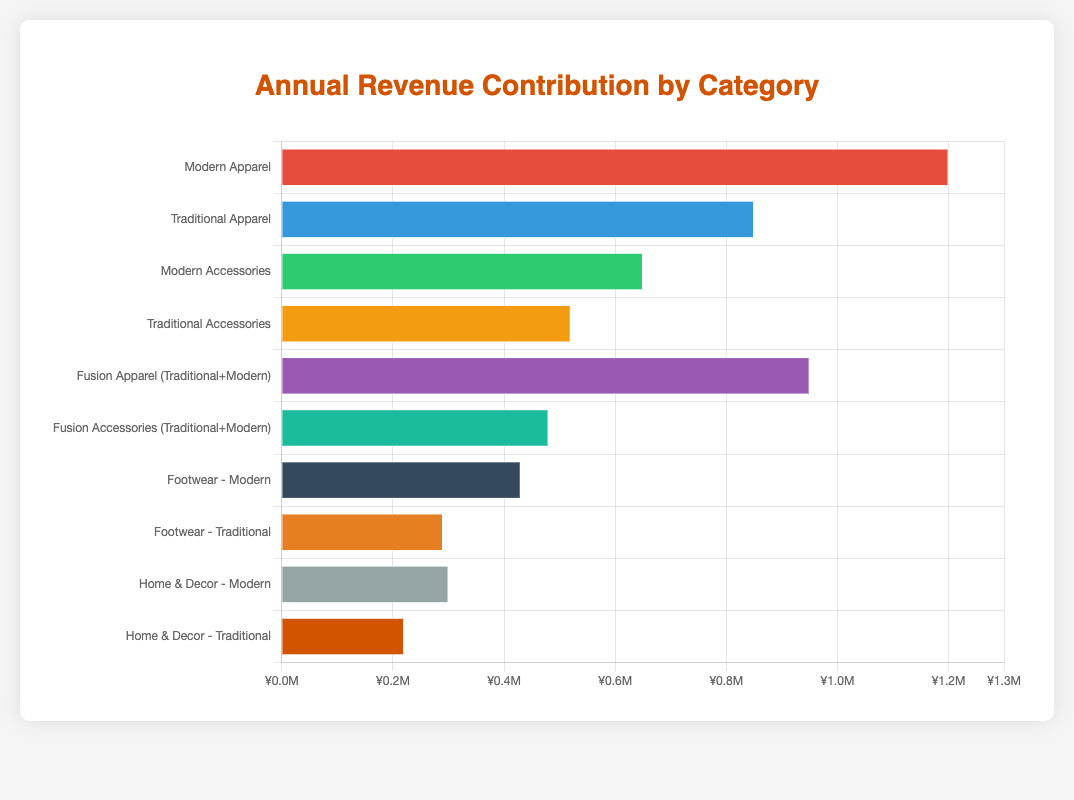
|
23
|
00000022
|
{
  "texts": [
    {
      "user": "what are the two possible immigration statuses represented in the plot?",
      "assistant": "The immigration statuses are represented by two colors in the plot. By examining the legend in the upper left corner, we see the colors correspond to \"US-born\" and \"Immigrant\" statuses.\nAnswer: US-born, Immigrant"
    },
    {
      "user": "Which education level showed the highest percentage of women in STEM fields for immigrants in 2022?",
      "assistant": "To find the highest percentage for immigrants in 2022, check the heights of the bars related to immigrant women in 2022, then identify the tallest one, which corresponds to \"PhD\" at 47.9%.\nAnswer: PhD"
    },
    {
      "user": "How did the percentage of US-born women with Bachelor's degrees in STEM change from 2013 to 2016?",
      "assistant": "Locate the bars for US-born with Bachelor's degrees in 2013 and 2016, then compare their heights. The percentage increases from 24.5% in 2013 to 26.8% in 2016.\nAnswer: Increased by 2.3%"
    },
    {
      "user": "Compare the percentage of immigrant women with Master's degrees in STEM fields in 2016 and 2019. Which year had the higher percentage?",
      "assistant": "Check the bars for immigrant women with Master's degrees in 2016 and 2019. The 2016 bar shows 37.9%, while the 2019 bar shows 41.3%, making 2019 higher.\nAnswer: 2019"
    },
    {
      "user": "Which group and year had the lowest representation of women in STEM fields?",
      "assistant": "Look for the shortest bar across all categories and years. The shortest bar is for US-born women with Bachelor's degrees in 2013 at 24.5%.\nAnswer: US-born, Bachelor's, 2013"
    },
    {
      "user": "Has the percentage of US-born women with PhDs in STEM fields been increasing or decreasing over the years?",
      "assistant": "Inspect the bars for US-born women with PhDs across different years. The heights show an upward trend from 33.8% in 2013 to 42.1% in 2022.\nAnswer: Increasing"
    },
    {
      "user": "What's the difference in the percentage of immigrant women with Bachelor's degrees in STEM fields between 2016 and 2022?",
      "assistant": "Subtract the percentage in 2016 (31.2%) from the percentage in 2022 (36.4%) for immigrant women with Bachelor's degrees in 36.4% - 31.2% = 5.2%.\nAnswer: 5.2%"
    },
    {
      "user": "Which education level has seen the most significant increase in the percentage of US-born women in STEM fields from 2013 to 2022?",
      "assistant": "Compare the differences for US-born women in each education level from 2013 to 2022: Bachelor's (31.5%-24.5%), Master's (38.7%-29.3%), PhD (42.1%-33.8%). The highest increase is seen in Bachelor's (7%).\nAnswer: Bachelor's"
    },
    {
      "user": "How does the representation of women in PhD programs (both US-born and Immigrant) change from 2013 to 2019?",
      "assistant": "Examine the bars for PhD in 2013 and 2019. US-born: 33.8% (2013) to 39.2% (2019), Immigrant: 38.2% (2013) to 44.5% (2019). Both groups increased.\nAnswer: Increased"
    },
    {
      "user": "What's the overall pattern of women's representation in STEM fields by immigration status over the decade?",
      "assistant": "Over the decade from 2013 to 2022, both US-born and Immigrant women's representation in STEM fields appears to be increasing, as seen by the growing heights of the bars over the years.\nAnswer: Increasing"
    }
  ],
  "original_index": 8122,
  "width": 1439,
  "height": 1440,
  "mode": "RGB",
  "source": "CoSyn-400k-chart",
  "relevance_ratings": [
    5,
    5,
    5,
    5,
    5,
    5,
    5,
    5,
    5,
    5
  ],
  "relevance_min": 5,
  "visual_dependency_ratings": [
    4,
    2,
    2,
    2,
    2,
    2,
    4,
    2,
    4,
    4
  ],
  "visual_dependency_min": 2,
  "image_correspondence_ratings": [
    5,
    5,
    4,
    4,
    5,
    4,
    5,
    5,
    5,
    5
  ],
  "image_correspondence_min": 4,
  "formatting_ratings": [
    4,
    5,
    4
|
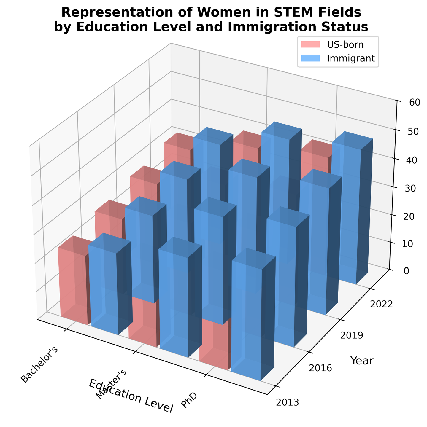
|
24
|
00000023
|
{
  "texts": [
    {
      "user": "What is the median response time for minor incidents?",
      "assistant": "The median response time can be identified by the horizontal line within the violin plot section for minor incidents.\nAnswer: 7"
    },
    {
      "user": "Which severity level has the longest range of response times?",
      "assistant": "The range of response times can be seen by comparing the vertical lengths of each violin. The critical severity level has the longest vertical length.\nAnswer: Critical"
    },
    {
      "user": "How do the median response times compare between major and critical incidents?",
      "assistant": "The median response times are marked by the horizontal line within each violin. By comparing the lines, the median for critical incidents is higher than for major incidents.\nAnswer: Critical has a higher median response time"
    },
    {
      "user": "What are the visual differences in terms of spread and central tendency between moderate and major incidents?",
      "assistant": "The spread is indicated by the width and length of the violins, while the central tendency is shown by the median line. The moderate incidents have a narrower spread and lower median compared to major incidents.\nAnswer: Moderate has a narrower spread and a lower median response time"
    },
    {
      "user": "Looking at the plot, what is the approximate maximum response time for moderate incidents?",
      "assistant": "The top boundary of the violin for moderate incidents shows the maximum response time, which can be estimated based on the axis.\nAnswer: Approximately 15 minutes"
    },
    {
      "user": "Which severity level shows the least variability in response times?",
      "assistant": "Variability can be assessed by the width of the violin plots. Thinner violins indicate lower variability. The minor severity level has the thinnest violin, indicating the least variability.\nAnswer: Minor"
    },
    {
      "user": "How does the median response time for minor incidents compare to the median response time for critical incidents?",
      "assistant": "By comparing the horizontal median lines of the violins for minor and critical incidents, the median for critical incidents is much higher.\nAnswer: Critical has a much higher median response time"
    },
    {
      "user": "What is the approximate interquartile range (IQR) for major incidents?",
      "assistant": "The IQR is a measure of the middle 50% of data points. It's indicated by the widest sections of the violin plot for major incidents, between the first and third quartiles. The range between these points can be estimated.\nAnswer: Approximately 20-23 minutes"
    },
    {
      "user": "Do any of the severity levels show symmetrical distribution in response times?",
      "assistant": "Symmetrical distribution in a violin plot is indicated when both sides of the violin are even. Minor incidents show a fairly symmetrical distribution.\nAnswer: Minor"
    }
  ],
  "original_index": 8123,
  "width": 2048,
  "height": 1359,
  "mode": "RGB",
  "source": "CoSyn-400k-chart",
  "relevance_ratings": [
    3,
    5,
    5,
    5,
    5,
    5,
    5,
    5,
    3
  ],
  "relevance_min": 3,
  "visual_dependency_ratings": [
    2,
    4,
    2,
    4,
    5,
    2,
    2,
    4,
    4
  ],
  "visual_dependency_min": 2,
  "image_correspondence_ratings": [
    5,
    5,
    5,
    4,
    4,
    5,
    5,
    4,
    4
  ],
  "image_correspondence_min": 4,
  "formatting_ratings": [
    4,
    4,
    4,
    4,
    4,
    4,
    4,
    4,
    4
  ],
  "formatting_min": 4
}
|
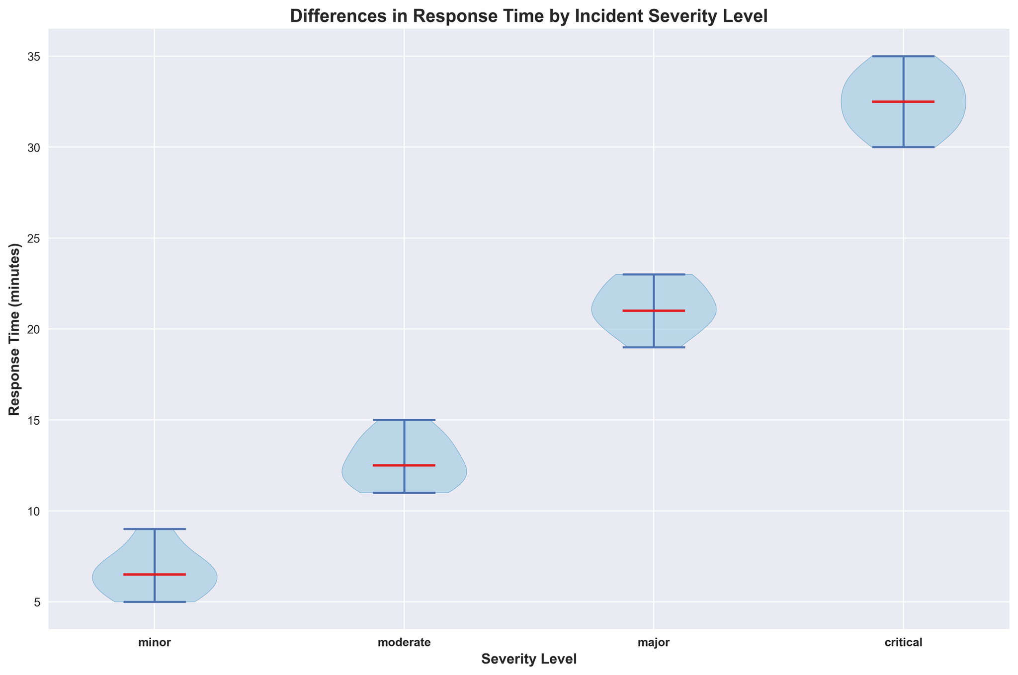
|
25
|
00000024
|
{
  "texts": [
    {
      "user": "What's the shortest recovery time among the infections listed?",
      "assistant": "The shortest recovery time can be seen by identifying the shortest bar on the chart. In this case, Norovirus has the shortest recovery time at 3 days.\nAnswer: 3 days"
    },
    {
      "user": "Which infection has the longest average recovery time?",
      "assistant": "To find the infection with the longest recovery time, look for the tallest bar on the chart. Japanese Encephalitis has the longest recovery time at 30 days.\nAnswer: 30 days"
    },
    {
      "user": "What is the difference in recovery time between Dengue Fever and Typhoid Fever?",
      "assistant": "Compare the height of the bars for Dengue Fever (14 days) and Typhoid Fever (14 days). The difference is 0 days.\nAnswer: 0 days"
    },
    {
      "user": "What is the average recovery time across all the listed infections?",
      "assistant": "To find the average recovery time, sum all the recovery times and divide by the number of infections. (7 + 10 + 3 + 14 + 28 + 7 + 10 + 21 + 14 + 5 + 14 + 16 + 7 + 14 + 30) / 15 = 200/15 = 13.33 days\nAnswer: 13.33 days"
    },
    {
      "user": "Which infections have the same recovery time and what is that time?",
      "assistant": "Look for groups of bars with the same height. Dengue Fever, Typhoid Fever, Measles, and West Nile Virus all have a recovery time of 14 days. *Additionally, Influenza and Chikungunya both have a recovery time of 10 days; and Common Cold, Zika Virus, and Rubella all have a recovery time of 7 days*.\nAnswer: Dengue Fever, Typhoid Fever, Measles, West Nile Virus (14 days); Influenza, Chikungunya (10 days); Common Cold, Zika Virus, Rubella (7 days)"
    },
    {
      "user": "What's the sum of the recovery times for all infections that last more than 20 days?",
      "assistant": "Identify and add the recovery times of infections with bars taller than the 20-day marker. Hepatitis A (28 days), Yellow Fever (21 days), Japanese Encephalitis (30 days). So, 28 + 21 + 30 = 79 days.\nAnswer: 79 days"
    },
    {
      "user": "How many infections have an average recovery time less than 10 days?",
      "assistant": "Count the bars that are below the 10-day mark. Common Cold (7 days), Norovirus (3 days), Zika Virus (7 days), Viral Gastroenteritis (5 days), Rubella (7 days) = 5 infections.\nAnswer: 5 infections"
    },
    {
      "user": "What is the combined recovery time for Common Cold, Influenza, and Measles?",
      "assistant": "Add the recovery times of these specific infections. Common Cold (7 days), Influenza (10 days), Measles (14 days). So, 7 + 10 + 14 = 31 days.\nAnswer: 31 days"
    },
    {
      "user": "What is the median recovery time for the infections listed?",
      "assistant": "List the recovery times in ascending order: 3, 5, 7, 7, 7, 10, 10, 14, 14, 14, 14, 16, 21, 28, 30. The median value is the middle number in this ordered list, which is 14 days.\nAnswer: 14 days"
    },
    {
      "user": "Which infection has an average recovery time closest to the overall average recovery time?",
      "assistant": "Calculate the overall average recovery time (13.33 days) and find the infection with the recovery time closest to this. Infections with recovery times closest to 13.33 days are Dengue Fever, Typhoid Fever, Measles, and West Nile Virus each with 14 days.\nAnswer: Dengue Fever, Typhoid Fever, Measles, West Nile Virus"
    }
  ],
  "original_index": 8124,
  "width": 2048,
  "height": 1276,
  "mode": "RGB",
  "source": "CoSyn-400k-chart",
  "relevance_ratings": [
    5,
    5,
    5,
    5,
    5,
    5,
    5,
    5,
    5,
    5
  ],
  "relevance_min": 5,
  "visual_dependency_ratings": [
    4,
    2,
    2,
    2,
    2,
    4,
    2,
    2,
    2,
    3
  ],
  "visual_dependency_min": 2,
  "image_correspondence_ratings": [
    5,
    5,
    5,
    4,
    5,
    5,
    5,
    4,
    5,
    5
  ],
  "image_correspondence_min": 4,
  "formatting_ratings": [
|
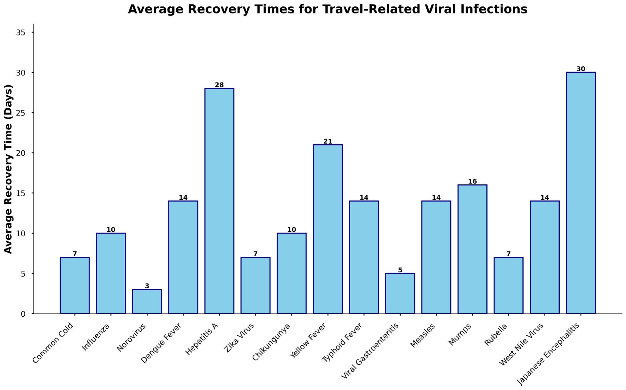
|
26
|
00000025
|
{
  "texts": [
    {
      "user": "What's the league with the highest average attendance?",
      "assistant": "The tallest bar represents the league with the highest average attendance. In the figure, the Campeonato Brasileiro S\u00e9rie A has the highest bar.\nAnswer: Campeonato Brasileiro S\u00e9rie A"
    },
    {
      "user": "How much higher is the average attendance of the Argentine Primera Divisi\u00f3n compared to the Uruguayan Primera Divisi\u00f3n?",
      "assistant": "Compare the heights of the bars for the Argentine Primera Divisi\u00f3n and the Uruguayan Primera Divisi\u00f3n. The difference is 18,700 - 9,800.\nAnswer: 8,900"
    },
    {
      "user": "Which league has a lower average attendance: the Chilean Primera Divisi\u00f3n or the Ecuadorian Serie A?",
      "assistant": "Compare the heights of the bars for the Chilean Primera Divisi\u00f3n and the Ecuadorian Serie A. The Chilean Primera Divisi\u00f3n has a higher bar.\nAnswer: Ecuadorian Serie A"
    },
    {
      "user": "What is the sum of the average attendances for the Colombian Categor\u00eda Primera A and the Peruvian Primera Divisi\u00f3n?",
      "assistant": "Look at the heights of the bars for the Colombian Categor\u00eda Primera A and the Peruvian Primera Divisi\u00f3n and add them together: 7,900 + 7,200.\nAnswer: 15,100"
    },
    {
      "user": "What position does the Paraguayan Primera Divisi\u00f3n hold in terms of average attendance ranking?",
      "assistant": "Order the leagues by the height of their bars from highest to lowest. The Paraguayan Primera Divisi\u00f3n holds the 8th position.\nAnswer: 8th"
    },
    {
      "user": "Is the average attendance of the Venezuelan Primera Divisi\u00f3n more than double that of the Bolivian Primera Divisi\u00f3n?",
      "assistant": "Compare the average attendance of the Venezuelan Primera Divisi\u00f3n (5,800) with double the average attendance of the Bolivian Primera Divisi\u00f3n (2 * 5,200 = 10,400). 5,800 is less than 10,400.\nAnswer: No"
    },
    {
      "user": "How many leagues have an average attendance greater than 15,000?",
      "assistant": "Count the number of bars with heights above 15,000. There are three leagues: Campeonato Brasileiro S\u00e9rie A, Argentine Primera Divisi\u00f3n, and Chilean Primera Divisi\u00f3n.\nAnswer: 3"
    },
    {
      "user": "What is the difference between the highest and lowest average attendances?",
      "assistant": "Look at the heights of the bars for the highest and lowest average attendances: 21,500 (Campeonato Brasileiro S\u00e9rie A) - 5,200 (Bolivian Primera Divisi\u00f3n).\nAnswer: 16,300"
    },
    {
      "user": "Which leagues have an average attendance between 5,000 and 10,000?",
      "assistant": "Identify the bars with heights falling within the range of 5,000 to 10,000. These leagues are the Uruguayan Primera Divisi\u00f3n, Ecuadorian Serie A, Colombian Categor\u00eda Primera A, Peruvian Primera Divisi\u00f3n, Paraguayan Primera Divisi\u00f3n, and Venezuelan Primera Divisi\u00f3n.\nAnswer: Uruguayan Primera Divisi\u00f3n, Ecuadorian Serie A, Colombian Categor\u00eda Primera A, Peruvian Primera Divisi\u00f3n, Paraguayan Primera Divisi\u00f3n, Venezuelan Primera Divisi\u00f3n"
    }
  ],
  "original_index": 8125,
  "width": 2048,
  "height": 1360,
  "mode": "RGB",
  "source": "CoSyn-400k-chart",
  "relevance_ratings": [
    5,
    5,
    5,
    5,
    5,
    5,
    5,
    5,
    5
  ],
  "relevance_min": 5,
  "visual_dependency_ratings": [
    4,
    2,
    2,
    4,
    2,
    2,
    5,
    4,
    2
  ],
  "visual_dependency_min": 2,
  "image_correspondence_ratings": [
    5,
    5,
    5,
    4,
    5,
    5,
    5,
    5,
    5
  ],
  "image_correspondence_min": 4,
  "formatting_ratings": [
    5,
    4,
    4,
    4,
    4,
    5,
    4,
    4,
    4
  ],
  "formatting_min": 4
}
|
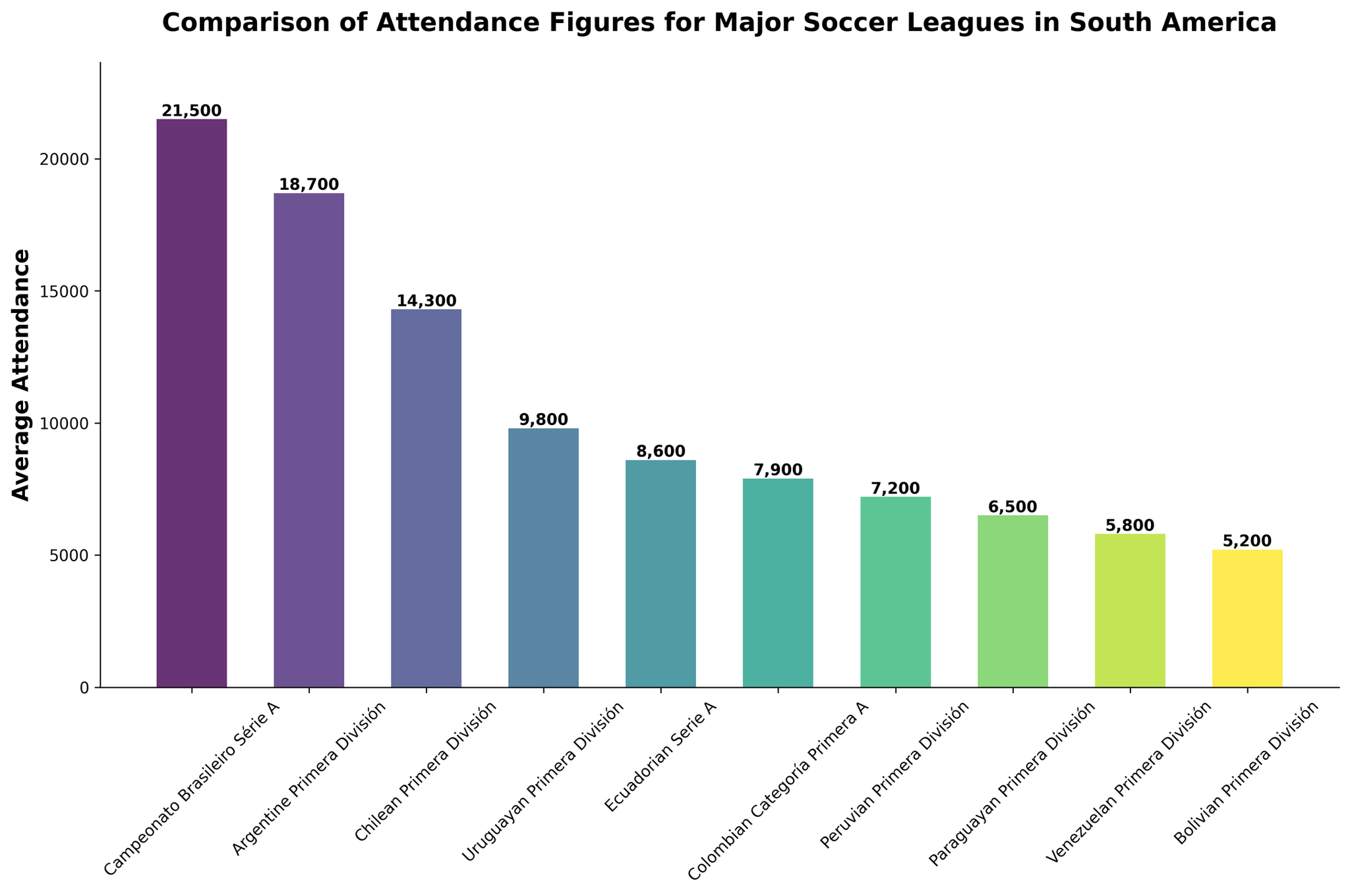
|
27
|
00000026
|
{
  "texts": [
    {
      "user": "What's the title of the plot?",
      "assistant": "The title of the plot is clearly mentioned and can be found at the top of the figure.\nAnswer: Agreement Rates in Mediation Sessions by Income Level and Location"
    },
    {
      "user": "What are the labels for the x-axis and y-axis?",
      "assistant": "The labels for the axes are identified by looking at the titles assigned to each axis.\nAnswer: x-axis: Total Cases, y-axis: Parties Agreed"
    },
    {
      "user": "How many locations are represented in the plot?",
      "assistant": "The different locations are indicated by the distinct markers in the legend. Manually count the unique location names.\nAnswer: 4"
    },
    {
      "user": "Which location has the highest number of total cases?",
      "assistant": "Look for the data point farthest to the right on the x-axis and check the legend to see which location it belongs to.\nAnswer: Houston"
    },
    {
      "user": "Which income level shows the highest parties agreed in New York?",
      "assistant": "Filter the New York data points and identify the highest y-value. Then, check the hover text for the corresponding income level.\nAnswer: High"
    },
    {
      "user": "What is the total number of cases for Low-income levels in Chicago?",
      "assistant": "Identify the data point for \"Low\" income level in Chicago and read the x-axis value.\nAnswer: 20"
    },
    {
      "user": "How many medium-income level cases are there in Los Angeles?",
      "assistant": "Locate the \"Medium\" income level data point for Los Angeles and note the x-axis value.\nAnswer: 30"
    },
    {
      "user": "Which two cities have similar agreement rates for high-income levels?",
      "assistant": "Compare the y-values (Parties Agreed) for the high income level data points across different cities.\nAnswer: New York and Los Angeles"
    },
    {
      "user": "Which income level in Houston has the highest agreement rate?",
      "assistant": "Evaluate the y-values for Houston's data points and find the one with the highest value. Check the income level from the hover text.\nAnswer: High"
    },
    {
      "user": "In which location do low-income levels have the highest number of parties agreed?",
      "assistant": "Compare the y-values for the low-income data points across all locations.\nAnswer: Houston"
    }
  ],
  "original_index": 8126,
  "width": 1282,
  "height": 837,
  "mode": "RGB",
  "source": "CoSyn-400k-chart",
  "relevance_ratings": [
    5,
    5,
    5,
    5,
    3,
    5,
    5,
    5,
    3,
    3
  ],
  "relevance_min": 3,
  "visual_dependency_ratings": [
    5,
    5,
    4,
    4,
    2,
    2,
    2,
    4,
    4,
    4
  ],
  "visual_dependency_min": 2,
  "image_correspondence_ratings": [
    5,
    5,
    5,
    4,
    4,
    3,
    3,
    4,
    4,
    4
  ],
  "image_correspondence_min": 3,
  "formatting_ratings": [
    4,
    4,
    4,
    4,
    4,
    4,
    4,
    4,
    4,
    4
  ],
  "formatting_min": 4
}
|
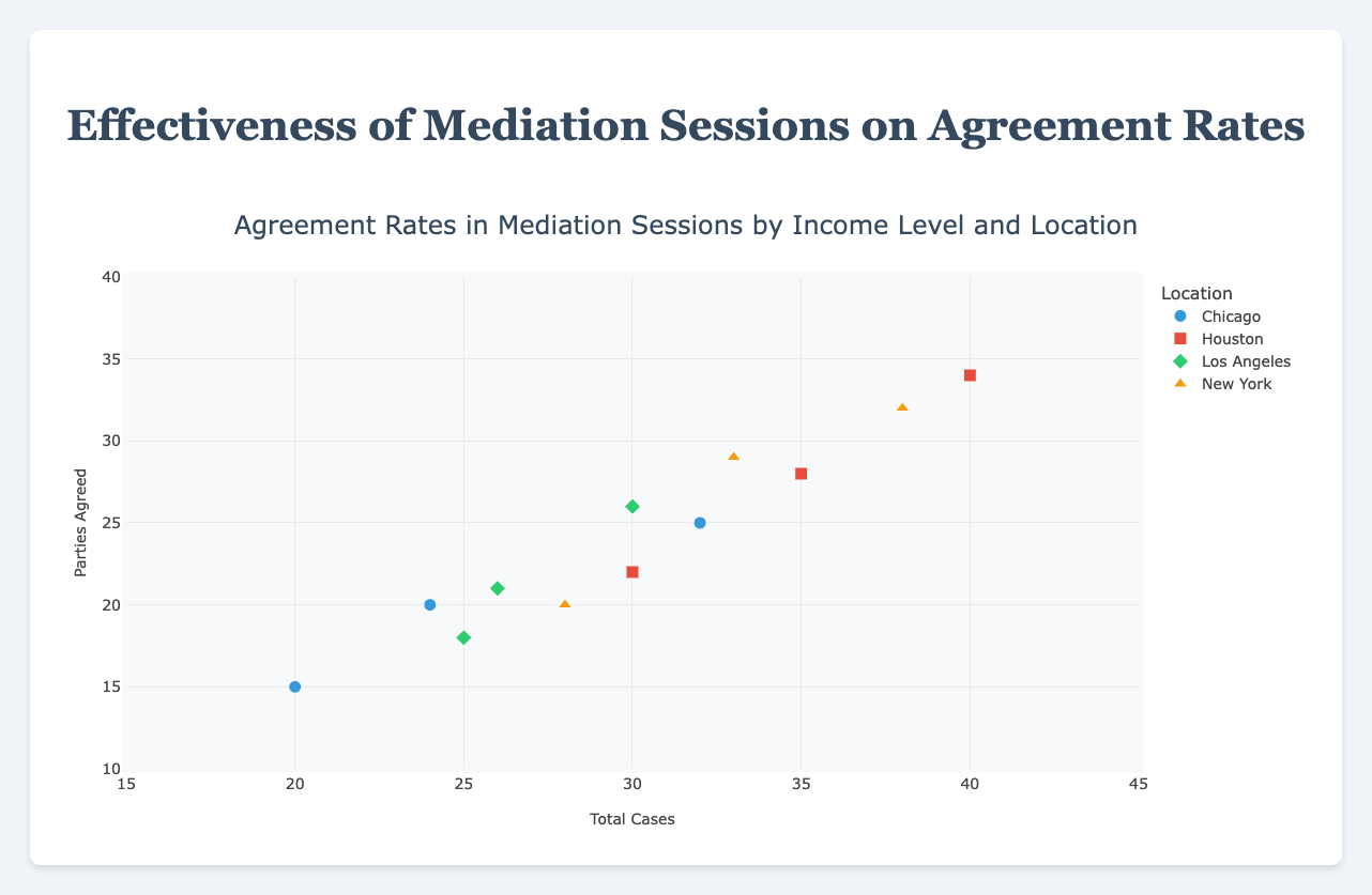
|
28
|
00000027
|
{
  "texts": [
    {
      "user": "How many user engagement points does Codecademy have?",
      "assistant": "According to the figure, Codecademy has a bar representing user engagement that reaches up to 1,250,000 points. This information can be directly read from the height of the first bar.\nAnswer: 1,250,000"
    },
    {
      "user": "Which two resources together make up the most substantial user engagement?",
      "assistant": "The two largest bars in the figure represent the resources Codecademy and freeCodeCamp. By analyzing their heights, we see Codecademy has 1,250,000 points and freeCodeCamp has 980,000 points. Adding these, we get 1,250,000 + 980,000 = 2,230,000.\nAnswer: Codecademy and freeCodeCamp"
    },
    {
      "user": "What is the cumulative percentage of user engagement for Codecademy and freeCodeCamp combined?",
      "assistant": "The cumulative percentage is shown as a line graph. At the point where freeCodeCamp is labeled, the cumulative percentage is around 51.8%. This includes the cumulative effect of both Codecademy and freeCodeCamp.\nAnswer: 51.8%"
    },
    {
      "user": "Which resource shows a user engagement of 620,000?",
      "assistant": "From the figure, the bar for Udemy reaches up to 620,000 points, indicating that Udemy is the resource with this user engagement level.\nAnswer: Udemy"
    },
    {
      "user": "Is the user engagement for the top three resources greater than that of the bottom seven combined?",
      "assistant": "First sum up the top three: Codecademy (1,250,000), freeCodeCamp (980,000), and GitHub (820,000). This gives 1,250,000 + 980,000 + 820,000 = 3,050,000. Now sum up the bottom seven: HackerRank (240,000), Pluralsight (200,000), W3Schools (180,000), Khan Academy (150,000), Udacity (120,000). This gives 420,000 + 380,000 + 310,000 + 280,000 + 1,630,000. Comparing, 3,050,000 is greater.\nAnswer: Yes"
    },
    {
      "user": "What are the user engagement values for resources that have less than 300,000 points?",
      "assistant": "From the figure, resources with less than 300,000 points are LeetCode (280,000), HackerRank (240,000), Pluralsight (200,000), W3Schools (180,000), Khan Academy (150,000), and Udacity (120,000).\nAnswer: LeetCode, HackerRank, Pluralsight, W3Schools, Khan Academy, Udacity"
    },
    {
      "user": "By what percentage does GitHub contribute to the total user engagement?",
      "assistant": "First, find GitHub's user engagement, which is 820,000 points. The total user engagement is obtained by summing all values: 1250000 + 980000 + 820000 + 750000 + 620000 + 510000 + 420000 + 380000 + 310000 + 280000 + 240000 + 200000 + 180000 + 150000 + 120000 = 7,280,000. The percentage contribution of GitHub is (820,000 / 7,280,000) * 100 \u2248 11.26%.\nAnswer: 11.26%"
    },
    {
      "user": "Among the listed resources, which one has the lowest user engagement and how is this represented in the figure?",
      "assistant": "According to the figure, Udacity has the lowest user engagement with 120,000 points. This is represented by the shortest bar in the Pareto chart.\nAnswer: Udacity, 120,000"
    }
  ],
  "original_index": 8127,
  "width": 2048,
  "height": 1016,
  "mode": "RGB",
  "source": "CoSyn-400k-chart",
  "relevance_ratings": [
    5,
    5,
    3,
    5,
    5,
    2,
    5,
    5
  ],
  "relevance_min": 2,
  "visual_dependency_ratings": [
    1,
    4,
    2,
    2,
    4,
    1,
    2,
    4
  ],
  "visual_dependency_min": 1,
  "image_correspondence_ratings": [
    5,
    5,
    5,
    5,
    5,
    4,
    4,
    5
  ],
  "image_correspondence_min": 4,
  "formatting_ratings": [
    5,
    5,
    4,
    5,
    4,
    4,
    5,
    4
  ],
  "formatting_min": 4
}
|
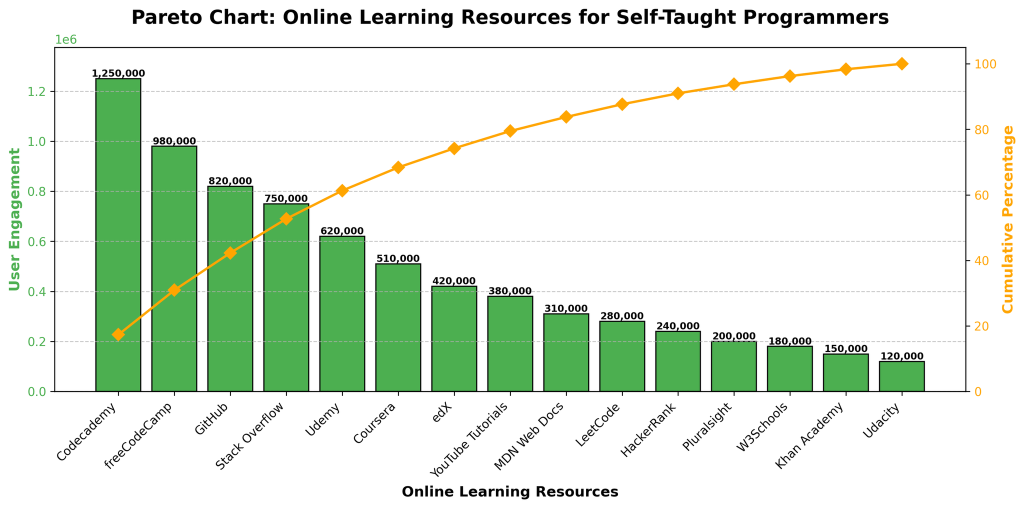
|
29
|
00000028
|
{
  "texts": [
    {
      "user": "Which country has the highest youth literacy rate for both genders?",
      "assistant": "Look at the heights of both the blue and red bars for each country. Japan has the tallest bars for both males and females, indicating the highest youth literacy rates.\nAnswer: Japan"
    },
    {
      "user": "Which country shows the largest gender discrepancy in youth literacy rates?",
      "assistant": "Compare the male and female bars for each country to find the greatest difference. Afghanistan has the largest discrepancy, with a difference of 27.9% (62.1% for males and 34.2% for females).\nAnswer: Afghanistan"
    },
    {
      "user": "In which country are the youth literacy rates nearly equal for males and females?",
      "assistant": "Look for countries where the blue and red bars are almost the same height. In France, both male and female literacy rates are 99.8%, showing equality.\nAnswer: France"
    },
    {
      "user": "How does the youth literacy rate for females in Nigeria compare to that in Pakistan?",
      "assistant": "Compare the heights of the red bars for females in Nigeria and Pakistan. Nigeria's female literacy rate is 58.0%, which is higher than Pakistan's at 53.1%.\nAnswer: Nigeria has a higher rate"
    },
    {
      "user": "What is the average youth literacy rate for females across all countries in the plot?",
      "assistant": "Sum the youth literacy rates for females in each country and divide by the number of countries. The rates are 34.2, 83.2, 98.6, 99.2, 90.1, 99.8, 86.5, 99.9, 86.8, 98.1, 58.0, 53.1, 93.6, and 99.0, totaling 1179.1. There are 14 countries, so the average is 1179.1 / 14 = 84.2%.\nAnswer: 84.2%"
    },
    {
      "user": "Which country has a higher youth literacy rate for females compared to males?",
      "assistant": "Compare each pair of blue and red bars. Bangladesh, Brazil, Kenya, and Mexico have higher female literacy rates compared to males.\nAnswer: Bangladesh, Brazil, Kenya, Mexico"
    },
    {
      "user": "Which country has the lowest youth literacy rate for males?",
      "assistant": "Identify the shortest blue bar. Afghanistan has the lowest male literacy rate at 62.1%.\nAnswer: Afghanistan"
    },
    {
      "user": "In how many countries are male literacy rates higher than female literacy rates?",
      "assistant": "Count the countries where the blue bar is higher than the red bar. There are 7 countries: Afghanistan, China, Egypt, India, Nigeria, Pakistan, South Africa.\nAnswer: 7"
    },
    {
      "user": "Which two countries have identical youth literacy rates for both genders?",
      "assistant": "Check countries where both blue and red bars are equal. France and Japan both have identical rates for males and females.\nAnswer: France and Japan"
    },
    {
      "user": "By how much does the youth literacy rate for males in Egypt exceed that for females?",
      "assistant": "Subtract the female literacy rate from the male literacy rate in Egypt: 93.2 - 90.1 = 3.1%.\nAnswer: 3.1%"
    }
  ],
  "original_index": 8128,
  "width": 2048,
  "height": 1155,
  "mode": "RGB",
  "source": "CoSyn-400k-chart",
  "relevance_ratings": [
    5,
    5,
    5,
    5,
    5,
    5,
    5,
    5,
    5,
    5
  ],
  "relevance_min": 5,
  "visual_dependency_ratings": [
    2,
    4,
    3,
    2,
    4,
    2,
    2,
    2,
    4,
    2
  ],
  "visual_dependency_min": 2,
  "image_correspondence_ratings": [
    5,
    5,
    5,
    5,
    5,
    5,
    5,
    5,
    5,
    5
  ],
  "image_correspondence_min": 5,
  "formatting_ratings": [
    5,
    4,
    5,
    4,
    5,
    4,
    5,
    4,
    5,
    4
  ],
  "formatting_min": 4
}
|
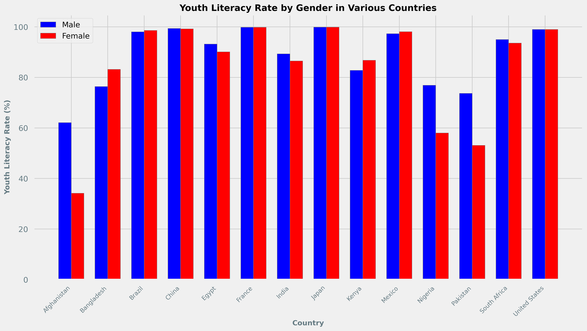
|
30
|
00000029
|
{
  "texts": [
    {
      "user": "How did the internet penetration rate change in the United States from 2000 to 2023?",
      "assistant": "In 2000, the penetration rate in the United States was 43.1%. By 2023, it increased to 94.5%. The difference is 94.5% - 43.1% = 51.4%.\nAnswer: 51.4%"
    },
    {
      "user": "Which country had the highest internet penetration rate in 2023?",
      "assistant": "Observing the end point of each line for 2023, Iceland has the highest rate at 99.8%.\nAnswer: Iceland"
    },
    {
      "user": "Compare the internet penetration rates of China and India in 2015. Which country had a higher rate and by how much?",
      "assistant": "In 2015, China's rate was 50.3% and India's was 17.0%. The difference is 50.3% - 17.0% = 33.3%.\nAnswer: China, 33.3%"
    },
    {
      "user": "What is the average internet penetration rate of Kenya over the years 2000, 2005, and 2010?",
      "assistant": "The rates for Kenya in these years are 0.3%, 3.1%, and 14.0%. The average is (0.3 + 3.1 + 14.0) / 3 = 5.8%.\nAnswer: 5.8%"
    },
    {
      "user": "Between which consecutive years did Nigeria experience the highest increase in internet penetration rate?",
      "assistant": "Noting the values, the largest increase occurred between 2015 and 2020, from 24.5% to 42.0%, which is an increase of 42.0% - 24.5% = 17.5%.\nAnswer: 2015 to 2020"
    },
    {
      "user": "Which country showed the most consistent growth in internet penetration rates from 2000 to 2023?",
      "assistant": "Upon examining the trends, Iceland shows steady growth with high values throughout, indicating consistent growth.\nAnswer: Iceland"
    },
    {
      "user": "In 2020, which country had a lower rate of internet penetration, Indonesia or Brazil? By how much?",
      "assistant": "In 2020, Brazil's rate was 73.9% and Indonesia's was 53.7%. The difference is 73.9% - 53.7% = 20.2%.\nAnswer: Indonesia, 20.2%"
    },
    {
      "user": "What is the total increase in internet penetration rate for Indonesia from 2010 to 2023?",
      "assistant": "The rate in 2010 is 10.9%, and in 2023 it is 73.0%. The total increase is 73.0% - 10.9% = 62.1%.\nAnswer: 62.1%"
    },
    {
      "user": "How does the internet penetration rate in Kenya compare with the United States in 2023?",
      "assistant": "In 2023, Kenya's rate is 92.5% and the United States is 94.5%. The difference is 94.5% - 92.5% = 2.0%.\nAnswer: United States, 2.0%"
    },
    {
      "user": "Which year did Brazil's internet penetration rate first exceed 50%?",
      "assistant": "Checking the data, in 2015 Brazil's rate was 58.3%, which is the first year it exceeded 50%.\nAnswer: 2015"
    }
  ],
  "original_index": 8129,
  "width": 2048,
  "height": 1195,
  "mode": "RGB",
  "source": "CoSyn-400k-chart",
  "relevance_ratings": [
    5,
    5,
    5,
    5,
    5,
    2,
    5,
    5,
    5,
    5
  ],
  "relevance_min": 2,
  "visual_dependency_ratings": [
    2,
    2,
    2,
    2,
    4,
    2,
    2,
    2,
    2,
    2
  ],
  "visual_dependency_min": 2,
  "image_correspondence_ratings": [
    5,
    5,
    5,
    4,
    4,
    5,
    5,
    4,
    5,
    4
  ],
  "image_correspondence_min": 4,
  "formatting_ratings": [
    5,
    5,
    5,
    5,
    5,
    5,
    5,
    5,
    4,
    4
  ],
  "formatting_min": 4
}
|
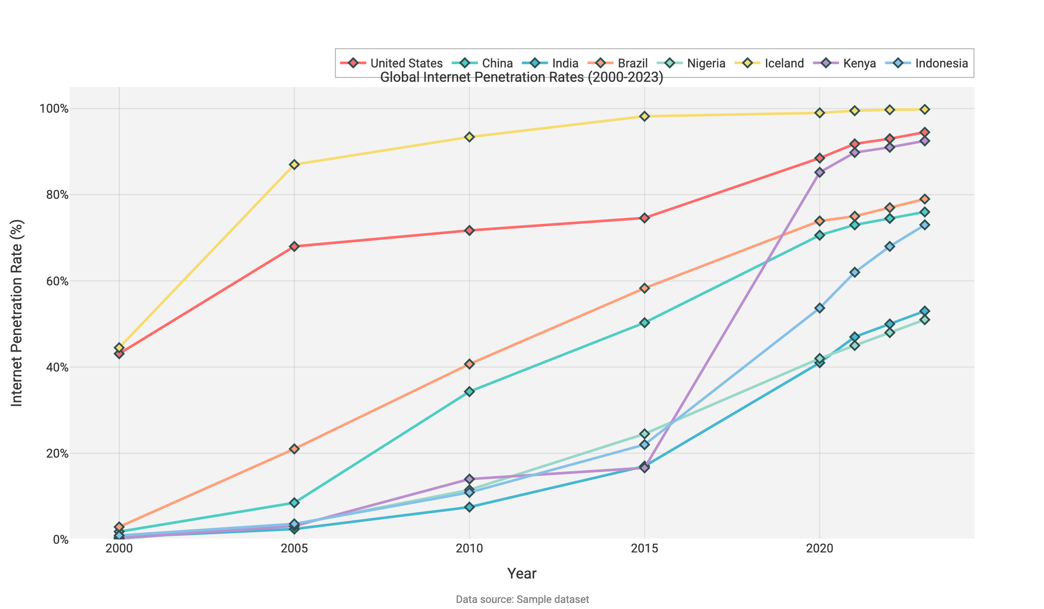
|
31
|
00000030
|
{
  "texts": [
    {
      "user": "What's the pattern of new library openings across the months?",
      "assistant": "The green line with circle markers on the plot represents new library openings. By observing this line, we notice fluctuations with the highest peaks in March, July, and December where there were 3 new openings in each of those months. The lowest point, with no new openings, appears in April and October.\nAnswer: The pattern shows fluctuations with peaks in March, July, and December, and no openings in April and October"
    },
    {
      "user": "Which month had the highest book borrowing among young readers, and how many books were borrowed?",
      "assistant": "Referring to the blue line with triangle markers, we find that the month's peak is the highest in July with a value of 12 book borrowings.\nAnswer: July, 12 books"
    },
    {
      "user": "How do book borrowings and book returns correlate in July?",
      "assistant": "In July, the book borrowing (blue line) reaches its highest peak at 12, while the book returning (red line) is at its neutral point (0). This suggests that while a lot of books were borrowed, none were returned in July.\nAnswer: High borrowing with no returns in July, 12 borrowed and 0 returned"
    },
    {
      "user": "What is the trend for book returning from January to December?",
      "assistant": "The red line with square markers indicates book returning trends. The values are mostly negative, ranging from -4 to 0, indicating more net returns or fewer books being returned each month, with the lowest returning in April and the exact neutral return in July.\nAnswer: Mostly negative, lowest in April (-4) and neutral in July (0)"
    },
    {
      "user": "In which months are the book borrowing and book returning trends exactly opposite?",
      "assistant": "We observe the blue and red lines: in months where borrowing is high, like July (12 borrowed, 0 returned), and months like April (3 borrowed, -4 returned), they are opposite in direction - one peaking up while the other peaking down.\nAnswer: July (12 borrowed, 0 returned) and April (3 borrowed, -4 returned)"
    },
    {
      "user": "Compare the maximum value of new library openings with the maximum value of book borrowings.",
      "assistant": "Observing the peaks of the green and blue lines, the maximum value of new library openings is 3 (March, July, December), while the highest peak for book borrowings is 12 (July).\nAnswer: 3 for new library openings, 12 for book borrowings"
    },
    {
      "user": "What is the average number of new library openings over the entire year?",
      "assistant": "Adding the values from the green line: 2 (Jan) + 1 (Feb) + 3 (Mar) + 0 (Apr) + 1 (May) + 2 (Jun) + 3 (Jul) + 2 (Aug) + 1 (Sep) + 0 (Oct) + 1 (Nov) + 2 (Dec) = 18. There are 12 months, so the average is 18/12 = 1.5.\nAnswer: 1.5"
    },
    {
      "user": "During which month(s) do book borrowings exceed the number of new library openings by the greatest margin?",
      "assistant": "To find this, we look at the difference in values between the blue and green lines. In July, borrowings (12) exceed new openings (3) by 9, which is the greatest margin when compared to other months.\nAnswer: July, by 9"
    },
    {
      "user": "Which month has the smallest net book return, and what is the net value?",
      "assistant": "Net return is indicated by the lowest point on the red line. In April, book returns hit -4, which is the smallest net return over the entire year.\nAnswer: April, -4"
    },
    {
      "user": "Compare the borrowing and returning trends in November.",
      "assistant": "In November, the values on the blue and red lines are 8 for borrowing and -1 for returning. Borrowing is significantly higher than returning, suggesting more books were borrowed than returned.\nAnswer: November, 8 borrowed and -1 returned"
    }
  ],
  "original_index": 8130,
  "width": 2048,
  "height": 1171,
  "mode": "RGB",
  "source
|
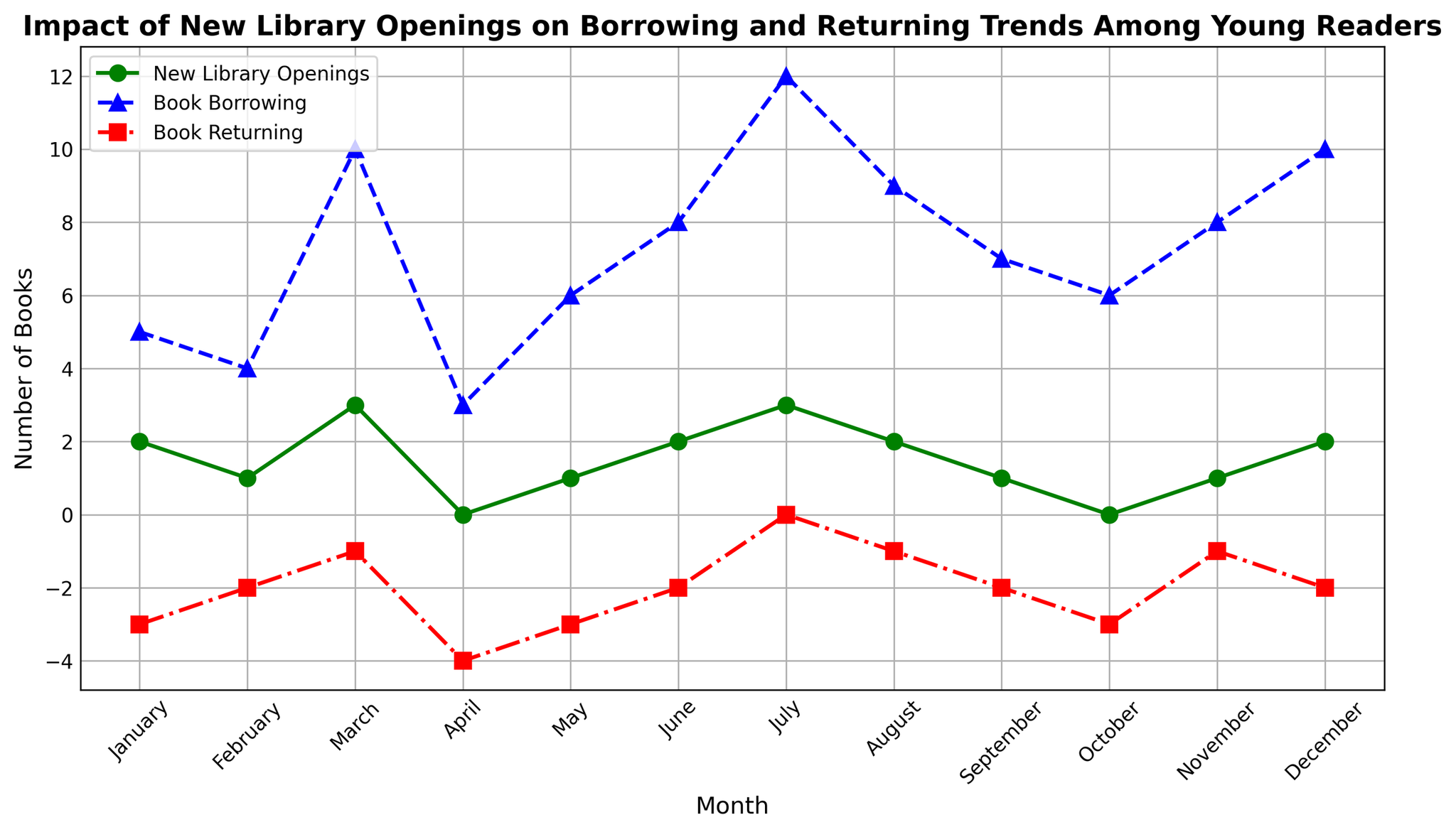
|
32
|
00000031
|
{
  "texts": [
    {
      "user": "What is the title of the figure?",
      "assistant": "The title is displayed at the top center of the plot, which is a common location for the title of a figure. Observing the title area reveals the text that represents the title of the figure.\nAnswer: Software Development Time Allocation"
    },
    {
      "user": "How many projects allocate 25% or more of their time to documentation?",
      "assistant": "To answer this, look at the points near the 'Documentation' axis on the ternary plot. Count the number of points where the fraction of documentation is 0.25 or more. These points will be closer to the 'Documentation' axis.\nAnswer: 4"
    },
    {
      "user": "Which project allocates the highest percentage of its time to coding?",
      "assistant": "Locate the point that is closest to the 'Coding' axis. The distance from the axis determines the proportion of time spent on coding. The project label associated with this point indicates the project that spends the most time on coding.\nAnswer: Backend API and Serverless Functions"
    },
    {
      "user": "Which project has the most balanced time allocation among coding, testing, and documentation?",
      "assistant": "Identify the point closest to the center of the plot since a balanced allocation means approximate equality in all three aspects. The project associated with this central point represents the most balanced allocation.\nAnswer: Microservices Architecture"
    },
    {
      "user": "Among the projects that allocate at least 30% of their time to testing, which project allocates the least time to coding?",
      "assistant": "First, identify all points representing projects with at least 30% testing (closer to the 'Testing' axis). Among these points, find the one that is farthest from the 'Coding' axis. The corresponding label reveals the project with the least coding time.\nAnswer: DevOps Automation"
    },
    {
      "user": "How many projects allocate more time to testing than to coding?",
      "assistant": "Compare the number of points closer to the 'Testing' axis than the 'Coding' axis. Count these points, noting which projects they represent. This can be visually determined by their relative positions on the plot.\nAnswer: 2"
    },
    {
      "user": "What is the average percentage of time allocated to documentation across all projects?",
      "assistant": "For each project, look at the percentage of time spent on documentation. Add these percentages together and divide by the number of projects to obtain the average. Detailed data values from the plot show: \\((10 + 15 + 10 + 15 + 25 + 10 + 15 + 20 + 20 + 25 + 15 + 15 + 15 + 25 + 15) / 15 = 16.67\\)\nAnswer: 16.67%"
    },
    {
      "user": "Which two projects have the closest time allocation proportions for coding and documentation?",
      "assistant": "Examine points that are closest to each other in terms of their 'Coding' and 'Documentation' proportions. Assess visually or compare proportions to identify the two nearest points.\nAnswer: Database Optimization and Authentication System"
    },
    {
      "user": "How does the time allocated to documentation in the Cloud Migration project compare to that in the Machine Learning Integration project?",
      "assistant": "Identify the positions representing these two projects on the plot and compare their distances from the 'Documentation' axis. The closer point indicates more time allocated to documentation.\nAnswer: They are equal"
    }
  ],
  "original_index": 8131,
  "width": 1600,
  "height": 1400,
  "mode": "RGB",
  "source": "CoSyn-400k-chart",
  "relevance_ratings": [
    5,
    4,
    5,
    4,
    5,
    3,
    5,
    4,
    3
  ],
  "relevance_min": 3,
  "visual_dependency_ratings": [
    5,
    2,
    2,
    4,
    4,
    4,
    2,
    4,
    2
  ],
  "visual_dependency_min": 2,
  "image_correspondence_ratings": [
    5,
    4,
    5,
    5,
    5,
    4,
    4,
    5,
    4
  ],
  "image_corr
|
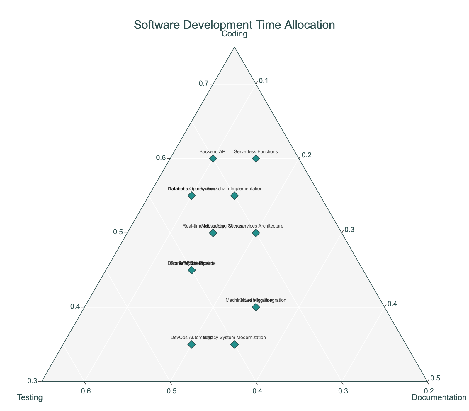
|