| # | sample_id | image_bytes | caption | model | persona | style | metadata |
|---|
1
|
0711_4411_000
|
|
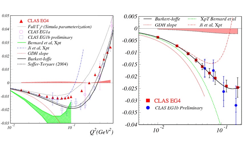
This two-panel figure presents a comparison of experimental data and theoretical models for a physical quantity plotted against the four-momentum transfer squared, $Q^2$, measured in $\text{GeV}^2$. The x-axis for both panels is on a logarithmic scale, ranging from $10^{-2}$ to approximately $3 \times 10^{-1}$ $\text{GeV}^2$.

The left panel displays a broad overview of the data. The y-axis ranges from $-0.03$ to $0.05$. Several experimental data sets are plotted with error bars: red triangles representing "CLAS EG4", red open circles for "CLAS EG1a", and purple open squares for "CLAS EG1b preliminary". These data points generally follow a downward trend before rising sharply as $Q^2$ increases toward $0.3 \text{ GeV}^2$. Overlaid on these points are various theoretical curves: a light grey line for "Full $\Gamma_1^p$ (Simula parameterization)", a solid green shaded region for "Bernard et al, Xpt", a blue dotted line for "Ji et al, Xpt", a red dotted line for the "GDH slope", a solid black line for "Burkert-Ioffe", and a black dashed line for "Soffer-Teryaev (2004)".

The right panel provides a zoomed-in view of the low-$Q^2$ region, focusing on the y-axis range from $-0.04$ to $0.005$. This panel highlights the "CLAS EG4" data (red squares) and "CLAS EG1b Preliminary" data (blue circles), both of which exhibit a steady decrease as $Q^2$ increases. The theoretical curves are repeated here for closer comparison: the solid black "Burkert-Ioffe" line closely follows the trend of the experimental data, while the green dotted line ("Xpt Bernard et al") drops more steeply. The red dotted "GDH slope" curve shows a characteristic parabolic dip, and a light red shaded region is visible near the top of the plot, representing the uncertainty or range associated with the GDH slope.
|
gemma-4-31B-it
|
an experienced professor explaining this figure to a graduate seminar
|
describe
|
{"caption_chars": 1800, "image_width": 859, "image_height": 505, "image_bytes": 118999}
|
2
|
0711_4411_001
|
|
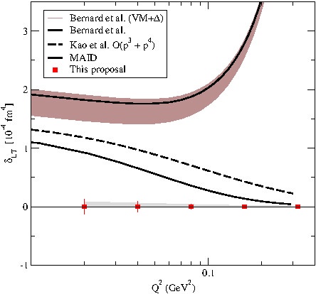
This graph explores the complex internal structure of subatomic particles by comparing different theoretical models against new experimental data. The vertical axis represents $\delta_{LT}$, a specific physical quantity measured in units of $10^{-4}\text{fm}^4$, while the horizontal axis shows $Q^2$, which relates to the momentum transfer or the "resolution" at which the particle is being probed, measured in $\text{GeV}^2$.

The most striking feature of the plot is the stark disagreement between the established theoretical predictions and the new proposal. Several existing models—represented by the solid and dashed black lines—predict that $\delta_{LT}$ should be positive and significantly higher than zero. In particular, the models by Bernard et al. and MAID suggest values between 1 and 3, with the Bernard et al. (VM+$\Delta$) model including a shaded uncertainty band that curves sharply upward as $Q^2$ increases. Even the Kao et al. model, while lower, still predicts a positive trend.

In contrast, the data from "This proposal," marked by red squares, sits almost exactly on the zero line across the entire measured range of $Q^2$. This indicates that the actual physical behavior of the system is vastly different from what the prevailing theories predicted. The fact that the experimental points remain flat and near zero suggests that certain expected effects are either absent or canceling each other out, challenging the current theoretical understanding and signaling a need to refine the models used to describe these fundamental interactions.
|
gemma-4-31B-it
|
a science journalist writing an accessible article for a general audience
|
interpret
|
{"caption_chars": 1568, "image_width": 444, "image_height": 414, "image_bytes": 42252}
|
3
|
0711_4411_002
|
|
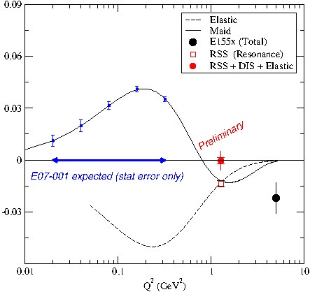
This plot illustrates the relationship between a measured quantity (on the y-axis) and the squared four-momentum transfer $Q^2$ (in $\text{GeV}^2$) on a logarithmic x-axis. The data compares experimental measurements with various theoretical models and contributions, including "Elastic," "Maid," and "RSS" (Resonance) components.

The "Maid" model, represented by a solid black line, shows a characteristic peak around $Q^2 \approx 0.3\text{--}0.4\text{ GeV}^2$ before crossing zero and dipping into negative values near $Q^2 \approx 1\text{--}2\text{ GeV}^2$. In contrast, the "Elastic" contribution, shown as a dashed line, remains negative across the majority of the displayed range, reaching its minimum near $0.3\text{ GeV}^2$.

Experimental data points are plotted with associated error bars. A point labeled "RSS + DIS + Elastic" (red circle) sits near zero at $Q^2 \approx 1.5\text{ GeV}^2$, marked as "Preliminary." Another data point, "El55x (Total)" (black circle), shows a significant negative value at higher $Q^2$ (approximately $5\text{ GeV}^2$). The blue horizontal arrow indicates the expected range for "E07-001" measurements, focusing on the region between $0.02$ and $1\text{ GeV}^2$, where the Maid model predicts a positive excursion. The divergence between the Elastic and Maid curves highlights the different physical contributions to the total signal across different momentum transfer scales.
|
gemma-4-31B-it
|
a technical writer documenting this figure for a survey paper
|
interpret
|
{"caption_chars": 1419, "image_width": 443, "image_height": 418, "image_bytes": 46180}
|
4
|
0711_4411_003
|
|
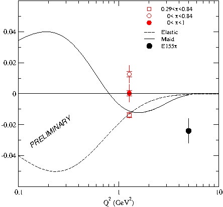
The plot illustrates the relationship between $Q^2$ (measured in $\text{GeV}^2$) on a logarithmic x-axis and a dimensionless quantity on the y-axis, comparing experimental data points with theoretical models. The data includes three sets of red points with error bars—represented by an open square, an open circle, and a solid circle—clustered around $Q^2 \approx 1.5 \text{ GeV}^2$. These points show a vertical spread, with the open circle representing the highest value and the open square the lowest. A single black data point (labeled E155$\pi$) appears as an outlier at a higher $Q^2$ value of approximately $5 \text{ GeV}^2$, sitting significantly below the zero line at roughly $-0.025$.

Two theoretical curves are presented: a dashed line labeled "Elastic" and a solid line labeled "Maid." The Elastic curve begins at approximately $-0.04$ at $Q^2 = 0.1$, dips further, and then gradually rises to converge toward zero as $Q^2$ increases. In contrast, the Maid curve starts positive, peaks near $0.04$ at $Q^2 \approx 0.2$, crosses the zero axis near $Q^2 = 1$, reaches a minimum of approximately $-0.01$ around $Q^2 = 2$, and then trends back toward zero.

The presentation is clear, utilizing a logarithmic scale to capture a wide range of $Q^2$ values. The inclusion of the "PRELIMINARY" watermark suggests the data is not yet final. The contrast between the oscillating Maid curve and the monotonic rise of the Elastic curve highlights a significant divergence in theoretical predictions at low $Q^2$, while the experimental points at $Q^2 \approx 1.5$ fall between these two predictions.
|
gemma-4-31B-it
|
a technical writer documenting this figure for a survey paper
|
analyze
|
{"caption_chars": 1602, "image_width": 444, "image_height": 413, "image_bytes": 34766}
|
5
|
0711_4411_004
|
|
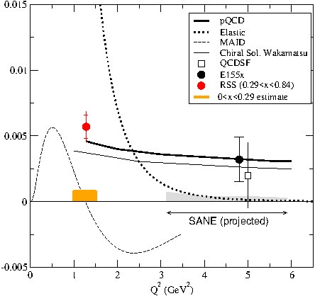
A line and scatter plot presents a comparison of theoretical models and experimental data points across a range of momentum transfer squared, $Q^2$, measured in $\text{GeV}^2$. The horizontal x-axis ranges from 0 to 6 $\text{GeV}^2$, while the vertical y-axis ranges from -0.005 to 0.015.

The plot contains several theoretical curves: a solid black line labeled "pQCD," a dotted black line labeled "Elastic," a dashed grey line labeled "MAID," and a thin solid grey line labeled "Chiral Sol. Wakamatsu." The pQCD and Chiral Sol. Wakamatsu lines are relatively flat and positive across the x-axis, while the Elastic curve shows a sharp peak that exceeds the top of the y-axis scale around $Q^2 \approx 1.5$ before dropping toward zero. The MAID curve exhibits an oscillatory behavior, peaking near $Q^2 \approx 0.5$ and dipping into negative values between $Q^2 \approx 2$ and $4$.

Experimental data are represented by discrete markers with error bars. A red circle with a vertical error bar is positioned near $Q^2 \approx 1.3$, labeled in the legend as "RSS ($0.29 < x < 0.84$)." A black circle with vertical error bars is located near $Q^2 \approx 4.7$, labeled as "E155x," and a small open square is positioned slightly below it, labeled as "QCDSF."

Additional annotations include an orange rectangular bar located between $Q^2 \approx 1$ and $1.5$ on the x-axis, identified as the "$0 < x < 0.29$ estimate." A grey shaded region extends from $Q^2 \approx 3$ to $5.5$ along the x-axis, accompanied by a double-headed arrow and the text "SANE (projected)."
|
gemma-4-31B-it
|
a data analyst focusing on the methodology and statistical aspects
|
describe
|
{"caption_chars": 1561, "image_width": 444, "image_height": 418, "image_bytes": 47224}
|
6
|
0711_4411_005
|
|
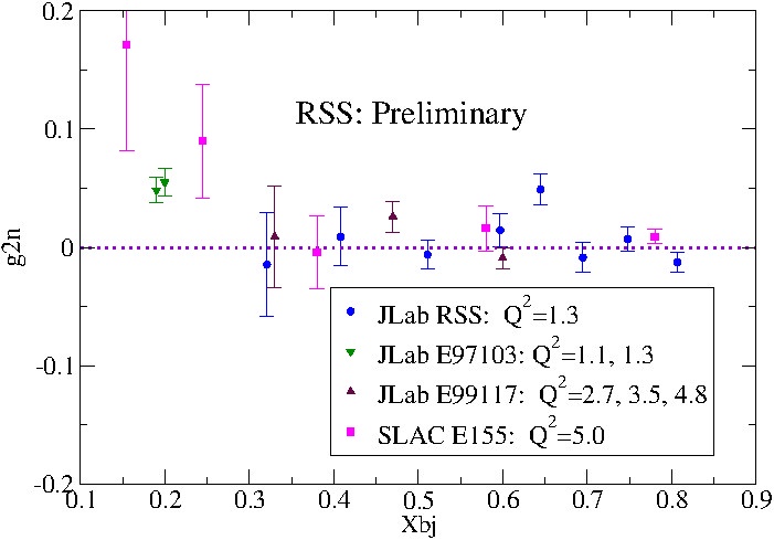
This plot examines the behavior of a quantum property denoted as $g_{2n}$ across different values of the Bjorken scaling variable, $X_{bj}$, which essentially probes the internal structure of the neutron. The data is a compilation of results from several high-energy physics experiments at Jefferson Lab (JLab) and SLAC, categorized by different momentum transfer values ($Q^2$).

A striking feature of the data is the high degree of variability and uncertainty at lower $X_{bj}$ values. The magenta squares, representing the SLAC E155 experiment, show the most dramatic fluctuations, including a significant peak near $X_{bj} = 0.15$ and a wide error bar around $0.25$. In contrast, as $X_{bj}$ increases toward 0.8, the data points from all experiments tend to converge and flatten out, clustering closely around the zero line (indicated by the dashed purple horizontal axis). This suggests that the measured effect becomes negligible or stabilizes at higher values of $X_{bj}$.

The presentation is clear and functional, utilizing distinct colors and shapes to differentiate between the four experimental datasets. The inclusion of error bars is critical here, as it reveals that many of the points—particularly those from the JLab RSS and E99117 runs—are statistically consistent with zero despite their apparent scatter. While the "Preliminary" label suggests these results were not yet final at the time of plotting, the figure effectively communicates a trend of decreasing magnitude and uncertainty as one moves from the left to the right of the x-axis.
|
gemma-4-31B-it
|
a science journalist writing an accessible article for a general audience
|
analyze
|
{"caption_chars": 1561, "image_width": 701, "image_height": 489, "image_bytes": 74555}
|
7
|
0711_4411_006
|
|
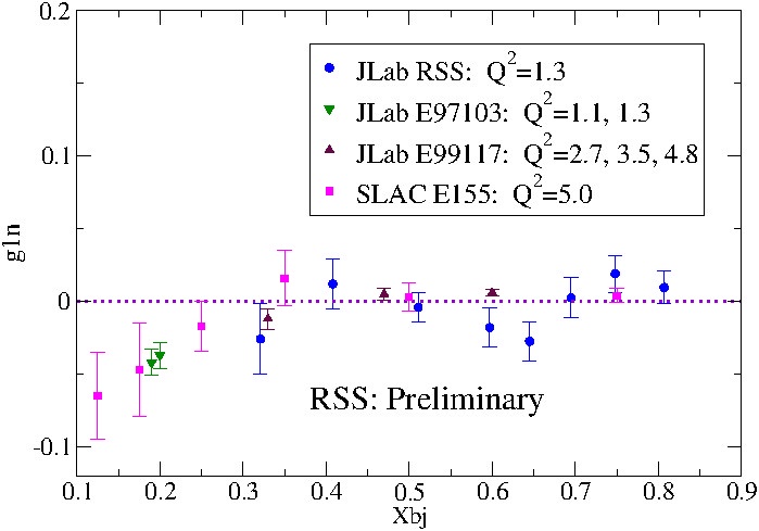
This plot displays the spin structure function $g_{1n}$ as a function of the Bjorken scaling variable $x_{Bj}$, featuring data from several different experimental runs at JLab and SLAC. The data points are distributed across an $x_{Bj}$ range from approximately 0.1 to 0.8, with the vertical axis representing $g_{1n}$ values ranging from -0.1 to 0.2.

There is a noticeable trend where $g_{1n}$ values are generally negative at lower $x_{Bj}$ values (below 0.3) and tend to fluctuate around or slightly above zero as $x_{Bj}$ increases. Specifically, the SLAC E155 data (magenta squares) and JLab E97103 data (green inverted triangles) show the most negative values in the $0.1 < x_{Bj} < 0.3$ region. As $x_{Bj}$ moves toward 0.8, the JLab RSS (blue circles) and JLab E99117 (maroon triangles) data points cluster more closely around the zero line, though they exhibit significant statistical uncertainty as indicated by the large error bars.

The presentation is clear, utilizing a distinct color and symbol coding system to differentiate between the four datasets and their corresponding $Q^2$ values. The inclusion of a dashed horizontal line at $g_{1n} = 0$ provides a useful reference for observing the sign change in the data. However, the label "RSS: Preliminary" suggests that the JLab RSS data is not yet final. The overall quality is standard for a physics preprint, though the wide spread of error bars—particularly for the SLAC and JLab RSS points—indicates a high degree of uncertainty in the individual measurements.
|
gemma-4-31B-it
|
a curious undergraduate student encountering this figure for the first time
|
analyze
|
{"caption_chars": 1532, "image_width": 699, "image_height": 489, "image_bytes": 73230}
|
8
|
0711_4411_008
|
|
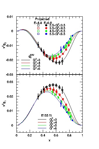
A two-panel vertical stack of plots presents the projected spin-dependent structure functions $x^2g_2$ (top panel) and $x^2g_1$ (bottom panel) as functions of the Bjorken scaling variable $x$, ranging from 0 to 1. Both panels utilize a shared x-axis.

The top panel plots $x^2g_2$ on the y-axis, with values ranging from -0.03 to 0.01. The data consists of several sets of experimental points with vertical error bars, categorized by beam energy $E$ and four ranges of four-momentum transfer squared $Q^2$. Specifically, $E=4.8$ is represented by open symbols and $E=6.0$ by filled symbols. The $Q^2$ ranges are color-coded: black for $2.5 < Q^2 < 3.5$, red for $3.5 < Q^2 < 4.5$, green for $4.5 < Q^2 < 5.5$, and blue for $5.5 < Q^2 < 6.5$. Overlaid on these points are four solid curves labeled as $g_2^{WW}$ (Wandzura-Wilczek) for discrete values of $Q^2 = 3, 4, 5, \text{ and } 6$, following the same color scheme. The $x^2g_2$ data and curves exhibit a characteristic dip, reaching a minimum around $x \approx 0.6$ before returning toward zero.

The bottom panel plots $x^2g_1$ on the y-axis, with values ranging from 0 to 0.03. This panel displays experimental data points with error bars and corresponding solid fit curves labeled "E155 fit." The data and fits are again categorized by $Q^2$ values of 3, 4, 5, and 6 using the black, red, green, and blue color scheme. The $x^2g_1$ distributions show a positive peak centered around $x \approx 0.5$ to $0.6$, with the magnitude of the peak decreasing as $Q^2$ increases.
|
gemma-4-31B-it
|
a PhD candidate summarizing this figure for their literature review
|
describe
|
{"caption_chars": 1527, "image_width": 340, "image_height": 510, "image_bytes": 52814}
|
9
|
0711_4413_000
|
|
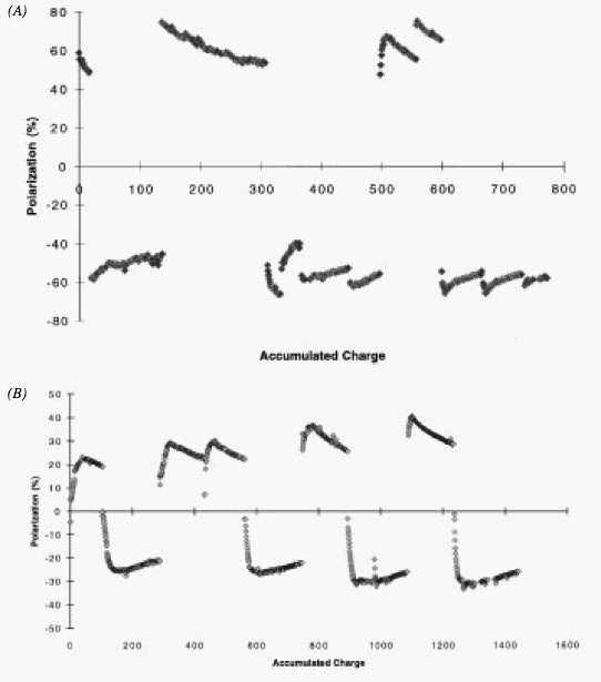
Two scatter plots, labeled (A) and (B), display Polarization (%) as a function of Accumulated Charge. Both plots use a Cartesian coordinate system where the y-axis represents Polarization in percentage and the x-axis represents Accumulated Charge, though the scales differ between the two panels.

Panel (A) features a y-axis ranging from -80% to 80% and an x-axis ranging from 0 to 800. The data points are clustered into several distinct segments. In the positive polarization region, there are three groups of points: a small cluster near the y-axis around 60%, a longer descending trend from approximately 150 to 300 on the x-axis starting near 80% and ending near 50%, and a final ascending group between 500 and 650 on the x-axis. In the negative polarization region, there are three corresponding clusters of points between -40% and -60%, showing undulating patterns across the x-axis.

Panel (B) features a y-axis ranging from -50% to 80% and an x-axis ranging from 0 to 1600. The data follows a repetitive, cyclic pattern of peaks and troughs. There are four distinct cycles where the polarization rises to a positive peak (ranging between 20% and 50%) and then drops sharply to a negative trough (ranging between -20% and -30%). These cycles occur roughly every 300 to 400 units of accumulated charge, creating a saw-tooth appearance. The transitions between the positive and negative polarization states are marked by nearly vertical lines of data points.
|
gemma-4-31B-it
|
a curious undergraduate student encountering this figure for the first time
|
describe
|
{"caption_chars": 1466, "image_width": 542, "image_height": 615, "image_bytes": 42868}
|
10
|
0711_4413_001
|
|
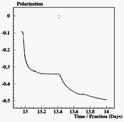
The plot tracks the evolution of polarization over a period of approximately 1.2 days, from day 13 to day 14. The polarization value begins at approximately -0.1 and undergoes a rapid decrease, dropping sharply to around -0.3 by day 13.1. Following this initial steep decline, the rate of change slows significantly, entering a plateau-like region between day 13.2 and 13.4 where the polarization remains relatively stable near -0.34.

A distinct discontinuity or shift occurs at approximately day 13.4, where the polarization begins to decrease again more rapidly, eventually trending toward -0.5 by day 14. The overall pattern indicates a non-linear decay of polarization characterized by two distinct phases of decline separated by a period of relative stability. This behavior suggests that the system underwent a change in dynamics or an external intervention around day 13.4 that accelerated the loss of polarization.
|
gemma-4-31B-it
|
a researcher in the field reviewing this figure in a peer-review context
|
interpret
|
{"caption_chars": 923, "image_width": 515, "image_height": 508, "image_bytes": 33218}
|