| # | image_name | image | caption |
|---|
1
|
357dfeb372348b62a1f25fdc0be10c86
|
|
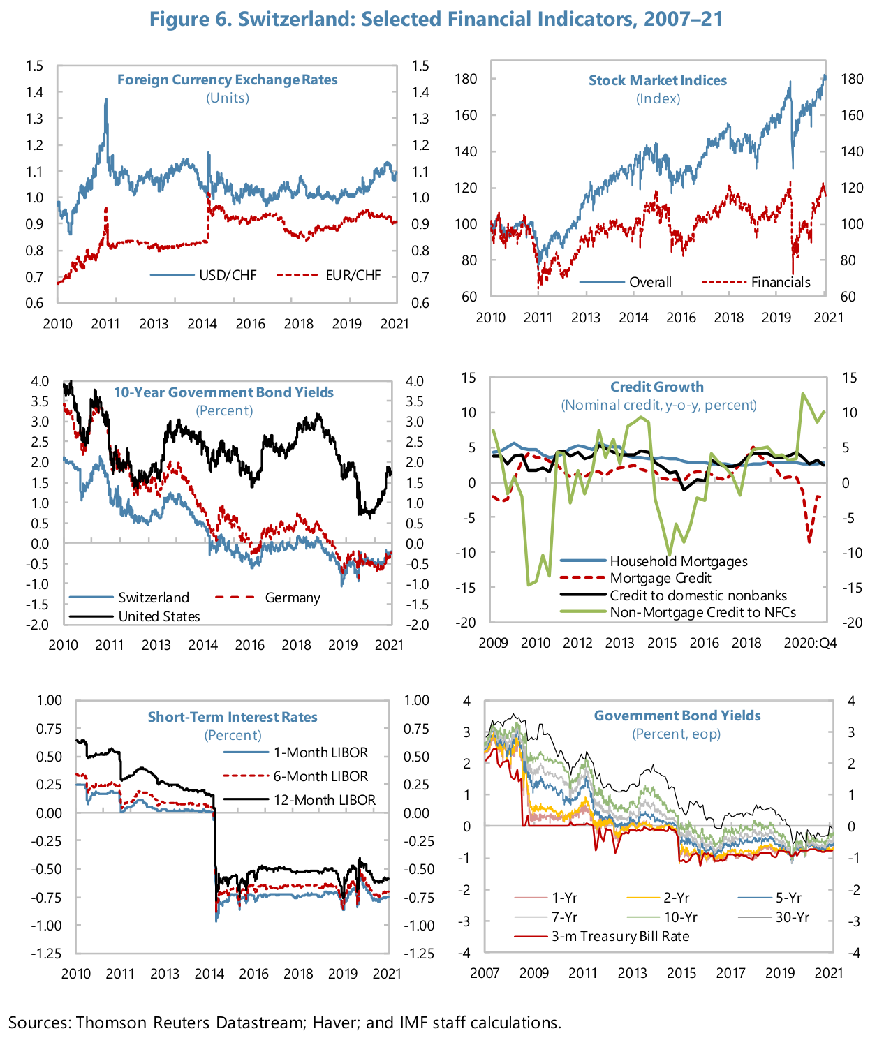
The figure presents a coordinated set of six panels that together portray exchange-rate movements, equity valuations, yields across maturities, short-term interest rates, and credit-growth dynamics for Switzerland and comparators over roughly 2010–21. Reading across panels reveals three consistent motifs: abrupt regime shifts in early 2011–2015, a long-run compression of nominal yields into negative territory for short and intermediate Swiss tenors, and a divergence between broad equity gains and the more muted path of bank/financial-sector stocks.

In the top-left panel, the blue line (USD/CHF) and the red dashed line (EUR/CHF) show distinct levels and turning points. USD/CHF climbs from near 1.0 in 2010 to a pronounced peak around 1.35–1.4 in 2011, then trends downward through 2012–14 to roughly 1.0, drops  in the mid-decade to about 0.95–1.0, and then drifts upward again to a little above 1.1 by 2020–21. EUR/CHF (red dashed) starts around 0.6–0.7 in 2010, moves up toward 1.0 in 2011, and afterward fluctuates in a band near 0.85–0.95 for most of the decade, finishing the series slightly below or around 0.95 in 2020–21. Thus the U.S. dollar shows larger amplitude swings against the franc than the euro does.

The top-right panel contrasts two equity series: the blue solid "Overall" index and the red dashed "Financials" index. The Overall index begins around 100 in 2010, dips to roughly 80 in 2011, then embarks on a sustained ascent to approximately 140–160 by 2017–19, with peaks near 180 by 2020–21. Financials track below the overall index for most of the period: starting near 100 in 2010, they fall to roughly 60–80 in the early decade, recover unevenly to about 100–120 in the late 2010s, and remain substantially below the overall index when the latter reaches its 160–180 range. The gap implies persistent underperformance of the financial sector relative to the broader market index across the shown interval.

Middle-left, the 10-year government bond yields panel plots three yields with clear separation. The blue Switzerland 10-year yield falls from around 2.0 percent in 2010 to near zero by about 2015 and declines further into negative territory, reaching roughly -0.5 to -0.7 percent in the late 2010s before edging up toward zero by 2021. Germany (red dashed) mirrors this direction but generally sits slightly above Swiss levels in the later years, moving from around 3.0–3.5 percent in 2010 down to negative territory near -0.5 percent by 2019–20. The United States 10-year yield (black) starts highest—around 3.5–4.0 percent in 2010—dips to roughly 1.5 percent by 2012, rises to near 3.0 percent in 2018, then falls again toward about 1.0–1.8 percent by 2020–21. The contrast underscores a compression to negative yields in core European tenors while U.S. yields remain positive and more volatile.

Middle-right, credit growth (nominal, y-o-y percent) displays four series. Household mortgages (blue) are relatively steady, centered around 3–6 percent through the period. Mortgage credit (red dashed) runs slightly lower, typically -3–5 percent. Non-mortgage credit to nonfinancial corporations (light green)  is the most volatile: it plunges to roughly -15 percent around 2010–11, then rebounds sharply to peaks near 10–12 percent in spikes around 2012 and again near 2020, before oscillating around low single digits.Credit to domestic nonbanks (dark green) mostly occupies a moderate positive band of about 0–5 percent with oscillations; it shows elevated readings in a few years and a dip toward low single digits near the end of the series. Overall, mortgage-related series are steady positive contributors while nonbank credit exhibits episodic large swings.

Bottom-left displays short-term interest rates (1-month LIBOR blue, 6-month red dashed, 12-month black). All three start positive in 2010—roughly 0.25–0.75 percent for short tenors and higher for the 12-month—then undergo a large step down into substantially negative territory in the mid-de
|
2
|
92923e9349f629bd8442b480cfbbc863
|
|
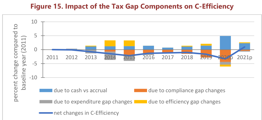
Figure 15 presents a year-by-year decomposition of how four tax-gap components contribute to changes in C‑Efficiency relative to the 2011 baseline, together with the net percent change in C‑Efficiency plotted as a line. Reading the line first, C‑Efficiency drifts slightly negative after 2011, with a modest decline through 2013 and a more pronounced trough in the mid‑decade, then recovers toward zero before a sharp deterioration in 2020 and a projected rebound in 2021. Numerically, the net change sits essentially at zero in 2011, is slightly negative in 2012 (near −0.2 percentage points), drops further to roughly −1.5 by 2013 and reaches its mid‑decade low around −2 to −2.5 in 2015; it then edges back toward −2 to −1 by 2015–2016, hovers near zero across 2017–2019, plunges again to the chart’s largest decline in 2020 (on the order of −3 to −4), and is projected to recover to a small positive outcome in 2021 (approximately +1 to +2).

The stacked bars for each year decompose that overall movement into four components: the impact “due to cash vs accrual,” “due to compliance gap changes,” “due to expenditure gap changes,” and “due to efficiency gap changes.” The cash-versus-accrual contribution (blue bars) is the most visibly variable contributor: nearly zero in the early years, increasing to small positive values in the 2013–2016 window, and rising sharply in 2020 where it attains its largest positive single‑year contribution (about +5 percentage points). That same cash/accrual contribution remains positive in the 2021 projection (roughly +2 to +3).

The compliance-gap changes (orange segments) are the principal negative driver in several years. Visually, orange segments extend below the zero line in most years, with notable negative magnitude in 2014–2015 (each roughly −2 to −3) and a particularly deep negative contribution in 2020 (on the order of −4). In contrast, that negative compliance contribution is smaller in 2016–2018 and modestly negative again in 2019, but it is visibly less adverse in the 2021 projection than in 2020.

Expenditure-gap changes (gray) generate additional downward pressure in the years where they are pronounced. The gray segments are most noticeable in 2014 and 2015 (each roughly around −2 to −3) and again in 2020 where the gray bar contributes materially to the overall decline (near −0.5 to −1). In most other years the expenditure-gap effect is small or negligible relative to compliance and cash/accrual.

Efficiency-gap changes (yellow) generally contribute small positive offsets across the series. The yellow segments sit above zero in several years—most clearly in 2013–2015 where they add visibly to the positive side (each roughly 2 to 3), and in 2018–2019 where they give a modest upward nudge. In 2020 the yellow slice is minimal and may slightly reduce rather than raise C‑Efficiency, while the 2021 projection shows a small positive efficiency contribution that helps the net rebound.

Putting the pieces together, the mid‑decade net decline (2013–2015) reflects a combination of stronger negative compliance and expenditure‑gap contributions that outweigh modest positive cash/accrual and efficiency effects; the near‑zero net results in 2016–2019 come from a balance between small positive cash/accrual and efficiency contributions and smaller negative compliance/expenditure effects; the deep 2020 downturn is driven mainly by a pronounced negative compliance gap and an appreciable expenditure‑gap decline that together outweigh the year’s unusually large positive cash‑vs‑accrual contribution; and the 2021 projection suggests a partial recovery when the positive cash vs accrual and efficiency components increase while the negative compliance and expenditure effects are reduced. Overall, the chart highlights that fluctuations in the compliance gap and the cash/accrual treatment are the dominant forces behind the largest swings in annual C‑Efficiency relative to the 2011 baseline.
|
3
|
8b43c6f6136c8f5b52141f6a3b067f47
|
|
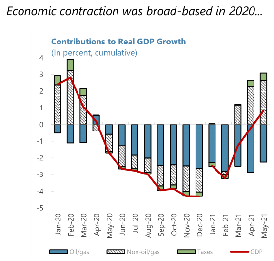
The chart documents a pronounced two-phase movement: an early-2020 expansion dominated by non-oil activity followed by a rapid, broad-based contraction that reaches its nadir in autumn 2020 and only begins to recover in the spring of 2021. Quantitatively, the aggregate (red) GDP line rises from roughly 2.5 percentage points in January 2020 to a peak near 2.8–3.0 points in February, then eases to about 2.1 points in March before reversing sharply. By April and May 2020 the cumulative growth rate crosses into negative territory (April roughly +0.6 to +0.8; May around −1.8), and the decline deepens through the summer to a trough in November 2020 near −4.2 to −4.4 percentage points, remains around −2.9 to −3.1 in early 2021, and climbs toward zero and then slightly positive territory by May 2021 (about +1.0–1.5).

Decomposing that trajectory into the three stacked components clarifies the drivers. In the expansion phase (January–March 2020) the non-oil/gas sector (hatched bars) supplies by far the largest positive contribution: approximately +2.4–3.3 percentage points across those months, with February at the highest point near 3.0–3.3. Oil and gas (solid blue) in this same interval either subtract from or barely add to growth: January shows a small negative contribution (around −0.3), February a larger negative contribution (roughly −1 to −1.1), and March a modest negative effect near −0.9 to −1. Taxes (thin green slivers) provide a small positive offset early in 2020—on the order of +0.2 to +0.6 points—so that the net pre-crisis GDP reading remains comfortably positive despite headwinds from oil/gas.

The contraction that begins in April 2020 is visibly broad-based: both the non-oil/gas and oil/gas components turn negative and together drive cumulative GDP sharply down. By May 2020 the non-oil/gas block shifts from positive to roughly −1.2 to −1.3 points while oil/gas contributes an additional −0.6 to −0.8, producing an aggregate around −1.8. Through June–August the non-oil contribution deteriorates further (about −1.9 to −2.1) and oil/gas weakness deepens (about −0.8 to −1.1), bringing cumulative losses into the −2.7 to −3.2 range. The deepest monthly aggregate loss appears in September–October 2020: non-oil/gas is roughly −2.8 to −3.0 and oil/gas approximately −1.2 to −1.4, with taxes providing at best a neutral or very small negative adjustment; their sum yields the trough near −4.2 to −4.4 percentage points.

From late 2020 into 2021 the pattern shifts from further deterioration to stabilization and recovery. November–December 2020 record smaller negatives (around −3.6 to −3.7) as the magnitude of non-oil/gas losses eases by several tenths of a point and oil/gas weakness moderates. Early 2021 retains a negative aggregate—February is still around −3.0 to −3.2—but the composition begins to change: the hatched non-oil/gas component starts to regain ground between February and March, while oil/gas remains a drag. By March 2021 the rebound in non-oil/gas is visible enough to reduce the aggregate to roughly −1.2 to −1.4 points. That rebound accelerates into April–May 2021, when non-oil/gas contributes a clear positive swing (May roughly +2.4–2.6), taxes add a modest positive contribution (around +0.4–0.6), and oil/gas still subtracts but by a reduced amount (about −1.4 to −1.6), yielding a net positive GDP contribution of approximately +1.0–1.5 in May.

In sum, the contraction is concentrated in the non-oil/gas sector in absolute terms—this component accounts for the largest positive shares before the downturn and the largest negative shares at the trough—while oil and gas exert an important persistent negative influence across much of 2020. Taxes play only a marginal stabilizing role throughout. The cumulative numbers emphasize that the 2020 decline was truly broad-based: both major sectors moved from positive contributions into multi-point declines, producing an aggregate swing of roughly 7 to 8 percentage points from the Februa
|
4
|
251fa078d963b837d38cfa3b3a0dee86
|
|
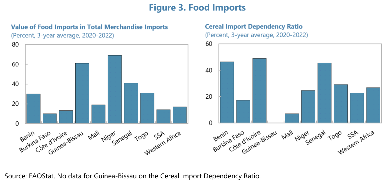
The two juxtaposed panels expose a consistent but heterogeneous relationship between the importance of food within overall merchandise trade and countries’ reliance on imports to meet cereal needs across a 3‑year average (2020–2022). Reading the left panel as a measure of the share that food represents in total merchandise imports, Niger and Guinea‑Bissau stand out as the largest exposures: Niger’s food-imports share is the highest at roughly 68–72 percent, while Guinea‑Bissau is the next largest near the 60–65 percent range. Senegal occupies an intermediate, materially smaller position at about 40–42 percent. Benin and Togo register moderate values in the low‑to‑mid 20s to low 30s (Benin ≈30 percent; Togo ≈30–32 percent). Mali and Western Africa’s aggregate bar are close to one another — roughly 18–22 percent — and Côte d’Ivoire and the SSA aggregate lie at the lower end, around 12–16 percent for Côte d’Ivoire and roughly 12–15 percent for SSA. Burkina Faso is among the lowest in this panel at about 8–12 percent. In short, the left panel shows a wide span from under about 10 percent up to roughly 70 percent, with a small group of countries (Niger, Guinea‑Bissau) accounting for markedly higher shares of merchandise imports being food.

The right panel, which isolates cereal import dependency, reveals a different pattern of cross‑country variation that does not simply mirror the left panel. Côte d’Ivoire and Benin are notable for high cereal dependency despite Côte d’Ivoire’s modest food share: Côte d’Ivoire’s cereal import dependency is approximately 48–52 percent, one of the highest values in the set, while Benin’s cereal‑dependency ratio is also high at roughly 45–48 percent. Senegal likewise shows a high cereal dependency close to the mid‑40s percent. Togo and Western Africa are in the mid‑20s to mid‑30s (Togo ≈34–36 percent; Western Africa ≈26–28 percent), while the SSA aggregate sits a bit lower, near the mid‑20s. Niger has a moderate cereal dependency around 24–28 percent despite its very large food‑import share. Burkina Faso and Mali show relatively low cereal‑dependency ratios: Burkina Faso about 15–18 percent and Mali noticeably low near 6–9 percent. The chart also indicates that there are no available cereal‑dependency data for Guinea‑Bissau; that absence interrupts any direct two‑panel comparison for that country.

Comparative analysis highlights several systematic divergences. First, high overall food import shares do not universally correspond to the highest cereal dependency: Niger and Guinea‑Bissau register the largest proportions of merchandise imports as food but do not exhibit equally extreme cereal‑dependency ratios (Niger is moderate; Guinea‑Bissau’s cereal data are missing). Conversely, Côte d’Ivoire displays a modest food‑import share yet one of the highest cereal‑dependency ratios, implying cereals constitute a disproportionately large component of its food imports. Benin follows a similar pattern: a moderate overall food‑import share but comparatively high cereal dependency. Senegal is one of the few countries where both indicators are elevated and roughly comparable (food share ≈40 percent; cereal dependency ≈45 percent), indicating that cereals are both a large part of food imports and that food itself forms a large share of merchandise imports.

At the regional level, the SSA and Western Africa aggregates show lower food shares relative to some individual countries but cereal dependency in the mid‑20s, signaling that cereals form a meaningful portion of imports at the regional scale even when food as a whole is a smaller share of merchandise trade. The scatter of values between roughly 6–9 percent (Mali’s cereal dependency) and approximately 50 percent (Côte d’Ivoire) underlines pronounced heterogeneity in how food and cereals link to trade portfolios across the set. Overall, the figure conveys two related but non‑identical dimensions of import reliance: the magnitude of food within merchandise trade
|
5
|
1029333644d017af7b9b9d1976f8b3d6
|
|
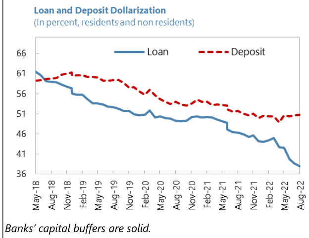
The figure titled "Loan and Deposit Dollarization" traces two distinct time series for the percent share of foreign-currency (dollar) denomination in loans (solid blue) and in deposits (red dashed) for residents and non-residents over the period May‑2018 through Aug‑2022. Visually and numerically, the most striking result is a sustained and pronounced decline in loan dollarization that is both larger in absolute terms and steeper in slope than the decline in deposit dollarization, producing an expanding gap between the two series by the end of the sample.

At the start of the series in May‑2018 both series are close together: loan dollarization sits just above 61 percent while deposit dollarization is slightly below  61 percent. Through the remainder of 2018 and into 2019 the two lines diverge: deposits register a modest rise and plateau in the low‑60s (peaking roughly around 62 percent in late‑2018/early‑2019) while loans drift down from the low‑60s into the mid‑50s by mid‑2019. By May‑2019 the blue loan line is approximately in the 53–55 percent band whereas deposits remain near the low‑60s, implying an early gap of roughly 7–9 percentage points.

From mid‑2019 through 2020 both series begin to trend downward but at different paces. Deposit dollarization moves from the low‑60s into the high‑50s and then into the mid‑50s by mid‑2020, a decline on the order of 5–8 percentage points over roughly one year. Loan dollarization falls more sharply over the same interval: it crosses the 50 percent mark around late‑2019 / early‑2020 and oscillates near 48–51 percent through much of 2020, with a small, short‑lived uptick visible around mid‑2020 before resuming its downward trajectory.

During 2021 the divergence continues but narrows temporarily in absolute gap: deposits hover in the mid‑50s to low‑50s (around 53–55 percent early in 2021, slipping toward 51–52 percent later in the year), while loans progressively move from roughly 49–50 percent at the start of 2021 down to the mid‑40s by mid‑2021. This phase shows both series declining but loan dollarization losing share faster, maintaining a consistent lower position relative to deposit dollarization.

The most pronounced separation occurs in 2022. Deposit dollarization records a continued but mild fall into the low‑50s by Aug‑2022 (approximately 50–52 percent), whereas loan dollarization steepens its descent, reaching roughly the high‑30s by Aug‑2022 (about 37–39 percent). Put differently, from May‑2018 to Aug‑2022 loan dollarization declines by roughly 23–25 percentage points (a fall from about 62 to about 38 percent), whereas deposit dollarization declines by about 9–11 percentage points (from roughly 61 to about 50–51 percent). The gap between deposits and loans therefore widens from near zero in May‑2018 to approximately 12–14 percentage points by Aug‑2022.

Short‑term fluctuations are modest for deposits — a plateau in 2018–2019 followed by a gradual slide — while loans show a more continuous and steeper downward slope punctuated by small rebounds (notably around mid‑2020 and early‑2021). Throughout the series deposits remain at all times at or above loan dollarization after mid‑2018, underlining a structural pattern in which banks’ deposit dollarization is comparatively stickier and higher, whereas loan dollarization has retrenched substantially over the four‑year window. The caption below the panel—"Banks' capital buffers are solid."—appears as an accompanying observation but the plotted data themselves primarily document the relative pace and magnitudes of decline: loans falling by roughly twice the absolute number of percentage points as deposits over the sample.
|
6
|
fcbc54a5131efe71d3c26bf9a0143ec9
|
|
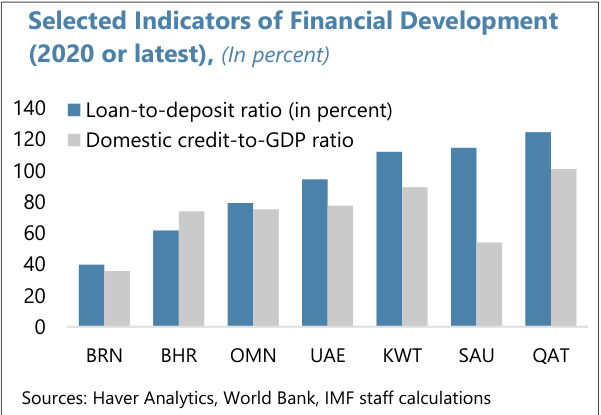
Selected Indicators of Financial Development (2020 or latest), (In percent)

The chart compares two complementary measures of banking-sector scale across seven economies: the loan‑to‑deposit ratio (blue bars) and the domestic credit‑to‑GDP ratio (gray bars). Numerical reading of the bars yields the following approximate values (all in percent): BRN — loan‑to‑deposit ~40, domestic credit‑to‑GDP ~35; BHR — loan‑to‑deposit ~65, domestic credit‑to‑GDP ~75; OMN — loan‑to‑deposit ~80, domestic credit‑to‑GDP ~75; UAE — loan‑to‑deposit ~95, domestic credit‑to‑GDP ~80; KWT — loan‑to‑deposit ~110, domestic credit‑to‑GDP ~90; SAU — loan‑to‑deposit ~115, domestic credit‑to‑GDP ~55; QAT — loan‑to‑deposit ~125, domestic credit‑to‑GDP ~100.

Two patterns are immediately apparent. First, loan‑to‑deposit ratios span a wider interval (roughly 40% to 125%) than domestic credit‑to‑GDP ratios (about 35% to 100%). Second, in five of the seven cases the loan‑to‑deposit ratio exceeds domestic credit as a share of GDP (BRN, OMN, UAE, KWT, SAU, QAT), while in one economy (BHR) domestic credit‑to‑GDP outstrips the loan‑to‑deposit ratio by roughly 10 percentage points (75% vs 65%). The only near parity occurs in OMN where loan‑to‑deposit (~80%) and domestic credit (~75%) differ by about 5 points.

Examining magnitudes and dispersion yields further contrasts. The highest loan‑to‑deposit reading is QAT at approximately 125%, followed by SAU (~115%) and KWT (~110%); UAE (~95%) and OMN (~80%) occupy the midrange, while BHR (~65%) and BRN (~40%) sit at the lower end. For domestic credit‑to‑GDP, QAT leads with about 100%, KWT follows at roughly 90%, UAE and OMN are clustered around 80–75%, BHR is at approximately 75%, SAU is markedly lower at about 55%, and BRN records the smallest value near 35%. Thus QAT and KWT score highly on both indicators, whereas BRN records the lowest values on both measures.

Relative gaps between the two metrics highlight noteworthy outliers. Saudi Arabia (SAU) shows the largest divergence: loan‑to‑deposit (~115%) exceeds domestic credit‑to‑GDP (~55%) by about 60 percentage points, indicating that lending relative to deposits in that economy is large compared with credit stock relative to national income. Qatar (QAT) also exhibits a substantial gap of roughly 25 points (125% vs 100%), and Kuwait (KWT) shows a 20‑point surplus of loan‑to‑deposit over domestic credit (110% vs 90%). By contrast, Bahrain (BHR) displays an inverse pattern where domestic credit (~75%) is about 10 points higher than the loan‑to‑deposit ratio (~65%). Oman (OMN) and BRN show modest differences of roughly 5 points and 5 points respectively, with OMN’s loan‑to‑deposit slightly above credit‑to‑GDP and BRN following the opposite order but at low absolute levels.

A simple aggregation of these approximations yields an average loan‑to‑deposit ratio near 90% (sum ≈630 across seven economies) and an average domestic credit‑to‑GDP near 73% (sum ≈510), reinforcing that, on average, loan volumes relative to deposits exceed domestic credit relative to GDP for this set. In sum, the dataset reveals heterogeneity across economies: some (QAT, KWT) register high values on both measures, one (BHR) has higher domestic credit relative to GDP than lending against deposits, and SAU stands out for an unusually large spread between lending activity and credit as a share of output.
|
7
|
36f55d82b204d555c042b126f376cf25
|
|
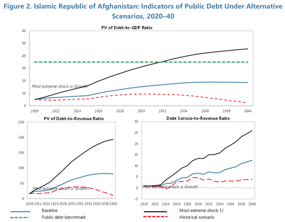
Across the three panels, the alternative-scenario trajectories diverge sharply, with the “most extreme shock” scenario producing the largest and fastest deterioration in all debt indicators, the baseline following a moderate upward path, and the historical scenario remaining comparatively contained. In the top panel (PV of Debt-to-GDP Ratio) the black line labeled “Most extreme shock” starts near roughly 5 percent in 2020 and climbs steadily, crossing the green dashed public-debt benchmark (at about 35 percent) around 2032 and continuing to about 50 percent by 2040. The baseline (solid blue) also rises from roughly 5 percent in 2020 but much more gradually, reaching a plateau in the high teens—around 18–20 percent—after the mid-2030s and ending slightly below 20 percent in 2040. The historical scenario (red dashed) shows a slight rise into the mid-2020s to about 8–10 percent, then a gradual decline through the 2030s to near zero–low single digits by 2040. Thus, only the extreme shock trajectory breaches the public-debt benchmark and does so decisively after 2030; the baseline remains well under that threshold throughout.

The lower-left panel (PV of Debt-to-Revenue Ratio) amplifies those differences in scale. Under the extreme shock (black), the ratio accelerates from a low base in 2020 to exceed 100 percent in the late 2020s and approach 200 percent by 2040, indicating a radical widening relative to revenues. The baseline path (blue) climbs more moderately to the order of 70–90 percent by the early-to-mid 2030s and then flattens or slightly declines toward the late 2030s, ending around the high seventies or low eighties. The historical scenario (red dashed) is comparatively muted: a small uptick into the 2020s to the 20–40 percent band, then a descending trend that brings it down to low double digits—near 10 percent—by 2040. The timing is notable: the largest gap between the extreme shock and baseline opens in the 2026–2034 interval when the black line’s slope is steepest, indicating rapid accumulation of debt relative to revenue in that decade.

Debt-service pressures mirror these PV dynamics in the lower-right panel (Debt Service-to-Revenue Ratio). The most extreme shock produces a rapid rise from essentially zero in 2020 to roughly 10 percent by the late 2020s and then a sustained acceleration to about 30 percent by 2040. The baseline debt-service ratio increases more moderately, reaching roughly 8–12 percent by the end of the projection window, with steady growth concentrated after the mid-2020s. The historical scenario remains near the bottom of the range, fluctuating between approximately 0 and 5 percent across the horizon and ending near 3–4 percent in 2040. The comparative dynamics show that debt-service obligations under the extreme shock not only grow larger in absolute terms but also rise earlier and faster than under the baseline, potentially consuming a much larger share of revenue from the early 2030s onward.

Taken together, the three panels highlight a consistent pattern: the extreme-growth shock generates the most severe and sustained deterioration across present-value and flow indicators, crossing the explicit public-debt benchmark around 2032 in PV Debt-to-GDP and producing very large PV Debt-to-Revenue and Debt Service-to-Revenue ratios by 2040; the baseline implies a significant but contained increase concentrated in the 2026–2036 decade; and the historical scenario remains broadly manageable with ratios that peak modestly and then fall toward the horizon. These relative magnitudes and timing differences are the defining features of the charted scenarios.
|
8
|
0b0adc9c8bbdd1cde6fd639973d77748
|
|
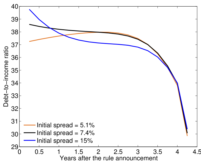
The chart displays three distinct trajectories of the debt‑to‑income ratio over roughly four and a quarter years after a policy announcement, differentiated by the initial spread associated with each series: an orange series for an initial spread of 5.1%, a black series for 7.4%, and a blue series for 15%. All three lines share a common long‑run pattern: relatively modest movement during the first half of the horizon, convergence toward a narrow band between years 1 and 3, and then a pronounced, simultaneous decline beginning shortly after year 3 that carries each series down to roughly 30 by the end of the plotted period.

Quantitatively, the blue series (initial spread = 15%) starts at the highest level on the vertical scale, just under 40 units. Its debt‑to‑income ratio is about 39.8 at year 0, falls to roughly 37.6 by year 1, and reaches approximately 37.0 by year 2. Between years 2 and 2.5 the blue series continues a gentle downward drift to about 36.9. From year 2.5 to year 3 the decline remains gradual (near 36.7), but after year 3 the slope steepens: the series drops to roughly 36.3 at year 3.5, to near 34.0 at year 4.0, and finally to about 30.5 by the final x‑value shown.

The black series (initial spread = 7.4%) begins in the high 38s—approximately 38.5 at year 0—then follows a mild downward slope across the next two years: roughly 38.2 at year 1 and about 38.0 by year 2. From year 2 through year 2.5 it remains essentially flat at about 38.0, and by year 3 it is still just under 38. After year 3 the black series declines more rapidly: roughly 36.3–36.5 at year 3.5, around 33.8 at year 4.0, and finishes close to 30.2 at the final plotted point.

The orange series (initial spread = 5.1%) starts lowest among the three, at about 37.3 at year 0, but it rises modestly during the first one to two years, reaching roughly 37.8–38.0 by year 1.5–2.5. The orange line essentially meets the black series in the 38‑unit neighborhood around year 2–2.5. Past year 2.5 it turns downward, mirroring the other series: about 37.8 at year 3, near 36.2 at year 3.5, about 33.9 at year 4.0, and finishing at approximately 30.0 at the end of the horizon.

Comparative dynamics are informative. Initially, higher initial spread corresponds to a higher debt‑to‑income ratio (blue > black > orange at year 0), but the rate of decline differs: the blue series declines more sharply in the earliest interval (year 0 to year 2) than the black series, producing an early narrowing of gaps. By around year 1.5–2.5 all three series converge to a tight band clustered around 37–38 units. After that convergence, their mid‑horizon behavior is quite similar until a coordinated acceleration of decline occurs after year 3, when each series steepens and falls roughly 4–7 units within about one year. By the final observation the three trajectories have essentially coalesced near the 30–31 range.

In sum, the figure shows three different starting positions tied to initial spread values, a short period of divergence and mild adjustment, convergence into a narrow band around 37–38 between years 1 and 3, and then a pronounced simultaneous drop after year 3 bringing all series to approximately 30 at the end of the plotted period. The most notable numeric features are the high starting point near 39.8 for the 15% spread, the mid‑horizon clustering near 38 across all spreads, and the steep terminal decline of roughly 6–9 units from the mid‑horizon band to the final values.
|
9
|
3e326c4ab05e655629dd5540181d5523
|
|
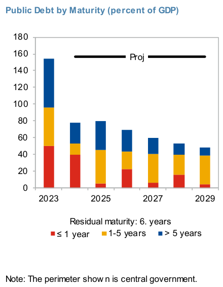
The stacked bars trace a clear and sustained decline in total public debt expressed as percent of GDP across the plotted years, and they also document a marked reallocation of that stock among three residual‑maturity buckets: short (≤1 year, red), medium (1–5 years, yellow) and long (>5 years, blue). The first column (2023) is the dominant observation: visually it reaches just below the 160 grid line and decomposes into roughly 50 percentage points in the short‑term bucket, about 45 points in the 1–5 year bucket, and roughly 60 points in the >5 year bucket, summing to an estimated total of 155 percent of GDP. In short, in 2023 long maturities represent the largest single component (≈60 points, about 39 percent of the 2023 total), with short maturities close behind (≈50 points, ≈32 percent) and the 1–5 year tranche contributing the remainder (≈45 points, ≈29 percent).

From that starting point the overall height of the stacked bars falls sharply. By the mid‑period column shown (the bar labeled 2025 along the x‑axis), the total has declined to about 80 percent of GDP. Its decomposition is visibly different: the long‑term (>5 years) component remains sizable at roughly 20-25 points (about half of that bar), the medium 1–5 year slice is close to 40 points (roughly 55 percent of that bar), and the short ≤1 year slice is negligible by comparison (only a handful of points, on the order of 4–6 percent of that column). This reflects a rapid drop in the short‑term share between 2023 and 2025, and a relative rise in the share of medium maturities within the shrinking total.

Successive columns continue the downward trajectory in absolute percent‑of‑GDP terms. A later column corresponding to 2027 stands at roughly 60 percent of GDP in total: its breakdown appears to be about 5–8 points in the short bucket, about 34–36 points in the medium bucket, and about 20–22 points in the long bucket. Compared with 2023, the long bucket has fallen in absolute terms from ≈60 points to ≈20 points, while the medium bucket has edged to become the single largest slice of the remaining stock. By the final labeled year (2029) the total has contracted further to roughly 45–50 percent of GDP; that last bar is composed of a small short‑term portion (≈2–3 points), a medium portion on the order of 30–35 points, and a long‑term portion of roughly 12–16 points.

Two interrelated patterns emerge from these numeric relationships. First, the aggregate public‑debt burden measured here declines by well over half between the first and last plotted columns (from roughly 155 percent to approximately 48 percent of GDP). Second, the maturity composition shifts: the short‑term share collapses from roughly one‑third of the 2023 total to a negligible share by the end of the series; the long‑term share, sizable in absolute terms in 2023, declines substantially in both absolute and relative terms; and the medium (1–5 year) bucket becomes the dominant component of the remaining debt stock, representing roughly half to two‑thirds of the later‑period bars. Visually, the black horizontal line labeled “Proj” sits near the upper part of the panel (around the 150 grid line) and draws attention to the high initial stock relative to subsequent projections. The figure also carries the textual annotation “Residual maturity: 6. years” beneath the x‑axis and a footnote referencing the perimeter shown as central government; these labels contextualize the decomposition and indicate the residual‑maturity basis used to construct the stacks. Overall, the chart conveys a rapid reduction in headline public‑debt percentages together with a reallocation away from short‑term and very long maturities toward the medium‑term bucket across the displayed timeline.
|
10
|
478a5fdf22676b2576d28708979f7f98
|
|
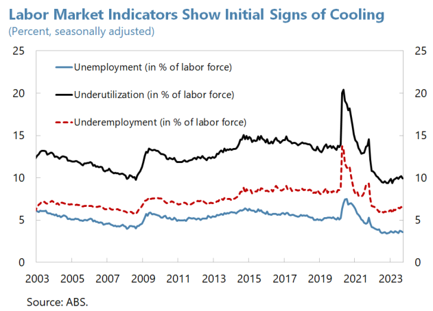
Across the two-decade span depicted, three labor measures move together through long-term compression followed by a sharply synchronous shock in 2020 and a pronounced reallocation thereafter. The black solid series (underutilization) is consistently the largest metric, the red dashed series (underemployment) lies in the middle, and the blue solid series (unemployment) remains the smallest throughout — a persistent ordering that frames the chart’s narrative.

Beginning in the early 2000s, underutilization registers near the low-to-mid teens: roughly 13 percent in 2003, edging down toward about 11–12 percent by the mid-2000s. The global financial crisis period around 2009 produces a discernible elevation in both underutilization and underemployment: underutilization rises to approximately 14–15 percent while underemployment climbs from roughly 6–6.5 percent before the crisis to near 7–8 percent at the trough. Unemployment (the blue line) follows the same cyclical pattern but at lower absolute levels, sitting close to 6 percent in 2003, dipping slightly below 5 percent around 2007–2008, then increasing to roughly 5.5–6 percent in 2009.

From roughly 2010 through the end of the 2010s the three series show gradual and modest movement rather than volatility. Underutilization hovers in the 12–15 percent band across the 2011–2019 interval, with small oscillations but no persistent upward or downward trend. Underemployment drifts slowly upward from the post‑2009 trough, typically occupying a band around 6–8 percent through the 2010s. Unemployment trends modestly downward across the same interval, staying generally between about 4.5 and 5.5 percent for much of the decade and thereby narrowing the gap to the other two measures only slightly.

A pronounced, simultaneous spike occurs at the 2019–2020 inflection point. Underutilization escalates sharply from its late‑2019 level near 13–14 percent to a peak around 20–21 percent during the 2020 shock. Underemployment more than doubles relative to its typical pre‑shock level, jumping from roughly 7–8 percent to about 13–14 percent at the same peak. Unemployment rises as well, but the magnitude is smaller in absolute terms: the blue series climbs from pre‑2020 levels near 5 percent to a peak roughly between 7 and 8 percent. Thus the 2020 disturbance disproportionately amplifies the broader measures of labor slack (underutilization and underemployment) relative to measured unemployment.

Following the spike, all three indicators fall significantly. Unemployment declines most rapidly from its 2020 peak to reach a low near 3.5–4 percent by 2022–2023, a level below most of the pre‑2020 decade. Underutilization retreats from its 20–21 percent apex back down into the low double digits, approximately 10–12 percent by 2022–2023, ending the period below the midpoint of the 2010s band but still above the lowest early‑2000s values. Underemployment also declines from its pandemic peak to settle around 8–9 percent by 2022–2023, remaining clearly above the blue unemployment series and indicating that a meaningful share of the labor force continues to experience underemployment even as measured unemployment falls.

Comparative dynamics are notable: across the entire period the gap between underutilization and unemployment is the largest and most persistent, though it narrows somewhat after the 2020 episode as underutilization falls faster in absolute terms. The red dashed underemployment line maintains a middle position, but its relative volatility around 2020 is higher in percentage terms than unemployment’s; it roughly doubles at the shock and then declines to a level modestly elevated relative to the pre‑2019 trend. Overall, the chart portrays a two‑decade context of moderate pre‑pandemic stabilization, a large temporary expansion of labor slack in 2020 concentrated in broad measures of underutilization and underemployment, and a subsequent rapid contraction in unemployment accompanied by a slower normaliz
|