| # | id | image | code | csv | summary | chart_type | library |
|---|
1
|
42ed3c42-dc30-43ef-9c5f-8592d20eaf28
|
|
import seaborn as sns
import matplotlib.pyplot as plt
import pandas as pd

data = {
    'Year': [2008, 2008, 2009, 2009, 2010, 2010, 2011, 2011, 2012, 2012, 2013, 2013, 2014, 2014],
    'Coverage': [
        29.8, 11.5, 32.5, 11.5, 31.0, 11.5, 35.0, 12.0,
        34.5, 14.0, 36.5, 14.5, 38.5, 15.0
    ],
    'Source': [
        'Private Bureau', 'Public Registry', 'Private Bureau', 'Public Registry',
        'Private Bureau', 'Public Registry', 'Private Bureau', 'Public Registry',
        'Private Bureau', 'Public Registry', 'Private Bureau', 'Public Registry',
        'Private Bureau', 'Public Registry'
    ]
}

df = pd.DataFrame(data)

plt.figure(figsize=(10, 6))
sns.kdeplot(
    data=df,
    x='Coverage',
    hue='Source',
    fill=True,
    common_norm=False,
    palette={'Private Bureau': '#3498db', 'Public Registry': '#e74c3c'},
    alpha=0.6,
    linewidth=2
)

plt.title('Distribution of Credit Bureau Coverage in Bolivia (2008-2014)', pad=20, fontsize=12)
plt.xlabel('Percentage of Adult Population Covered (%)', fontsize=10)
plt.ylabel('Density', fontsize=10)
plt.xlim(0, 50)
plt.grid(True, linestyle='--', alpha=0.5)

plt.tight_layout()
plt.savefig('output.png', dpi=150, bbox_inches='tight')
|
Percentage,Source,Density
10.0,Public Registry,0.000
10.5,Public Registry,0.005
11.0,Public Registry,0.020
11.5,Public Registry,0.220
12.0,Public Registry,0.150
12.5,Public Registry,0.120
13.0,Public Registry,0.080
13.5,Public Registry,0.050
14.0,Public Registry,0.040
14.5,Public Registry,0.030
15.0,Public Registry,0.020
15.5,Public Registry,0.010
16.0,Public Registry,0.000
25.0,Private Bureau,0.000
26.0,Private Bureau,0.005
27.0,Private Bureau,0.010
28.0,Private Bureau,0.020
29.0,Private Bureau,0.030
30.0,Private Bureau,0.040
31.0,Private Bureau,0.050
32.0,Private Bureau,0.060
33.0,Private Bureau,0.075
34.0,Private Bureau,0.090
35.0,Private Bureau,0.105
36.0,Private Bureau,0.100
37.0,Private Bureau,0.085
38.0,Private Bureau,0.070
39.0,Private Bureau,0.050
40.0,Private Bureau,0.035
41.0,Private Bureau,0.020
42.0,Private Bureau,0.010
43.0,Private Bureau,0.005
44.0,Private Bureau,0.000
|
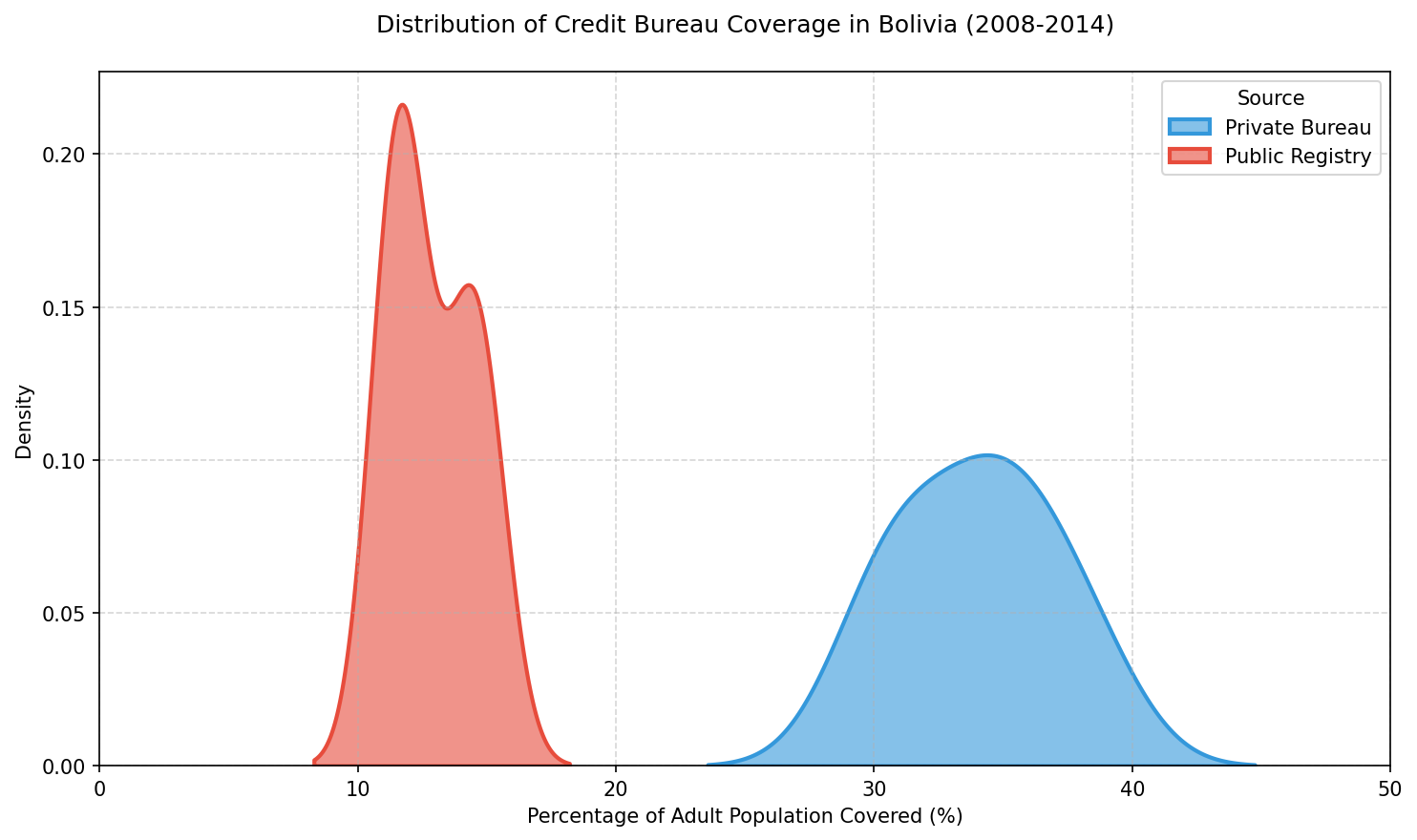
This image presents a kernel density estimate (KDE) plot illustrating the distribution of credit bureau coverage in Bolivia from 2008 to 2014. The chart compares two sources of credit data: Private Bureau and Public Registry, each represented by distinct colors—blue for the Private Bureau and red for the Public Registry.

The x-axis denotes the percentage of the adult population covered, ranging from 0% to 50%. The y-axis represents the density, indicating how frequently various coverage percentages occur within the dataset. The Private Bureau's coverage distribution, shown in blue, spans from approximately 25% to 45%, peaking around 35% with a density slightly above 0.10. This suggests that the majority of the adult population covered by private bureaus falls within this range during the observed period.

In contrast, the Public Registry's coverage, depicted in red, is concentrated between roughly 10% and 15%, peaking sharply near 11.5% with a density just above 0.20. This indicates a much narrower and lower coverage range compared to the Private Bureau, with a higher density at the lower end of the coverage spectrum.

The chart effectively highlights the disparity in coverage between the two sources, showing that private credit bureaus cover a significantly larger portion of the adult population than public registries during these years. The clear distinction in the density peaks and ranges provides a visual understanding of the differences in credit information distribution across these two sources in Bolivia.
|
Kernel Density Estimate Plot
|
seaborn
|
2
|
4ffbfb65-a9ab-4fe2-a1f1-abb1c0a16e49
|
|
import matplotlib.pyplot as plt

data = {
    'Sector': ['Fast Fashion', 'Luxury Apparel', 'Automotive ICE', 'Automotive EV',
               'Traditional Build', 'Green Construction', 'Fossil Energy', 'Renewable Energy'],
    'Economic Share': [12.3, 20.8, 28.5, 31.2, 8.6, 12.5, 18.4, 27.7],
    'Growth Category': ['Stagnant', 'Growing', 'Declining', 'Rapid Growth',
                        'Stagnant', 'Rapid Growth', 'Declining', 'Rapid Growth']
}

colors = ['#66c2a5', '#fc8d62', '#8da0cb', '#e78ac3',
          '#a6d854', '#ffd92f', '#e5c494', '#b3b3b3']

fig, (ax1, ax2) = plt.subplots(1, 2, figsize=(16, 8))

ax1.pie(data['Economic Share'], labels=data['Sector'], autopct='%1.1f%%',
        startangle=90, colors=colors, wedgeprops={'linewidth': 0.5, 'edgecolor': 'white'})
ax1.set_title('Economic Share by Sector (2024)', fontsize=14, pad=20)

growth_dist = {g: sum(s for s, cat in zip(data['Economic Share'], data['Growth Category']) if cat == g)
               for g in set(data['Growth Category'])}
growth_labels = list(growth_dist.keys())
growth_values = list(growth_dist.values())
growth_colors = ['#ffd92f', '#e78ac3', '#66c2a5', '#fc8d62']

ax2.pie(growth_values, labels=growth_labels, autopct='%1.1f%%',
        startangle=90, colors=growth_colors, wedgeprops={'linewidth': 0.5, 'edgecolor': 'white'})
ax2.set_title('Economic Share by Growth Category (2024)', fontsize=14, pad=20)

plt.tight_layout()
plt.savefig('output.png', dpi=300, bbox_inches='tight')
|
Sector,Economic Share
Automotive EV,19.5
Automotive ICE,17.8
Renewable Energy,17.3
Traditional Build,19.5
Green Construction,7.8
Fossil Energy,11.5
Luxury Apparel,13.0
Fast Fashion,7.7

Growth Category,Economic Share
Rapid Growth,44.6
Growing,13.0
Declining,29.3
Stagnant,13.1
|
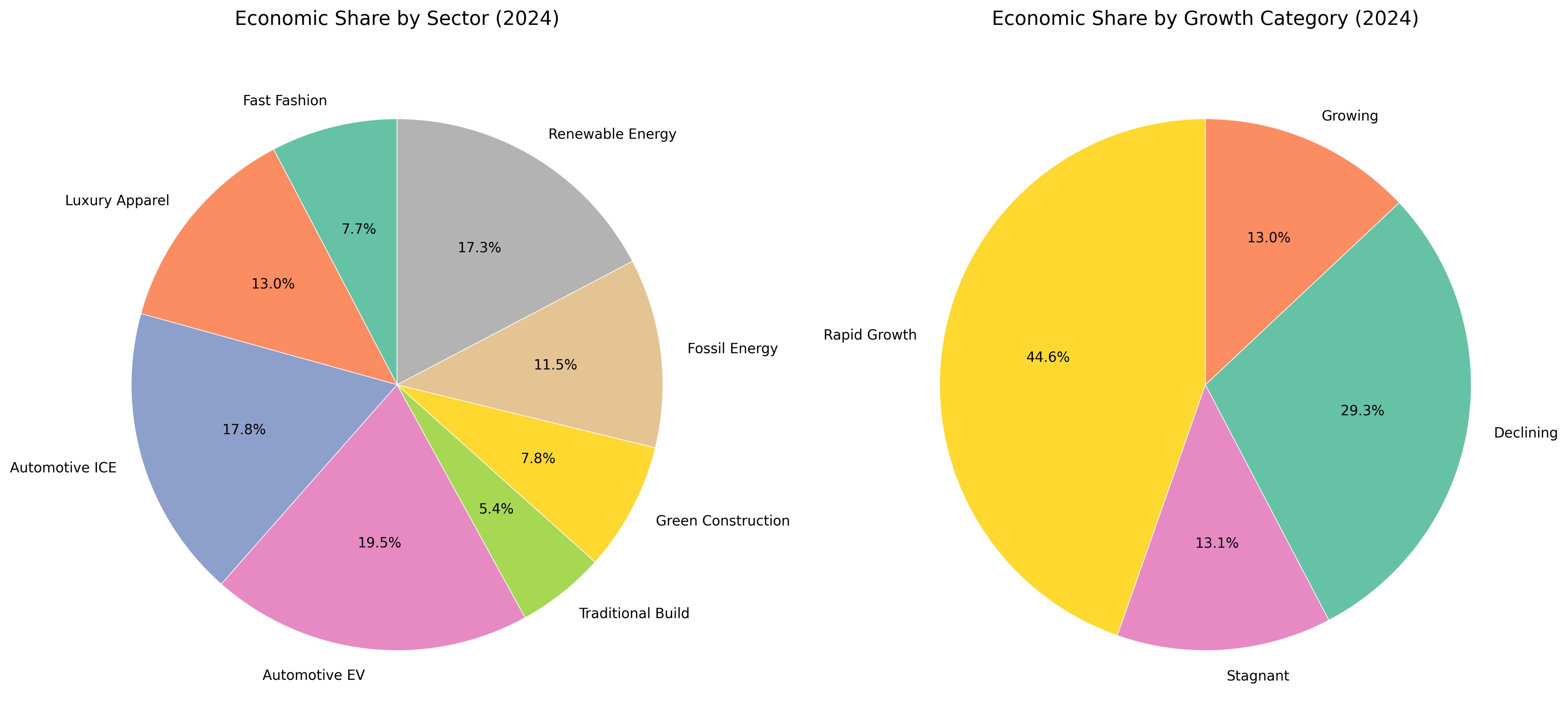
The image displays two pie charts side by side, each providing a distinct perspective on economic share data for the year 2024. The chart on the left, titled "Economic Share by Sector (2024)," breaks down the economic contributions of various sectors. The sectors represented include Fast Fashion, Luxury Apparel, Automotive ICE (Internal Combustion Engine), Automotive EV (Electric Vehicles), Traditional Build, Green Construction, Fossil Energy, and Renewable Energy. Each sector is depicted in a unique color, with their respective economic shares labeled as percentages within the pie slices. Specifically, Automotive EV holds the largest share at 19.5%, followed by Automotive ICE at 17.8%, Renewable Energy at 17.3%, Traditional Build at 19.5%, Green Construction at 7.8%, Fossil Energy at 11.5%, Luxury Apparel at 13.0%, and Fast Fashion at 7.7%.

The chart on the right, titled "Economic Share by Growth Category (2024)," aggregates the sectors into broader growth categories: Rapid Growth, Growing, Declining, and Stagnant. Each category is represented by a different color. The Rapid Growth category, depicted in pink, accounts for the largest share at 44.6%, followed by the Declining category in teal at 29.3%. The Growing category, shown in orange, holds 13.0%, while the Stagnant category, in purple, represents 13.1% of the economic share. Both pie charts feature clean white borders between slices for clarity, and the percentages are displayed prominently within each segment. The overall layout provides a clear and detailed view of how different sectors and their growth categories contribute to the economy in 2024.
|
Pie Chart
|
matplotlib
|
3
|
7ae72cad-c230-4a43-9d68-04e24bd6d8eb
|
|
import seaborn as sns
import matplotlib.pyplot as plt
import pandas as pd

data = {
    "Stage": [
        "Eligible Population",
        "Diagnosed with HIV",
        "Linked to Care",
        "Retained in Care (3 months)",
        "Retained in Care (6 months)",
        "Prescribed ART",
        "Adherent to ART (3 months)",
        "Adherent to ART (6 months)",
        "Viral Suppression (3 months)",
        "Viral Suppression (6 months)"
    ],
    "2014": [75000, 60000, 54000, 48000, 45000, 42000, 38000, 36000, 35000, 32000],
    "2016": [78000, 65000, 60000, 55000, 52000, 50000, 46000, 44000, 42000, 39000],
    "2018": [80000, 70000, 66000, 62000, 59000, 57000, 53000, 50000, 48000, 46000],
    "2020": [82000, 75000, 72000, 69000, 66000, 64000, 61000, 58000, 56000, 54000]
}

df = pd.DataFrame(data)
df = df.set_index("Stage")

plt.figure(figsize=(12, 8))
heatmap = sns.heatmap(
    df,
    annot=True,
    fmt="d",
    cmap="Blues",
    linewidths=0.5,
    linecolor="gray",
    cbar_kws={"label": "Number of Individuals"},
    annot_kws={"size": 10}
)

plt.title("HIV Treatment Cascade in Central African Republic (2014-2020)", pad=20)
plt.xlabel("Year", labelpad=10)
plt.ylabel("Treatment Stage", labelpad=10)
plt.xticks(rotation=0)
plt.yticks(rotation=0)
plt.tight_layout()

plt.savefig("output.png")
|
Treatment Stage,2014,2016,2018,2020
Eligible Population,75000,78000,80000,82000
Diagnosed with HIV,60000,65000,70000,75000
Linked to Care,54000,60000,66000,72000
Retained in Care (3 months),48000,55000,62000,69000
Retained in Care (6 months),45000,52000,59000,66000
Prescribed ART,42000,50000,57000,64000
Adherent to ART (3 months),38000,46000,53000,61000
Adherent to ART (6 months),36000,44000,50000,58000
Viral Suppression (3 months),35000,42000,48000,56000
Viral Suppression (6 months),32000,39000,46000,54000
|
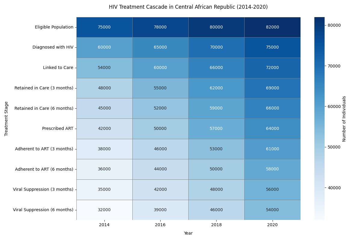
The image is a heatmap that illustrates the HIV Treatment Cascade in the Central African Republic from 2014 to 2020. The chart uses varying shades of blue to represent the number of individuals at different stages of HIV treatment across four specific years: 2014, 2016, 2018, and 2020. The vertical axis, labeled "Treatment Stage," lists ten progressive stages of HIV treatment, starting from the "Eligible Population" at the top and descending through stages such as "Diagnosed with HIV," "Linked to Care," "Retained in Care (3 months)," "Retained in Care (6 months)," "Prescribed ART," "Adherent to ART (3 months)," "Adherent to ART (6 months)," "Viral Suppression (3 months)," and finally "Viral Suppression (6 months)" at the bottom. The horizontal axis is labeled "Year" and spans the selected years.

Each cell within the heatmap contains a numeric value representing the number of individuals at a particular treatment stage for the corresponding year. Darker shades of blue indicate higher numbers of individuals, while lighter shades represent lower numbers. For instance, in 2014, the number of individuals in the eligible population is 75,000, which gradually increases to 82,000 by 2020. Similarly, the number of individuals diagnosed with HIV rises from 60,000 in 2014 to 75,000 in 2020. As the stages progress toward more advanced treatment, the numbers generally decrease. For example, the number of individuals adherent to ART for six months increases from 36,000 in 2014 to 58,000 in 2020.

The heatmap effectively highlights the gradual improvement in the number of individuals at each stage of the HIV treatment cascade over the years, providing a clear visual representation of progress and areas where retention in care may still be a challenge. A color bar on the right side of the chart serves as a legend, indicating the range of individual counts from around 30,000 to 80,000.
|
Heatmap
|
seaborn
|
4
|
442b06db-b98d-4c3c-a9c0-ab9ff46a75e9
|
|
import seaborn as sns
import matplotlib.pyplot as plt
import pandas as pd

data = [
    {'year': 2006, 'country': 'DR Congo', 'aid_millions': 1.8, 'gdp_growth': 5.6, 'region': 'Central Africa'},
    {'year': 2007, 'country': 'DR Congo', 'aid_millions': 1.48, 'gdp_growth': 6.2, 'region': 'Central Africa'},
    {'year': 2008, 'country': 'DR Congo', 'aid_millions': 1.25, 'gdp_growth': 2.9, 'region': 'Central Africa'},
    {'year': 2009, 'country': 'DR Congo', 'aid_millions': 0.8, 'gdp_growth': 2.8, 'region': 'Central Africa'},
    {'year': 2010, 'country': 'DR Congo', 'aid_millions': 0.22, 'gdp_growth': 7.1, 'region': 'Central Africa'},
    {'year': 2011, 'country': 'DR Congo', 'aid_millions': 0.3, 'gdp_growth': 6.9, 'region': 'Central Africa'},
    {'year': 2012, 'country': 'DR Congo', 'aid_millions': 0.4, 'gdp_growth': 7.2, 'region': 'Central Africa'},
    {'year': 2013, 'country': 'DR Congo', 'aid_millions': 0.35, 'gdp_growth': 8.5, 'region': 'Central Africa'},
    {'year': 2006, 'country': 'Croatia', 'aid_millions': 0.1, 'gdp_growth': 4.7, 'region': 'Europe'},
    {'year': 2007, 'country': 'Croatia', 'aid_millions': 0.18, 'gdp_growth': 5.1, 'region': 'Europe'},
    {'year': 2008, 'country': 'Croatia', 'aid_millions': 0.15, 'gdp_growth': 1.4, 'region': 'Europe'},
    {'year': 2009, 'country': 'Croatia', 'aid_millions': 0.16, 'gdp_growth': -6.9, 'region': 'Europe'},
    {'year': 2010, 'country': 'Croatia', 'aid_millions': 0.02, 'gdp_growth': -1.4, 'region': 'Europe'},
    {'year': 2011, 'country': 'Croatia', 'aid_millions': 0.025, 'gdp_growth': 0.0, 'region': 'Europe'},
    {'year': 2012, 'country': 'Croatia', 'aid_millions': 0.03, 'gdp_growth': -1.5, 'region': 'Europe'},
    {'year': 2013, 'country': 'Croatia', 'aid_millions': 0.035, 'gdp_growth': -0.9, 'region': 'Europe'},
    {'year': 2006, 'country': 'Guinea', 'aid_millions': 0.0, 'gdp_growth': 2.2, 'region': 'West Africa'},
    {'year': 2007, 'country': 'Guinea', 'aid_millions': 0.08, 'gdp_growth': 1.8, 'region': 'West Africa'},
    {'year': 2008, 'country': 'Guinea', 'aid_millions': 0.05, 'gdp_growth': 4.9, 'region': 'West Africa'},
    {'year': 2009, 'country': 'Guinea', 'aid_millions': 0.06, 'gdp_growth': -0.3, 'region': 'West Africa'},
    {'year': 2010, 'country': 'Guinea', 'aid_millions': 0.05, 'gdp_growth': 1.9, 'region': 'West Africa'},
    {'year': 2011, 'country': 'Guinea', 'aid_millions': 0.07, 'gdp_growth': 4.0, 'region': 'West Africa'},
    {'year': 2012, 'country': 'Guinea', 'aid_millions': 0.08, 'gdp_growth': 3.9, 'region': 'West Africa'},
    {'year': 2013, 'country': 'Guinea', 'aid_millions': 0.09, 'gdp_growth': 2.3, 'region': 'West Africa'},
    {'year': 2006, 'country': 'Sri Lanka', 'aid_millions': 1.2, 'gdp_growth': 7.7, 'region': 'South Asia'},
    {'year': 2007, 'country': 'Sri Lanka', 'aid_millions': 0.05, 'gdp_growth': 6.8, 'region': 'South Asia'},
    {'year': 2008, 'country': 'Sri Lanka', 'aid_millions': 0.0, 'gdp_growth': 6.0, 'region': 'South Asia'},
    {'year': 2009, 'country': 'Sri Lanka', 'aid_millions': 0.03, 'gdp_growth': 3.5, 'region': 'South Asia'},
    {'year': 2010, 'country': 'Sri Lanka', 'aid_millions': 0.05, 'gdp_growth': 8.0, 'region': 'South Asia'},
    {'year': 2011, 'country': 'Sri Lanka', 'aid_millions': 0.06, 'gdp_growth': 8.2, 'region': 'South Asia'},
    {'year': 2012, 'country': 'Sri Lanka', 'aid_millions': 0.07, 'gdp_growth': 9.1, 'region': 'South Asia'},
    {'year': 2013, 'country': 'Sri Lanka', 'aid_millions': 0.08, 'gdp_growth': 7.3, 'region': 'South Asia'},
    {'year': 2006, 'country': 'Angola', 'aid_millions': 0.5, 'gdp_growth': 18.6, 'region': 'Southern Africa'},
    {'year': 2007, 'country': 'Angola', 'aid_millions': 0.4, 'gdp_growth': 22.6, 'region': 'Southern Africa'},
    {'year': 2008, 'country': 'Angola', 'aid_millions': 0.35, 'gdp_growth': 13.8, 'region': 'Southern Africa'},
    {'year': 2009, 'country': 'Angola', 'aid_millions': 0.45, 'gdp_growth': 2.4, 'region': 'Southern Africa'},
    {'year': 2010, 'coun
|
Year,Angola,Croatia,DR Congo,Guinea,Sri Lanka
2006,18.6,4.7,5.6,2.2,7.7
2007,22.6,5.1,6.2,1.8,6.8
2008,13.8,1.4,2.9,4.9,6.0
2009,2.4,-6.9,2.8,-0.3,3.5
2010,3.4,-1.4,7.1,1.9,8.0
2011,3.9,0.0,6.9,4.0,8.2
2012,5.2,-1.5,7.2,3.9,9.1
2013,6.8,-0.9,8.5,2.3,7.3
2014,4.8,0.5,9.5,0.6,5.0
2015,0.9,2.4,6.9,0.1,5.0
|
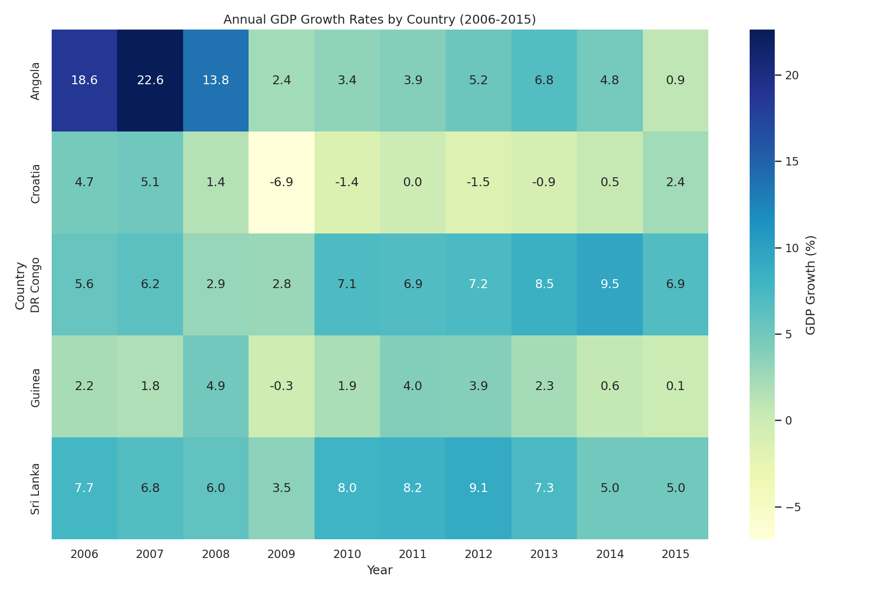
This image is a heatmap that illustrates the annual GDP growth rates of five countries—Angola, Croatia, the Democratic Republic of the Congo (DR Congo), Guinea, and Sri Lanka—over the period from 2006 to 2015. The heatmap uses a color gradient ranging from deep blue to pale yellow, representing varying levels of GDP growth percentages, with the color bar on the right indicating that deeper blues correspond to higher growth rates and lighter shades approaching yellow reflect lower or negative growth.

The horizontal axis represents the years from 2006 to 2015, while the vertical axis lists the countries. Each cell within the heatmap contains a numerical value indicating the GDP growth rate for a specific country in a given year. Angola exhibits the most dramatic fluctuations, with exceptionally high growth rates of 18.6% in 2006, peaking at 22.6% in 2007, and then sharply declining to 13.8% in 2008 and further down to 2.4% by 2009. The country’s growth rates remain relatively modest afterward, ending at 0.9% in 2015.

Croatia’s GDP growth shows a contrasting trend, starting with moderate growth of 4.7% in 2006 but experiencing negative growth from 2009 onward, hitting a low of -6.9% in 2009 and -1.5% in 2012, before slightly recovering to 2.4% by 2015. The Democratic Republic of the Congo generally displays steady positive growth, maintaining rates between 2.8% and 9.5%, with a notable peak at 9.5% in 2014. Guinea's growth rates are more modest, with minor fluctuations and a brief negative dip of -0.3% in 2009, ending at 0.1% in 2015. Sri Lanka's growth rates remain consistently positive throughout the period, ranging from 3.5% in 2009 to a high of 9.1% in 2012, concluding at 5.0% in both 2014 and 2015.

Overall, the heatmap effectively visualizes the variations and trends in GDP growth rates across these countries over the decade, highlighting periods of economic expansion and contraction.
|
Heatmap
|
seaborn
|
5
|
a74c2415-5938-4b42-9d9f-5268f396a7b1
|
|
import pandas as pd
import seaborn as sns
import matplotlib.pyplot as plt

regions = [
    'Lusaka', 'Copperbelt', 'Southern', 'Central',
    'Eastern', 'Northern', 'North-Western', 'Luapula', 'Western', 'Muchinga'
]

sectors = [
    'Agriculture-Subsistence', 'Agriculture-Commercial',
    'Mining-Copper', 'Mining-Gold', 'Mining-Coal',
    'Manufacturing-Light', 'Manufacturing-Heavy',
    'Finance-Banking', 'Finance-Insurance', 'Finance-Investments',
    'Tourism-Lodging', 'Tourism-Adventure', 'Tourism-Cultural',
    'Healthcare-Public', 'Healthcare-Private', 'Healthcare-Specialized',
    'Education-Basic', 'Education-Tertiary', 'Education-Vocational',
    'Transport-Road', 'Transport-Rail', 'Transport-Air',
    'Energy-Electric', 'Energy-Renewable', 'Energy-OilGas'
]

data = []
for region in regions:
    for sector in sectors:
        if sector.startswith('Agriculture'):
            base_gdp = 90 if 'Subsistence' in sector else 180
            base_employment = 3800 if 'Subsistence' in sector else 2100
        elif sector.startswith('Mining'):
            if 'Copper' in sector:
                base_gdp = 550
                base_employment = 1800
            elif 'Gold' in sector:
                base_gdp = 420
                base_employment = 1200
            else:
                base_gdp = 360
                base_employment = 1100
        elif sector.startswith('Manufacturing'):
            base_gdp = 190 if 'Light' in sector else 260
            base_employment = 2100 if 'Light' in sector else 3000
        elif sector.startswith('Finance'):
            if 'Banking' in sector:
                base_gdp = 320
                base_employment = 1700
            elif 'Insurance' in sector:
                base_gdp = 250
                base_employment = 1400
            else:
                base_gdp = 280
                base_employment = 1600
        elif sector.startswith('Tourism'):
            if 'Lodging' in sector:
                base_gdp = 220
                base_employment = 1900
            elif 'Adventure' in sector:
                base_gdp = 200
                base_employment = 1800
            else:
                base_gdp = 190
                base_employment = 1700
        elif sector.startswith('Healthcare'):
            if 'Public' in sector:
                base_gdp = 140
                base_employment = 950
            elif 'Private' in sector:
                base_gdp = 230
                base_employment = 1500
            else:
                base_gdp = 270
                base_employment = 1800
        elif sector.startswith('Education'):
            if 'Basic' in sector:
                base_gdp = 110
                base_employment = 1200
            elif 'Tertiary' in sector:
                base_gdp = 220
                base_employment = 1000
            else:
                base_gdp = 150
                base_employment = 1300
        elif sector.startswith('Transport'):
            if 'Road' in sector:
                base_gdp = 260
                base_employment = 2300
            elif 'Rail' in sector:
                base_gdp = 240
                base_employment = 2100
            else:
                base_gdp = 300
                base_employment = 1900
        elif sector.startswith('Energy'):
            if 'Electric' in sector:
                base_gdp = 200
                base_employment = 1600
            elif 'Renewable' in sector:
                base_gdp = 280
                base_employment = 2200
            else:
                base_gdp = 320
                base_employment = 2000

        region_factor = 1 + (ord(region[0]) % 5) * 0.05
        gdp = base_gdp * region_factor
        employment = base_employment * region_factor

        data.append({
            'Region': region,
            'Sector': sector,
            'GDP Contribution (USD Million)': gdp,
            'Employment': employment
        })

df = pd.DataFrame(data)
heatmap_data = df.pivot_table(index='Re
|
Region,Sector,GDP Contribution (USD Million)
Central,Agriculture-Subsistence,198.0
Central,Agriculture-Commercial,99.0
Central,Education-Basic,121.0
Central,Education-Tertiary,242.0
Central,Education-Vocational,165.0
Central,Energy-Electric,220.0
Central,Energy-Renewable,352.0
Central,Energy-OilGas,308.0
Central,Finance-Banking,352.0
Central,Finance-Insurance,275.0
Central,Finance-Investments,308.0
Central,Healthcare-Public,154.0
Central,Healthcare-Private,297.0
Central,Healthcare-Specialized,286.0
Central,Manufacturing-Light,209.0
Central,Manufacturing-Heavy,396.0
Central,Mining-Coal,264.0
Central,Mining-Copper,605.0
Central,Mining-Gold,462.0
Central,Tourism-Adventure,220.0
Central,Tourism-Cultural,209.0
Central,Tourism-Lodging,242.0
Central,Transport-Air,264.0
Central,Transport-Rail,242.0
Central,Transport-Road,330.0
Copperbelt,Agriculture-Subsistence,198.0
Copperbelt,Agriculture-Commercial,99.0
Copperbelt,Education-Basic,121.0
Copperbelt,Education-Tertiary,242.0
Copperbelt,Education-Vocational,165.0
Copperbelt,Energy-Electric,220.0
Copperbelt,Energy-Renewable,352.0
Copperbelt,Energy-OilGas,308.0
Copperbelt,Finance-Banking,352.0
Copperbelt,Finance-Insurance,275.0
Copperbelt,Finance-Investments,308.0
Copperbelt,Healthcare-Public,154.0
Copperbelt,Healthcare-Private,297.0
Copperbelt,Healthcare-Specialized,286.0
Copperbelt,Manufacturing-Light,209.0
Copperbelt,Manufacturing-Heavy,396.0
Copperbelt,Mining-Coal,264.0
Copperbelt,Mining-Copper,605.0
Copperbelt,Mining-Gold,462.0
Copperbelt,Tourism-Adventure,220.0
Copperbelt,Tourism-Cultural,209.0
Copperbelt,Tourism-Lodging,242.0
Copperbelt,Transport-Air,264.0
Copperbelt,Transport-Rail,242.0
Copperbelt,Transport-Road,330.0
Eastern,Agriculture-Subsistence,216.0
Eastern,Agriculture-Commercial,108.0
Eastern,Education-Basic,132.0
Eastern,Education-Tertiary,264.0
Eastern,Education-Vocational,180.0
Eastern,Energy-Electric,240.0
Eastern,Energy-Renewable,384.0
Eastern,Energy-OilGas,336.0
Eastern,Finance-Banking,384.0
Eastern,Finance-Insurance,300.0
Eastern,Finance-Investments,336.0
Eastern,Healthcare-Public,168.0
Eastern,Healthcare-Private,324.0
Eastern,Healthcare-Specialized,312.0
Eastern,Manufacturing-Light,228.0
Eastern,Manufacturing-Heavy,432.0
Eastern,Mining-Coal,288.0
Eastern,Mining-Copper,660.0
Eastern,Mining-Gold,504.0
Eastern,Tourism-Adventure,240.0
Eastern,Tourism-Cultural,228.0
Eastern,Tourism-Lodging,264.0
Eastern,Transport-Air,288.0
Eastern,Transport-Rail,264.0
Eastern,Transport-Road,360.0
Luapula,Agriculture-Subsistence,189.0
Luapula,Agriculture-Commercial,94.5
Luapula,Education-Basic,115.5
Luapula,Education-Tertiary,231.0
Luapula,Education-Vocational,157.5
Luapula,Energy-Electric,210.0
Luapula,Energy-Renewable,336.0
Luapula,Energy-OilGas,294.0
Luapula,Finance-Banking,336.0
Luapula,Finance-Insurance,262.5
Luapula,Finance-Investments,294.0
Luapula,Healthcare-Public,147.0
Luapula,Healthcare-Private,283.5
Luapula,Healthcare-Specialized,273.0
Luapula,Manufacturing-Light,199.5
Luapula,Manufacturing-Heavy,378.0
Luapula,Mining-Coal,252.0
Luapula,Mining-Copper,577.5
Luapula,Mining-Gold,441.0
Luapula,Tourism-Adventure,210.0
Luapula,Tourism-Cultural,199.5
Luapula,Tourism-Lodging,231.0
Luapula,Transport-Air,252.0
Luapula,Transport-Rail,231.0
Luapula,Transport-Road,315.0
Lusaka,Agriculture-Subsistence,189.0
Lusaka,Agriculture-Commercial,94.5
Lusaka,Education-Basic,115.5
Lusaka,Education-Tertiary,231.0
Lusaka,Education-Vocational,157.5
Lusaka,Energy-Electric,210.0
Lusaka,Energy-Renewable,336.0
Lusaka,Energy-OilGas,294.0
Lusaka,Finance-Banking,336.0
Lusaka,Finance-Insurance,262.5
Lusaka,Finance-Investments,294.0
Lusaka,Healthcare-Public,147.0
Lusaka,Healthcare-Private,283.5
Lusaka,Healthcare-Specialized,273.0
Lusaka,Manufacturing-Light,199.5
Lusaka,Manufacturing-Heavy,378.0
Lusaka,Mining-Coal,252.0
Lusaka,Mining-Copper,577.5
Lusaka,Mining-Gold,441.0
Lusaka,Tourism-Adventure,210.0
Lusaka,Tourism-Cultural,199.5
Lusaka,Tourism-Lodging,231.0
Lusaka,Transport-Air,252.0
Lusaka,Transport-Rail,231.0
Lu
|
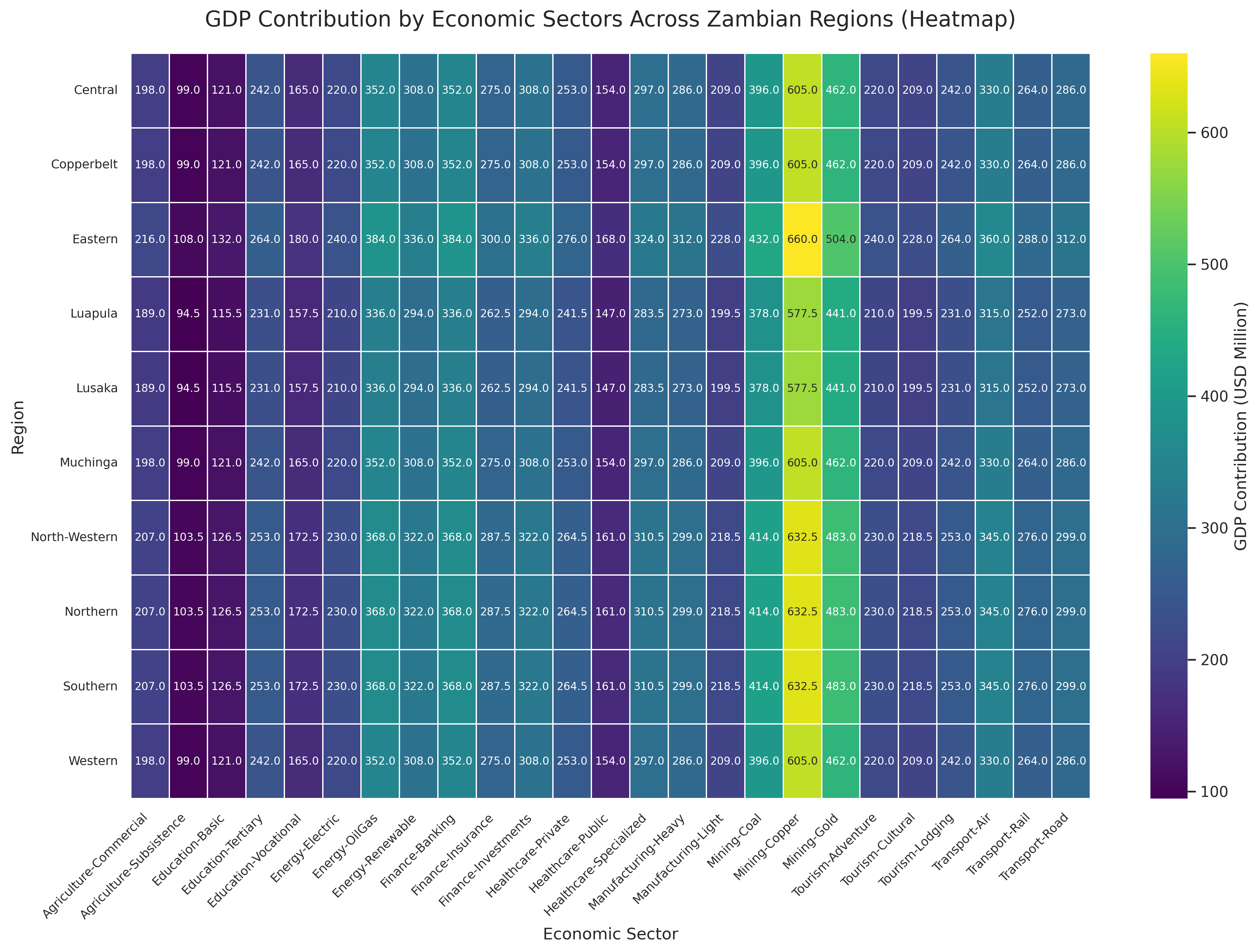
This image is a heatmap titled "GDP Contribution by Economic Sectors Across Zambian Regions." The heatmap visually represents the contribution of various economic sectors to the GDP across ten Zambian regions, with values expressed in millions of U.S. dollars. The x-axis lists the economic sectors, which include categories such as Agriculture (Subsistence and Commercial), Mining (Copper, Gold, and Coal), Manufacturing (Light and Heavy), Finance (Banking, Insurance, and Investments), Tourism (Lodging, Adventure, and Cultural), Healthcare (Public, Private, and Specialized), Education (Basic, Tertiary, and Vocational), Transport (Road, Rail, and Air), and Energy (Electric, Renewable, and Oil/Gas). The y-axis lists the regions: Lusaka, Copperbelt, Southern, Central, Eastern, Northern, North-Western, Luapula, Western, and Muchinga.

The color gradient of the heatmap ranges from dark purple, representing lower GDP contributions, to bright yellow, representing higher GDP contributions, with a color bar on the right side indicating the GDP scale from 100 to 600 million USD. Each cell in the heatmap contains a numerical value that precisely indicates the GDP contribution of a particular sector in a specific region.

Notable observations include the bright yellow cells in the Copperbelt region for the Mining-Copper sector, showing the highest GDP contributions around 605 to 660 million USD. Other sectors like Manufacturing-Heavy and Energy-OilGas also show relatively high GDP contributions in multiple regions, represented by shades of green and teal. Conversely, sectors like Healthcare-Public and Education-Basic show lower GDP contributions, depicted in darker shades. The heatmap effectively highlights the economic disparities and sectoral strengths across different regions in Zambia.
|
Heatmap
|
seaborn
|
6
|
7eb69fd6-b342-4883-b525-ea22128e7459
|
|
import plotly.express as px

interventions = [
    {'name': 'Neonatal Care Access', 'coverage': 95, 'impact_score': 90, 'cost_per_person': 25, 'dropout_rate': 5},
    {'name': 'Skilled Birth Attendance', 'coverage': 88, 'impact_score': 85, 'cost_per_person': 30, 'dropout_rate': 7},
    {'name': 'Child Immunization (DPT)', 'coverage': 82, 'impact_score': 80, 'cost_per_person': 10, 'dropout_rate': 12},
    {'name': 'Nutritional Support (Stunting)', 'coverage': 70, 'impact_score': 75, 'cost_per_person': 40, 'dropout_rate': 15},
    {'name': 'Clean Water Access', 'coverage': 65, 'impact_score': 70, 'cost_per_person': 50, 'dropout_rate': 8},
    {'name': 'Maternal Health Education', 'coverage': 58, 'impact_score': 65, 'cost_per_person': 20, 'dropout_rate': 10},
    {'name': 'Prenatal Care (4+ Visits)', 'coverage': 50, 'impact_score': 60, 'cost_per_person': 35, 'dropout_rate': 18},
    {'name': 'Emergency Obstetric Care', 'coverage': 45, 'impact_score': 88, 'cost_per_person': 120, 'dropout_rate': 5},
    {'name': 'Vitamin A Supplementation', 'coverage': 78, 'impact_score': 50, 'cost_per_person': 5, 'dropout_rate': 20}
]

fig = px.scatter(
    interventions,
    x='coverage',
    y='impact_score',
    size='cost_per_person',
    color='dropout_rate',
    hover_name='name',
    size_max=60,
    title='Impact vs Coverage of Child Mortality Reduction Interventions',
    labels={
        'coverage': 'Coverage (% of Target Population)',
        'impact_score': 'Impact Score (0-100)',
        'dropout_rate': 'Dropout Rate (%)',
        'cost_per_person': 'Cost per Person (USD)'
    },
    color_continuous_scale=px.colors.sequential.Viridis
)

fig.update_layout(
    plot_bgcolor='white',
    font=dict(family='Arial', size=12),
    margin=dict(l=50, r=50, b=60, t=80, pad=4),
    coloraxis_colorbar=dict(
        title='Dropout<br>Rate (%)',
        thickness=15,
        len=0.5,
        yanchor='middle',
        y=0.5
    )
)

fig.update_traces(
    marker=dict(line=dict(width=1, color='DarkSlateGrey')),
    selector=dict(mode='markers')
)

fig.update_xaxes(
    gridcolor='lightgrey',
    zeroline=False,
    range=[30, 100]
)

fig.update_yaxes(
    gridcolor='lightgrey',
    zeroline=False,
    range=[40, 100]
)

for intervention in interventions:
    fig.add_annotation(
        x=intervention['coverage'],
        y=intervention['impact_score'],
        text=intervention['name'],
        showarrow=False,
        font=dict(size=10),
        yshift=15
    )

fig.write_image('output.png', scale=2)
|
intervention,coverage,impact_score,cost_per_person,dropout_rate
Neonatal Care Access,95,90,25,5
Skilled Birth Attendance,88,85,30,7
Child Immunization (DPT),82,80,10,12
Nutritional Support (Stunting),70,75,40,15
Clean Water Access,65,70,50,8
Maternal Health Education,58,65,20,10
Prenatal Care (4+ Visits),50,60,35,18
Emergency Obstetric Care,45,88,120,5
Vitamin A Supplementation,78,50,5,20
|
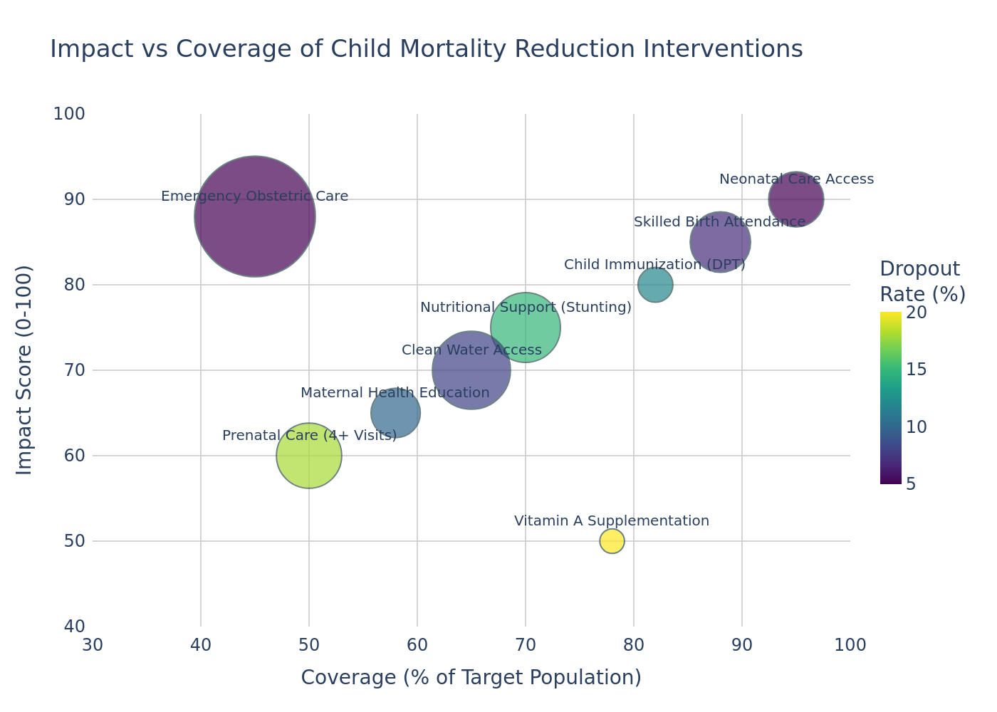
The image is a bubble chart titled "Impact vs Coverage of Child Mortality Reduction Interventions," which visually compares various health interventions based on their coverage, impact, cost, and dropout rates. The horizontal axis represents "Coverage (% of Target Population)," ranging from 30% to 100%, while the vertical axis depicts the "Impact Score (0-100)," spanning from 40 to 100. Each bubble corresponds to a specific intervention, with its position indicating its coverage and impact score.

The size of each bubble reflects the cost per person in USD, with larger bubbles representing higher costs. The color of the bubbles represents the dropout rate, measured as a percentage, with a gradient ranging from dark purple (low dropout rate, around 5%) to bright yellow (high dropout rate, around 20%). A color bar on the right side of the chart provides a reference for the dropout rate percentages.

Notable interventions include "Emergency Obstetric Care," which has a relatively low coverage of 45% but a high impact score of 88, represented by a large dark purple bubble indicating a high cost but low dropout rate. "Neonatal Care Access" shows high coverage at 95% and a high impact score of 90, with a smaller bubble size reflecting moderate cost and a very low dropout rate. Conversely, "Vitamin A Supplementation" exhibits moderate coverage at 78% but a lower impact score of 50, with a small bubble and bright yellow color, indicating low cost but a high dropout rate. Other interventions such as "Skilled Birth Attendance," "Child Immunization (DPT)," and "Nutritional Support (Stunting)" are also displayed, each with varying coverage, impact, cost, and dropout rates. The chart effectively highlights the trade-offs between these factors for different child mortality reduction strategies.
|
Bubble Chart
|
plotly
|
7
|
43995602-35b5-4e87-9fae-61d6d788ef86
|
|
import matplotlib.pyplot as plt
import pandas as pd

regions = [
    'Phnom Penh Urban', 'Siem Reap Tourism', 'Battambang Rural',
    'Kampong Thom Rural', 'Sihanoukville Coastal', 'Kandal Suburban',
    'Takeo Agricultural', 'Pailin Border', 'Kampong Cham Riverine',
    'Svay Rieng Agricultural', 'Kampot Highland', 'Pursat Forest',
    'Koh Kong Coastal', 'Prey Veng Agricultural', 'Kratie Rural'
]

region_types = {
    'Phnom Penh Urban': 'Urban',
    'Siem Reap Tourism': 'Tourist',
    'Battambang Rural': 'Rural',
    'Kampong Thom Rural': 'Rural',
    'Sihanoukville Coastal': 'Coastal',
    'Kandal Suburban': 'Suburban',
    'Takeo Agricultural': 'Agricultural',
    'Pailin Border': 'Border',
    'Kampong Cham Riverine': 'Riverine',
    'Svay Rieng Agricultural': 'Agricultural',
    'Kampot Highland': 'Highland',
    'Pursat Forest': 'Forest',
    'Koh Kong Coastal': 'Coastal',
    'Prey Veng Agricultural': 'Agricultural',
    'Kratie Rural': 'Rural'
}

program_data = {
    'Region': [],
    'TotalParticipants': [],
    'AvgRetentionRate': [],
    'TotalInvestment': [],
    'RegionType': []
}

base_participants = {
    'Phnom Penh Urban': 1400, 'Siem Reap Tourism': 1000,
    'Battambang Rural': 1500, 'Kampong Thom Rural': 1300,
    'Sihanoukville Coastal': 900, 'Kandal Suburban': 1200,
    'Takeo Agricultural': 1400, 'Pailin Border': 1100,
    'Kampong Cham Riverine': 1350, 'Svay Rieng Agricultural': 1050,
    'Kampot Highland': 950, 'Pursat Forest': 1150,
    'Koh Kong Coastal': 800, 'Prey Veng Agricultural': 1250,
    'Kratie Rural': 1000
}

base_retention = {
    'Phnom Penh Urban': 0.89, 'Siem Reap Tourism': 0.87,
    'Battambang Rural': 0.73, 'Kampong Thom Rural': 0.71,
    'Sihanoukville Coastal': 0.90, 'Kandal Suburban': 0.86,
    'Takeo Agricultural': 0.77, 'Pailin Border': 0.80,
    'Kampong Cham Riverine': 0.81, 'Svay Rieng Agricultural': 0.83,
    'Kampot Highland': 0.84, 'Pursat Forest': 0.76,
    'Koh Kong Coastal': 0.88, 'Prey Veng Agricultural': 0.74,
    'Kratie Rural': 0.72
}

investment_multipliers = {
    'Urban': 1.5,
    'Tourist': 1.2,
    'Rural': 1.0,
    'Coastal': 1.3,
    'Suburban': 1.4,
    'Agricultural': 0.9,
    'Border': 1.1,
    'Riverine': 1.2,
    'Highland': 1.0,
    'Forest': 0.8
}

for region in regions:
    participants = base_participants[region]
    retention = base_retention[region]
    region_type = region_types[region]
    total_investment = participants * 22 * investment_multipliers[region_type] * 12

    program_data['Region'].append(region)
    program_data['TotalParticipants'].append(participants)
    program_data['AvgRetentionRate'].append(retention)
    program_data['TotalInvestment'].append(total_investment)
    program_data['RegionType'].append(region_type)

df = pd.DataFrame(program_data)

type_summary = df.groupby('RegionType').agg({
    'TotalParticipants': 'sum',
    'TotalInvestment': 'sum',
    'AvgRetentionRate': 'mean'
}).reset_index()

fig, ax = plt.subplots(figsize=(12, 8))

colors = [
    '#66c2a5', '#fc8d62', '#8da0cb', '#e78ac3',
    '#a6d854', '#ffd92f', '#e5c494', '#b3b3b3',
    '#8c564b', '#c49c94'
]

wedges, texts, autotexts = ax.pie(
    type_summary['TotalInvestment'],
    labels=type_summary['RegionType'],
    colors=colors,
    wedgeprops=dict(width=0.4, edgecolor='w'),
    autopct='%1.1f%%',
    pctdistance=0.85,
    startangle=90,
    textprops=dict(color='black', fontsize=10)
)

centre_circle = plt.Circle((0,0), 0.25, fc='white')
fig.gca().add_artist(centre_circle)

ax.axis('equal')

plt.title('Nutrition Program Investment Distribution by Region Type', fontsize=16, pad=20)
plt.tight_layout()
plt.savefig("output.png", dpi=300, bbox_inches='tight')
|
RegionType,InvestmentPercentage
Rural,20.0
Agricultural,17.5
Coastal,11.6
Urban,11.0
Suburban,8.8
Riverine,8.5
Border,6.4
Tourist,6.3
Highland,5.0
Forest,4.8
|
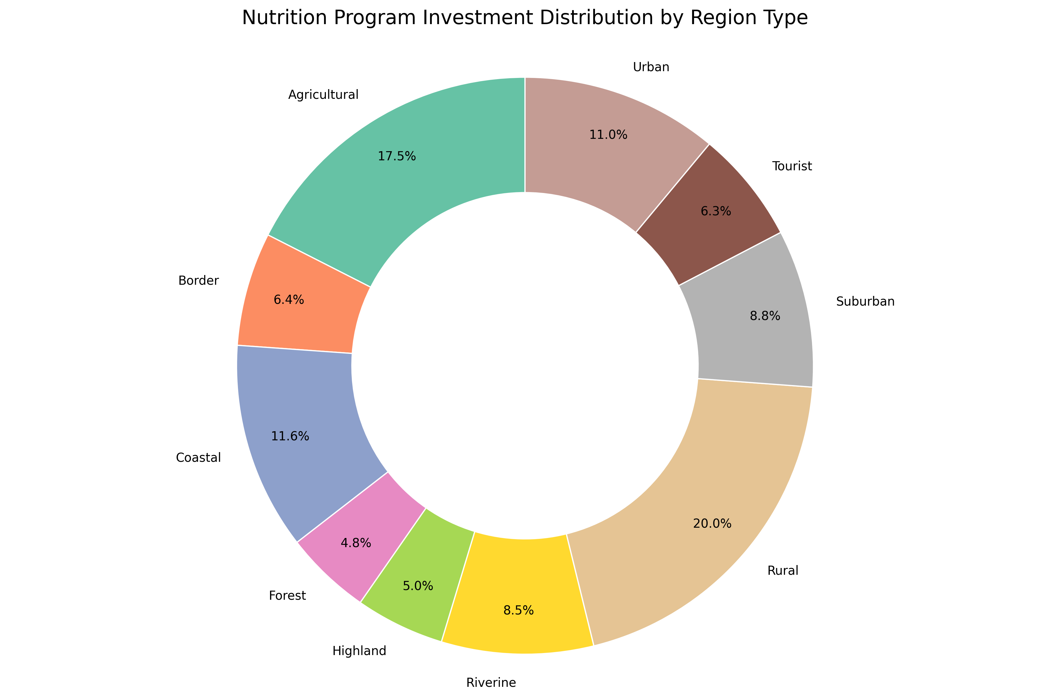
The image is a ring chart titled "Nutrition Program Investment Distribution by Region Type," which visually represents the proportion of total investment allocated to different types of regions within a nutrition program. The chart is divided into ten distinct segments, each corresponding to a specific region type, and is color-coded for easy differentiation.

Starting from the largest segment, the "Rural" regions, displayed in a light beige color, account for the highest investment share at 20.0%. Following this, the "Agricultural" regions, represented in a soft green hue, make up 17.5% of the total investment. The "Coastal" regions, shown in a muted blue, receive 11.6% of the investment, while "Urban" regions, depicted in a light brown tone, account for 11.0%.

The "Suburban" regions, illustrated in gray, comprise 8.8% of the investment, closely followed by "Riverine" regions in yellow at 8.5%. The "Border" regions, shown in a peach color, represent 6.4% of the total, while "Tourist" regions, in a reddish-brown shade, account for 6.3%. The "Highland" regions, depicted in a light pink color, make up 5.0% of the investment, and finally, the "Forest" regions, represented in a pale purple, hold the smallest share at 4.8%.

Each segment is clearly labeled with the region type and its corresponding percentage of the total investment, providing a comprehensive view of how resources are distributed across various region types. The ring structure of the chart, with its central void, allows for a clear and uncluttered presentation of the data.
|
Ring Chart
|
matplotlib
|
8
|
6edf00ed-2b22-4d63-9d0f-47d794de9d39
|
|
import seaborn as sns
import matplotlib.pyplot as plt
import pandas as pd

trade_data = {
    'Year': [
        2018, 2019, 2020, 2021, 2022, 2023,
        2018, 2019, 2020, 2021, 2022, 2023,
        2018, 2019, 2020, 2021, 2022, 2023,
        2018, 2019, 2020, 2021, 2022, 2023,
        2018, 2019, 2020, 2021, 2022, 2023
    ],
    'Profit Margin (%)': [
        10.5, 11.2, 11.8, 12.1, 11.7, 11.8,
        9.8, 10.0, 10.2, 10.5, 10.3, 10.2,
        6.8, 7.2, 7.5, 7.9, 7.6, 7.9,
        6.0, 6.3, 6.5, 6.7, 6.4, 6.5,
        18.2, 18.7, 17.5, 17.8, 18.1, 17.5
    ],
    'Commodity': [
        'Arabica Coffee', 'Arabica Coffee', 'Arabica Coffee', 'Arabica Coffee', 'Arabica Coffee', 'Arabica Coffee',
        'Robusta Coffee', 'Robusta Coffee', 'Robusta Coffee', 'Robusta Coffee', 'Robusta Coffee', 'Robusta Coffee',
        'Gold Bullion', 'Gold Bullion', 'Gold Bullion', 'Gold Bullion', 'Gold Bullion', 'Gold Bullion',
        'Silver Bullion', 'Silver Bullion', 'Silver Bullion', 'Silver Bullion', 'Silver Bullion', 'Silver Bullion',
        'Tanzanite Gems', 'Tanzanite Gems', 'Tanzanite Gems', 'Tanzanite Gems', 'Tanzanite Gems', 'Tanzanite Gems'
    ],
    'Region': [
        'Africa', 'Africa', 'Africa', 'Africa', 'Africa', 'Africa',
        'Africa', 'Africa', 'Africa', 'Africa', 'Africa', 'Africa',
        'Africa', 'Africa', 'Africa', 'Africa', 'Africa', 'Africa',
        'Africa', 'Africa', 'Africa', 'Africa', 'Africa', 'Africa',
        'Africa', 'Africa', 'Africa', 'Africa', 'Africa', 'Africa'
    ],
    'Trade Volume (Million USD)': [
        1750, 1800, 1820, 1850, 1830, 1850,
        1150, 1180, 1200, 1220, 1190, 1200,
        1050, 1080, 1100, 1120, 1100, 1100,
        900, 920, 930, 950, 940, 950,
        900, 920, 950, 930, 960, 950
    ]
}

df = pd.DataFrame(trade_data)

plt.figure(figsize=(12, 8))
sns.set_theme(style="whitegrid")
palette = sns.color_palette(["#2a9d8f", "#e9c46a", "#f4a261", "#e76f51", "#264653"])

line_plot = sns.lineplot(
    data=df,
    x='Year',
    y='Profit Margin (%)',
    hue='Commodity',
    style='Commodity',
    markers=True,
    dashes=False,
    palette=palette,
    linewidth=2.5
)

line_plot.set_title('Profit Margin Trends for Key African Commodities (2018-2023)', fontsize=16, pad=20)
line_plot.set_xlabel('Year', fontsize=12)
line_plot.set_ylabel('Profit Margin (%)', fontsize=12)
line_plot.tick_params(axis='both', labelsize=10)

plt.legend(
    title='Commodity',
    title_fontsize=12,
    fontsize=10,
    frameon=True,
    framealpha=1,
    bbox_to_anchor=(1.05, 1),
    loc='upper left'
)

plt.tight_layout()
plt.savefig('output.png', dpi=300, bbox_inches='tight')
|
Year,Arabica Coffee,Robusta Coffee,Gold Bullion,Silver Bullion,Tanzanite Gems
2018,10.5,9.8,6.8,6.0,18.2
2019,11.2,10.0,7.2,6.3,18.7
2020,11.8,10.2,7.5,6.5,17.5
2021,12.1,10.5,7.9,6.7,17.8
2022,11.7,10.3,7.6,6.4,18.1
2023,11.8,10.2,7.9,6.5,17.5
|
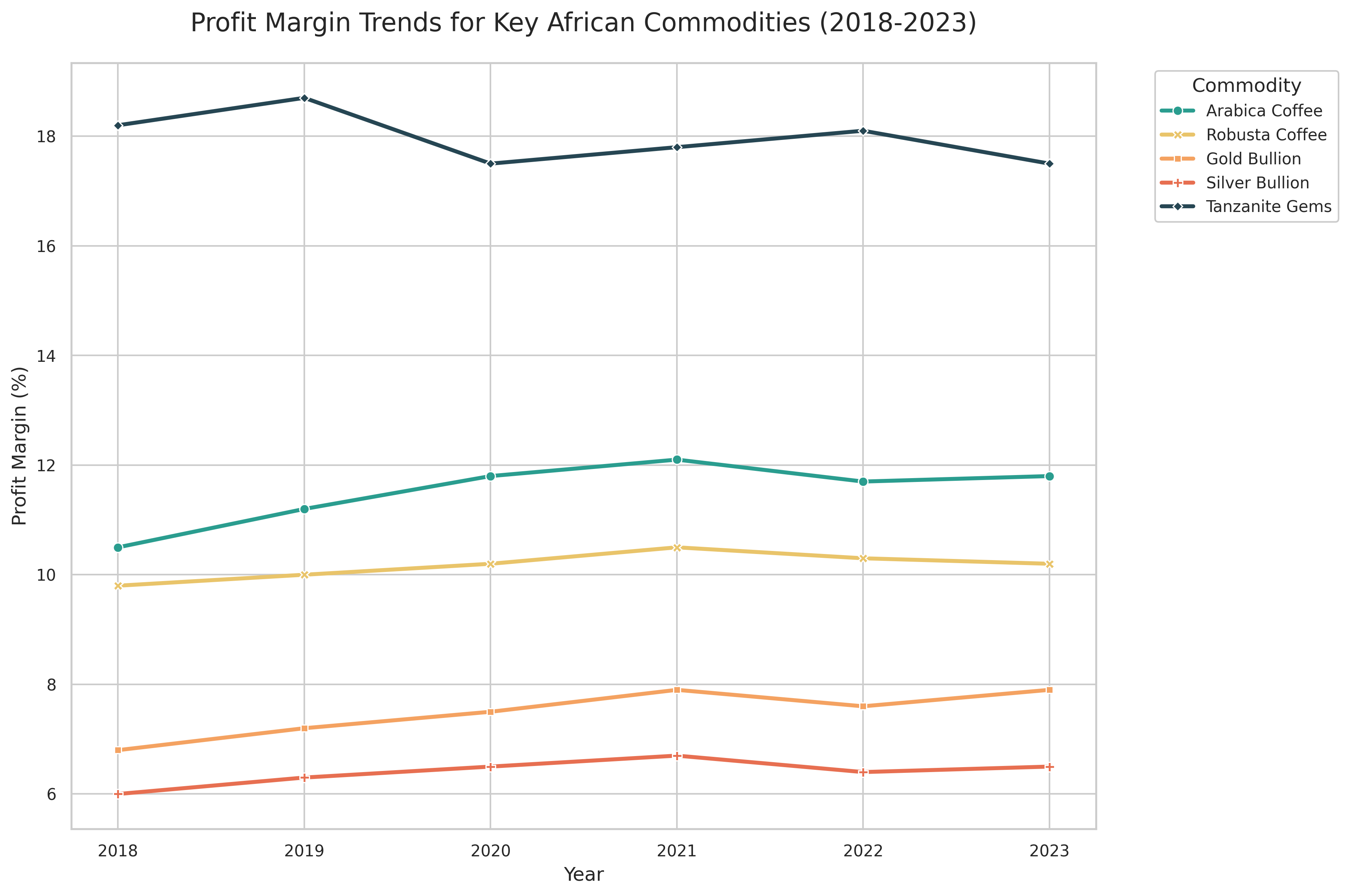
The image is a line chart titled "Profit Margin Trends for Key African Commodities (2018-2023)," which illustrates the annual profit margins for five key African commodities over a six-year period. The chart features five distinct lines, each representing a different commodity and differentiated by both color and marker style. The vertical axis, labeled "Profit Margin (%)", spans from 6% to 19%, while the horizontal axis represents the years from 2018 to 2023.

The commodities and their corresponding colors are as follows: Arabica Coffee (teal), Robusta Coffee (golden yellow), Gold Bullion (light orange), Silver Bullion (bright orange-red), and Tanzanite Gems (dark blue). Each line is marked with points at yearly intervals, allowing for precise identification of profit margin values.

Tanzanite Gems exhibit the highest profit margins, starting at 18.2% in 2018, peaking at 18.7% in 2019, dipping to 17.5% in 2020, rising again to 18.1% in 2022, and finally settling at 17.5% in 2023. Arabica Coffee follows, with margins beginning at 10.5% in 2018, gradually increasing to 12.1% in 2021, then slightly declining to 11.8% by 2023. Robusta Coffee shows a more modest trend, starting at 9.8% in 2018, peaking at 10.5% in 2021, and then decreasing slightly to 10.2% in 2023. Gold Bullion’s profit margin starts at 6.8% in 2018, steadily rising to 7.9% in both 2021 and 2023, with a small dip to 7.5% in 2020. Silver Bullion consistently has the lowest margins, beginning at 6.0% in 2018, increasing to 6.7% in 2021, and then tapering to 6.5% by 2023.

The chart provides a clear visual representation of how profit margins for these key commodities have fluctuated over time, highlighting Tanzanite Gems as the standout performer in terms of profitability.
|
Line Chart
|
seaborn
|
9
|
a99b0153-ac12-4e66-8318-528a0256ab5f
|
|
import seaborn as sns
import matplotlib.pyplot as plt
import pandas as pd

data = {
    'Year': [2010, 2010, 2010, 2010, 2010, 2010, 2010, 2010,
             2013, 2013, 2013, 2013, 2013, 2013, 2013, 2013,
             2016, 2016, 2016, 2016, 2016, 2016, 2016, 2016],
    'Sector': ['Port Logistics', 'Air Transport', 'Maritime Transport', 'Hotel Chains', 'Local Tourism',
               'Malls & Retail', 'Residential Construction', 'Commercial Construction'] * 3,
    'Performance': [70.2, 30.1, 27.8, 42.5, 155.3, 53.7, 62.4, 58.9,
                    75.1, 34.2, 30.5, 46.3, 162.8, 57.2, 65.0, 61.3,
                    78.5, 37.6, 33.2, 50.1, 171.2, 60.8, 68.7, 64.5],
    'Growth': [3.5, 5.1, 4.3, 3.1, 3.9, 2.4, 3.3, 3.0,
               4.8, 4.6, 4.0, 3.7, 4.2, 2.7, 3.6, 3.2,
               3.0, 4.2, 3.8, 3.4, 3.7, 2.5, 3.1, 2.9],
    'Investment': [220, 180, 150, 95, 320, 110, 240, 210,
                   270, 210, 175, 110, 360, 130, 280, 240,
                   310, 250, 200, 130, 400, 150, 320, 280],
    'Employment': [11500, 9200, 7800, 8700, 21800, 14500, 19000, 17200,
                   14200, 10800, 9100, 10200, 24300, 16200, 21000, 18800,
                   16800, 12500, 10500, 11900, 27100, 18000, 23500, 21200]
}

df = pd.DataFrame(data)

plt.figure(figsize=(12, 7))
scatter = sns.scatterplot(
    data=df,
    x='Performance',
    y='Growth',
    hue='Sector',
    size='Investment',
    sizes=(50, 400),
    palette='viridis',
    alpha=0.8,
    edgecolor='w',
    linewidth=0.5
)

plt.title('Sector Performance vs Growth with Investment Impact in Oman (2010-2016)', fontsize=14, pad=20)
plt.xlabel('Performance Index', fontsize=12)
plt.ylabel('Annual Growth (%)', fontsize=12)

plt.legend(bbox_to_anchor=(1.05, 1), loc='upper left', borderaxespad=0)
plt.grid(True, linestyle='--', alpha=0.7)

plt.tight_layout()
plt.savefig('output.png', dpi=300, bbox_inches='tight')
|
Sector,Performance,Growth,Investment
Port Logistics,70.2,3.5,220
Port Logistics,75.1,4.8,270
Port Logistics,78.5,3.0,310
Air Transport,30.1,5.1,180
Air Transport,34.2,4.6,210
Air Transport,37.6,4.2,250
Maritime Transport,27.8,4.3,150
Maritime Transport,30.5,4.0,175
Maritime Transport,33.2,3.8,200
Hotel Chains,42.5,3.1,95
Hotel Chains,46.3,3.7,110
Hotel Chains,50.1,3.4,130
Local Tourism,155.3,3.9,320
Local Tourism,162.8,4.2,360
Local Tourism,171.2,3.7,400
Malls & Retail,53.7,2.4,110
Malls & Retail,57.2,2.7,130
Malls & Retail,60.8,2.5,150
Residential Construction,62.4,3.3,240
Residential Construction,65.0,3.6,280
Residential Construction,68.7,3.1,320
Commercial Construction,58.9,3.0,210
Commercial Construction,61.3,3.2,240
Commercial Construction,64.5,2.9,280
|
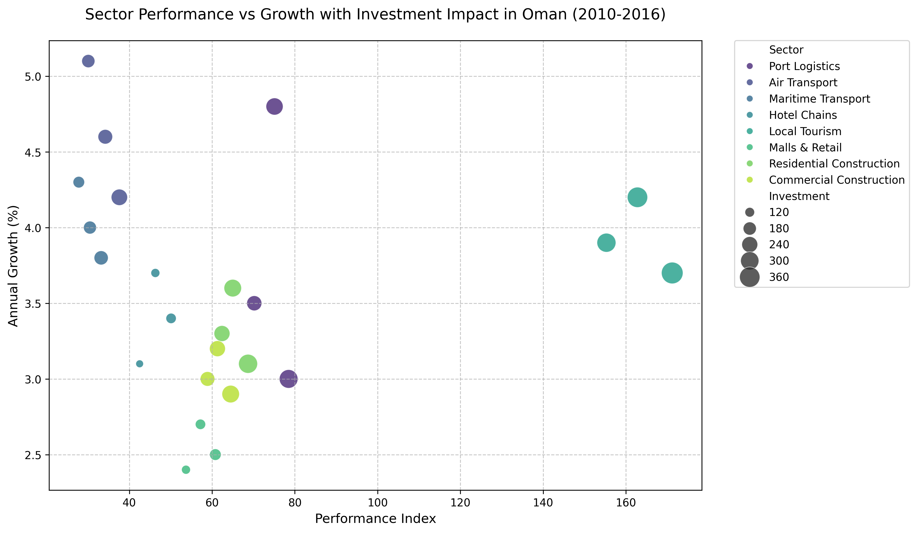
This scatter plot visualizes the relationship between sector performance and annual growth in Oman from 2010 to 2016, highlighting the impact of investment across various sectors. The chart’s horizontal axis represents the **Performance Index**, ranging from approximately 25 to 175, while the vertical axis measures **Annual Growth (%)**, spanning from 2.4% to 5.2%. Each data point corresponds to a specific sector, with its size reflecting the level of investment, where larger circles indicate higher investment values.

The sectors are distinguished by color, creating a gradient from dark purple to yellow-green, as indicated by the legend on the right. For instance, **Local Tourism** appears in a bright green hue, displaying the highest performance index values (around 155, 163, and 171) with annual growth rates between 3.7% and 3.9%. In contrast, **Air Transport**, shown in a deep purple, exhibits lower performance indices (around 30 to 38) but relatively high annual growth rates (between 4.2% and 5.1%). The **Port Logistics** sector, represented in a dark blue shade, shows moderate performance indices (70 to 79) with varying growth rates, peaking at 4.8% in one instance.

The size of the circles effectively conveys the scale of investment, with **Local Tourism** consistently showing the largest circles, indicating the highest investment levels, while sectors like **Maritime Transport** and **Malls & Retail** have smaller circles, reflecting lower investments. The chart also includes a grid for easier comparison, and the title clearly states the focus on sector performance, growth, and investment impact in Oman over the specified period. Overall, the visualization underscores the varying degrees of growth and performance across sectors, influenced by differing levels of investment.
|
Scatter Plot
|
seaborn
|
10
|
93abfd12-828b-4f36-91ee-97373535f2c4
|
|
import plotly.express as px
import pandas as pd

data = {
    'Stage': [
        'Initial Allocation', 'Funds Disbursed', 'Project Launch',
        'Implementation Phase', 'Completion', 'Post-Assessment',
        'Initial Allocation', 'Funds Disbursed', 'Project Launch',
        'Implementation Phase', 'Completion', 'Post-Assessment',
        'Initial Allocation', 'Funds Disbursed', 'Project Launch',
        'Implementation Phase', 'Completion', 'Post-Assessment'
    ],
    'Region': [
        'Central America', 'Central America', 'Central America',
        'Central America', 'Central America', 'Central America',
        'North Africa', 'North Africa', 'North Africa',
        'North Africa', 'North Africa', 'North Africa',
        'Southeast Asia', 'Southeast Asia', 'Southeast Asia',
        'Southeast Asia', 'Southeast Asia', 'Southeast Asia'
    ],
    'AidAmount': [
        1500, 1200, 850, 600, 350, 200,
        1800, 1400, 950, 750, 450, 220,
        1600, 1300, 1000, 800, 500, 300
    ],
    'Effectiveness': [
        95, 82, 70, 60, 40, 25,
        90, 78, 65, 55, 35, 20,
        85, 75, 68, 62, 50, 30
    ],
    'Year': [
        1971, 1971, 1971, 1971, 1971, 1971,
        1973, 1973, 1973, 1973, 1973, 1973,
        1975, 1975, 1975, 1975, 1975, 1975
    ]
}

df = pd.DataFrame(data)

fig = px.violin(
    df,
    x="Stage",
    y="AidAmount",
    color="Region",
    facet_col="Year",
    box=True,
    points="all",
    hover_data=df.columns,
    title="Distribution of Economic Aid Amounts by Development Stage and Region (1971-1975)",
    labels={"AidAmount": "Aid Amount (Thousands USD)", "Stage": "Development Stage"},
    color_discrete_sequence=px.colors.qualitative.Dark24,
    category_orders={"Year": sorted(df["Year"].unique())}
)

fig.update_layout(
    height=600,
    width=1100,
    title_font_size=18,
    hoverlabel=dict(
        bgcolor="white",
        font_size=12
    ),
    margin=dict(l=80, r=80, t=100, b=80),
    violinmode='group'
)

fig.update_xaxes(title_text="Development Stage")
fig.update_yaxes(title_text="Aid Amount (Thousands USD)")

fig.write_image("output.png")
|
Year,Region,Development Stage,Aid Amount (Thousands USD)
1971,Central America,Initial Allocation,1500
1971,Central America,Funds Disbursed,1200
1971,Central America,Project Launch,850
1971,Central America,Implementation Phase,600
1971,Central America,Completion,350
1971,Central America,Post-Assessment,200
1973,North Africa,Initial Allocation,1800
1973,North Africa,Funds Disbursed,1400
1973,North Africa,Project Launch,950
1973,North Africa,Implementation Phase,750
1973,North Africa,Completion,450
1973,North Africa,Post-Assessment,220
1975,Southeast Asia,Initial Allocation,1600
1975,Southeast Asia,Funds Disbursed,1300
1975,Southeast Asia,Project Launch,1000
1975,Southeast Asia,Implementation Phase,800
1975,Southeast Asia,Completion,500
1975,Southeast Asia,Post-Assessment,300
|
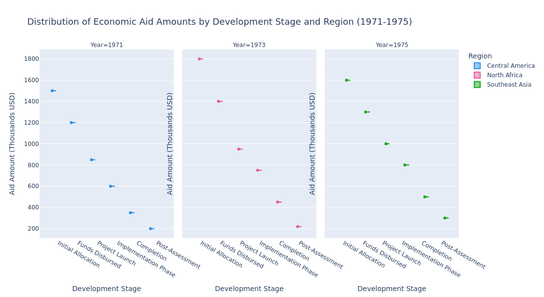
The image presents a series of three violin plots that illustrate the distribution of economic aid amounts across various development stages for three different regions over the years 1971, 1973, and 1975. The chart is titled "Distribution of Economic Aid Amounts by Development Stage and Region (1971-1975)." Each plot corresponds to a specific year and displays the aid amounts in thousands of USD along the vertical axis, while the horizontal axis represents different development stages, ranging from "Initial Allocation" to "Post-Assessment."

The regions are color-coded: Central America is represented in blue, North Africa in pink, and Southeast Asia in green. Each violin plot shows the density of aid amounts at different development stages, with embedded box plots indicating the median and interquartile range, and individual data points marked within the violins.

For the year 1971, the blue violin plots for Central America show that the aid amounts start at 1500 thousand USD for "Initial Allocation," decreasing progressively through each subsequent stage, down to 200 thousand USD at "Post-Assessment." In 1973, the pink violin plots for North Africa indicate that the aid amounts begin at 1800 thousand USD for "Initial Allocation," then steadily decline to 220 thousand USD by "Post-Assessment." Finally, in 1975, the green violin plots for Southeast Asia show a similar trend, with the aid amounts starting at 1600 thousand USD for "Initial Allocation" and reducing to 300 thousand USD at "Post-Assessment."

The plots reveal a consistent pattern across all regions and years, where the highest aid amounts are allocated at the initial stages, gradually diminishing as the development projects progress toward completion and post-assessment. This visual representation highlights how economic aid is distributed and utilized over different stages of development projects in the specified regions and years.
|
Violin Plot
|
plotly
|