| # | id | image | text | source |
|---|
1
|
0
|
|
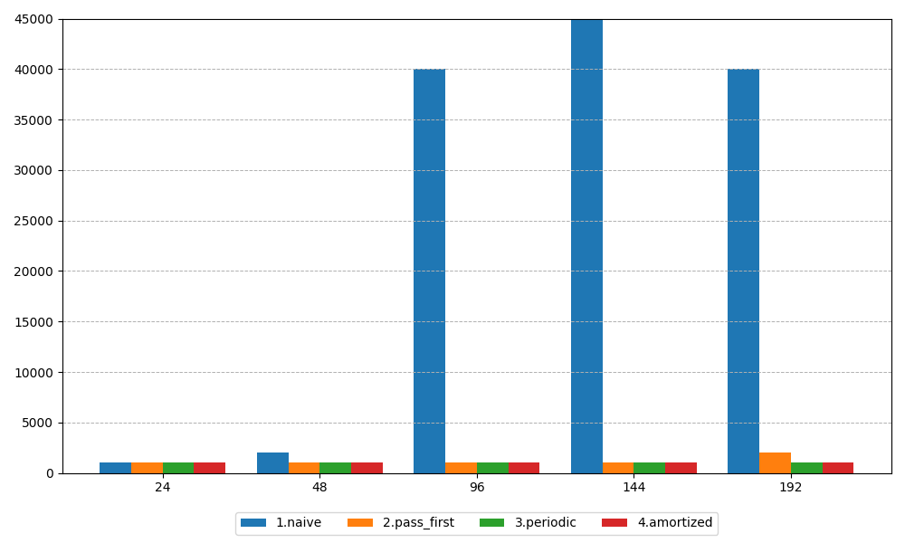
The image can be generated using the following Python code:
```python
import matplotlib.pyplot as plt
import numpy as np

# Data
x_labels = [24, 48, 96, 144, 192]
data = {
    '1.naive': [1000, 2000, 40000, 45000, 40000],
    '2.pass_first': [1000, 1000, 1000, 1000, 2000],
    '3.periodic': [1000, 1000, 1000, 1000, 1000],
    '4.amortized': [1000, 1000, 1000, 1000, 1000]
}

# Bar width
bar_width = 0.2
x = np.arange(len(x_labels))

# Create the bar plot
fig, ax = plt.subplots(figsize=(10, 6))

# Plot each dataset with a slight offset for each bar
for i, (label, values) in enumerate(data.items()):
    ax.bar(x + i * bar_width, values, width=bar_width, label=label)

# Customize the axes
ax.set_ylim(0, 45000)
ax.set_xticks(x + bar_width * (len(data) - 1) / 2)
ax.set_xticklabels(x_labels)
ax.grid(axis='y', linestyle='--', linewidth=0.7)

# Add labels and legend
ax.set_ylabel('')  # No label as per the original code
ax.legend(loc='lower center', bbox_to_anchor=(0.5, -0.15), ncol=len(data))

# Use LaTeX formatting for the legend
plt.rc('text', usetex=True)
plt.rc('font', family='serif')

# Show the plot
plt.tight_layout()
plt.show()
```
|
arxiv_woc_680k
|
2
|
1
|
|
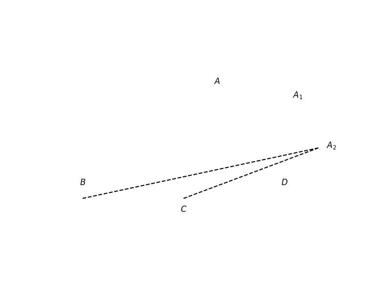
The image can be generated using the following Python code:
```python
import matplotlib.pyplot as plt
import numpy as np

# Create a new figure
plt.figure(figsize=(8, 6))

# Define the points for the polygon
points = np.array([[0, 0], [3, 0], [2, 1.5], [1.5, 0], [2.5, 0.75]])

# Draw the polygons
plt.fill(points[[0, 1, 2]], points[[0, 1, 2]], 'b', alpha=0.5)  # Triangle A
plt.fill(points[[0, 1, 3]], points[[0, 1, 3]], 'b', alpha=0.5)  # Triangle C
plt.fill(points[[1, 2, 3]], points[[1, 2, 3]], 'b', alpha=0.5)  # Triangle D

# Draw dashed lines
plt.plot([0, 3.5], [0, 0.75], 'k--')
plt.plot([1.5, 3.5], [0, 0.75], 'k--')

# Annotate points
plt.text(0, 0.2, r'$B$', fontsize=12, ha='center')
plt.text(3, 0.2, r'$D$', fontsize=12, ha='center')
plt.text(1.5, -0.2, r'$C$', fontsize=12, ha='center')
plt.text(2, 1.7, r'$A$', fontsize=12, ha='center')
plt.text(3.2, 1.5, r'$A_1$', fontsize=12, ha='center')
plt.text(3.7, 0.75, r'$A_2$', fontsize=12, ha='center')

# Set limits and aspect
plt.xlim(-0.5, 4)
plt.ylim(-0.5, 2)
plt.gca().set_aspect('equal', adjustable='box')

# Hide axes
plt.axis('off')

# Show the plot
plt.show()
```
|
multimath
|
3
|
2
|
|
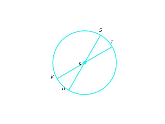
The image can be generated using the following Python code:
```python
import numpy as np
import matplotlib.pyplot as plt

# Define constants
R = 1
alpha = 30  # degrees
beta = 60   # degrees

# Convert angles from degrees to radians for calculations
alpha_rad = np.radians(alpha)
beta_rad = np.radians(beta)

# Define points based on the angles
T = (R * np.cos(alpha_rad), R * np.sin(alpha_rad))
S = (R * np.cos(beta_rad), R * np.sin(beta_rad))
U = (R * np.cos(np.radians(270 - alpha)), R * np.sin(np.radians(270 - alpha)))
V = (R * np.cos(np.radians(270 - beta)), R * np.sin(np.radians(270 - beta)))

# Create a figure and axis
fig, ax = plt.subplots()

# Draw the circle
circle = plt.Circle((0, 0), R, color='cyan', fill=False, linewidth=2)
ax.add_artist(circle)

# Draw the lines
ax.plot([0, T[0]], [0, T[1]], color='cyan', linewidth=2)
ax.plot([0, S[0]], [0, S[1]], color='cyan', linewidth=2)
ax.plot([0, U[0]], [0, U[1]], color='cyan', linewidth=2)
ax.plot([0, V[0]], [0, V[1]], color='cyan', linewidth=2)

# Fill the center point
ax.plot(0, 0, 'o', color='cyan', markersize=8)

# Annotate points
ax.text(T[0], T[1] + 0.1, r'$T$', fontsize=12, ha='center', color='black')
ax.text(0 - 0.1, 0 - 0.1, r'$R$', fontsize=12, ha='right', color='black')
ax.text(S[0], S[1] + 0.1, r'$S$', fontsize=12, ha='center', color='black')
ax.text(U[0] - 0.1, U[1], r'$U$', fontsize=12, ha='right', color='black')
ax.text(V[0] - 0.1, V[1], r'$V$', fontsize=12, ha='right', color='black')

# Set limits and aspect
ax.set_xlim(-1.5, 1.5)
ax.set_ylim(-1.5, 1.5)
ax.set_aspect('equal', adjustable='box')

# Hide axes
ax.axis('off')

# Show the plot
plt.show()
```
|
mathv360k
|
4
|
3
|
|
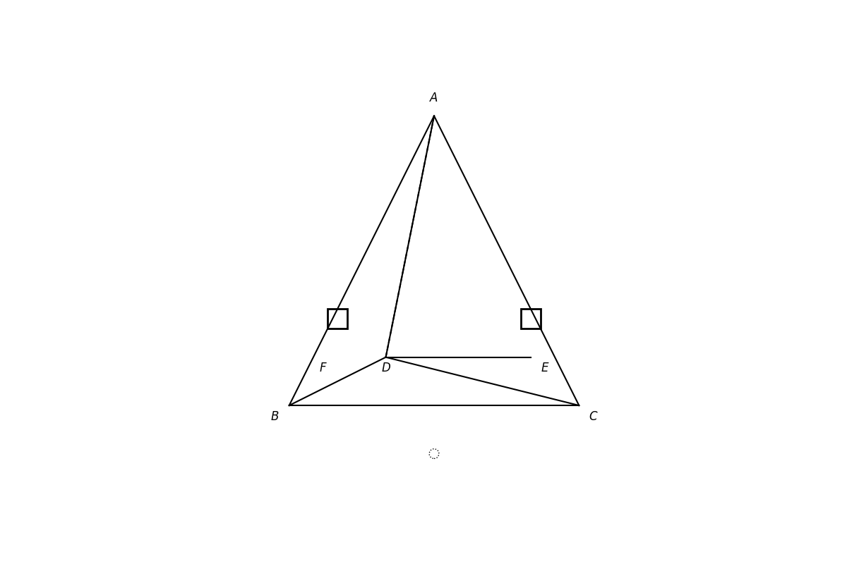
The image can be generated using the following Python code:
```python
import matplotlib.pyplot as plt
import numpy as np

# Create a new figure
plt.figure(figsize=(12, 8))

# Define the coordinates of the points
A = np.array([0, 6])
B = np.array([-3, 0])
C = np.array([3, 0])
D = np.array([-1, 1])
E = np.array([2, 1])
F = np.array([-2, 1])

# Plot the triangle ABC
plt.plot([A[0], B[0]], [A[1], B[1]], 'k-')
plt.plot([B[0], C[0]], [B[1], C[1]], 'k-')
plt.plot([C[0], A[0]], [C[1], A[1]], 'k-')

# Plot the lines AD, BD, and DE
plt.plot([A[0], D[0]], [A[1], D[1]], 'k-')
plt.plot([B[0], D[0]], [B[1], D[1]], 'k-')
plt.plot([D[0], C[0]], [D[1], C[1]], 'k-')
plt.plot([D[0], E[0]], [D[1], E[1]], 'k-')

# Draw dashed line AD
plt.plot([A[0], D[0]], [A[1], D[1]], 'k--')

# Draw thick rectangles
plt.gca().add_patch(plt.Rectangle((-2.2, 1.6), 0.4, 0.4, fill=None, edgecolor='k', linewidth=2))
plt.gca().add_patch(plt.Rectangle((1.8, 1.6), 0.4, 0.4, fill=None, edgecolor='k', linewidth=2))

# Draw a dotted circle
circle = plt.Circle((0, -1), 0.1, color='k', fill=False, linestyle=':')
plt.gca().add_artist(circle)

# Annotate points with LaTeX formatting
plt.text(A[0], A[1] + 0.3, r'$A$', fontsize=12, ha='center')
plt.text(B[0] - 0.3, B[1] - 0.3, r'$B$', fontsize=12, ha='center')
plt.text(C[0] + 0.3, C[1] - 0.3, r'$C$', fontsize=12, ha='center')
plt.text(D[0], D[1] - 0.3, r'$D$', fontsize=12, ha='center')
plt.text(E[0] + 0.3, E[1] - 0.3, r'$E$', fontsize=12, ha='center')
plt.text(F[0] - 0.3, F[1] - 0.3, r'$F$', fontsize=12, ha='center')

# Set limits and aspect
plt.xlim(-4, 4)
plt.ylim(-2, 7)
plt.gca().set_aspect('equal', adjustable='box')

# Hide axes
plt.axis('off')

# Show the plot
plt.show()
```
|
k12
|
5
|
4
|
|
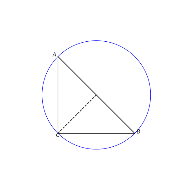
The image can be generated using the following Python code:
```python
import numpy as np
import matplotlib.pyplot as plt

# Define the radius
R = 1.5

# Create a figure and axis
fig, ax = plt.subplots(figsize=(6, 6))

# Draw the grid
ax.set_xticks(np.arange(-1.5, 1.6, 0.5))
ax.set_yticks(np.arange(-1.5, 1.6, 0.5))
ax.grid(True)

# Draw the circle
circle = plt.Circle((0, 0), R, color='blue', fill=False)
ax.add_artist(circle)

# Define points A, B, C using polar coordinates
A = (R * np.cos(np.radians(135)), R * np.sin(np.radians(135)))
C = (R * np.cos(np.radians(225)), R * np.sin(np.radians(225)))
B = (R * np.cos(np.radians(315)), R * np.sin(np.radians(315)))

# Plot the points and the triangle
points = np.array([A, C, B, A])  # Closing the triangle
ax.plot(points[:, 0], points[:, 1], color='black')

# Add labels for points A, B, C
ax.text(A[0] - 0.1, A[1], r'$A$', fontsize=12, ha='center')
ax.text(C[0], C[1] - 0.1, r'$C$', fontsize=12, ha='center')
ax.text(B[0] + 0.1, B[1], r'$B$', fontsize=12, ha='center')

# Draw the dashed line from O to C
ax.plot([0, C[0]], [0, C[1]], color='black', linestyle='--')

# Set limits and aspect
ax.set_xlim(-2, 2)
ax.set_ylim(-2, 2)
ax.set_aspect('equal', adjustable='box')

# Hide the axes
ax.axis('off')

# Show the plot
plt.show()
```
|
k12
|
6
|
5
|
|
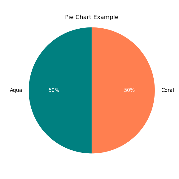
The image can be generated using the following Python code:
```python
import matplotlib.pyplot as plt

# Data for the pie chart
sizes = [100, 100]
labels = ['Aqua', 'Coral']
colors = ['#008080', '#FF7F50']  # Teal and Coral colors

# Create the pie chart
plt.figure(figsize=(6, 6))
wedges, texts, autotexts = plt.pie(sizes, labels=labels, colors=colors, startangle=90, autopct='%1.0f%%')

# Improve the appearance of the text
for text in texts:
    text.set_fontsize(12)
for autotext in autotexts:
    autotext.set_color('white')
    autotext.set_fontsize(12)

# Equal aspect ratio ensures that pie is drawn as a circle.
plt.axis('equal')
plt.title('Pie Chart Example', fontsize=14)
plt.show()
```
|
mathv360k
|
7
|
6
|
|
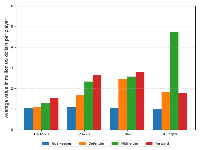
The image can be generated using the following Python code:
```python
import matplotlib.pyplot as plt
import numpy as np

# Data
categories = ['Up to 23', '23--29', '30--', 'All ages']
goalkeeper = [1.05, 1.09, 1.04, 1.00]
defender = [1.11, 1.68, 2.45, 1.82]
midfielder = [1.30, 2.34, 2.58, 4.75]
forward = [1.54, 2.63, 2.79, 1.79]

# Bar width
bar_width = 0.2

# X locations for the groups
x = np.arange(len(categories))

# Create the bar plots
plt.bar(x - 1.5 * bar_width, goalkeeper, width=bar_width, label='Goalkeeper')
plt.bar(x - 0.5 * bar_width, defender, width=bar_width, label='Defender')
plt.bar(x + 0.5 * bar_width, midfielder, width=bar_width, label='Midfielder')
plt.bar(x + 1.5 * bar_width, forward, width=bar_width, label='Forward')

# Adding labels and title
plt.ylabel(r'Average value in million US dollars per player', fontsize=10)
plt.xticks(x, categories, fontsize=8)
plt.yticks(np.arange(0, 7, 1), fontsize=8)
plt.ylim(0, 6)

# Adding grid
plt.grid(axis='y', linestyle='--', linewidth=0.5, alpha=0.7)

# Adding legend
plt.legend(loc='lower center', bbox_to_anchor=(0.5, -0.15), ncol=4, fontsize=8)

# Show the plot
plt.tight_layout()
plt.show()
```
|
mathv360k
|
8
|
7
|
|
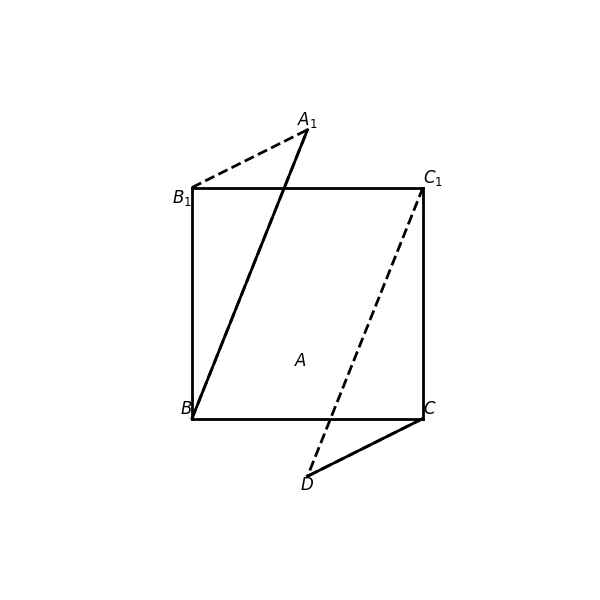
The image can be generated using the following Python code:
```python
import matplotlib.pyplot as plt
import numpy as np

# Create a new figure
plt.figure(figsize=(6, 6))

# Define the points for the square and the lines
B = np.array([0, 0])
C = np.array([2, 0])
C1 = np.array([2, 2])
B1 = np.array([0, 2])
A1 = np.array([1, 2.5])
D = np.array([1, -0.5])

# Draw the square
plt.plot([B[0], C[0]], [B[1], C[1]], 'k-', linewidth=2)  # BC
plt.plot([C[0], C1[0]], [C[1], C1[1]], 'k-', linewidth=2)  # C1C
plt.plot([C1[0], B1[0]], [C1[1], B1[1]], 'k-', linewidth=2)  # B1C1
plt.plot([B1[0], B[0]], [B1[1], B[1]], 'k-', linewidth=2)  # B1B

# Draw the lines
plt.plot([B[0], A1[0]], [B[1], A1[1]], 'k-', linewidth=2)  # BA1
plt.plot([C[0], D[0]], [C[1], D[1]], 'k-', linewidth=2)  # CD
plt.plot([B1[0], A1[0]], [B1[1], A1[1]], 'k--', linewidth=2)  # B1A1
plt.plot([C[0], D[0]], [C[1], D[1]], 'k--', linewidth=2)  # CD
plt.plot([B[0], A1[0]], [B[1], A1[1]], 'k--', linewidth=2)  # BA1
plt.plot([C1[0], D[0]], [C1[1], D[1]], 'k--', linewidth=2)  # C1D

# Annotate the points
plt.text(B[0], B[1], r'$B$', fontsize=12, ha='right', va='bottom')
plt.text(C[0], C[1], r'$C$', fontsize=12, ha='left', va='bottom')
plt.text(C1[0], C1[1], r'$C_1$', fontsize=12, ha='left', va='bottom')
plt.text(B1[0], B1[1], r'$B_1$', fontsize=12, ha='right', va='top')
plt.text(A1[0], A1[1], r'$A_1$', fontsize=12, ha='center', va='bottom')
plt.text(D[0], D[1], r'$D$', fontsize=12, ha='center', va='top')
plt.text(1, 0.5, r'$A$', fontsize=12, ha='right', va='center')

# Set limits and aspect
plt.xlim(-1, 3)
plt.ylim(-1, 3)
plt.gca().set_aspect('equal', adjustable='box')

# Hide axes
plt.axis('off')

# Show the plot
plt.show()
```
|
k12
|
9
|
8
|
|
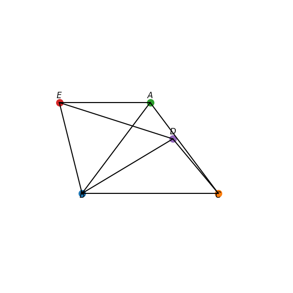
The image can be generated using the following Python code:
```python
import matplotlib.pyplot as plt

# Define the coordinates for the points
B = (0, 0)
C = (3, 0)
A = (1.5, 2)
E = (-0.5, 2)
D = (2, 1.2)

# Create a new figure
plt.figure(figsize=(6, 6))

# Plot the points
plt.plot(*B, 'o', label='$B$', markersize=10)
plt.plot(*C, 'o', label='$C$', markersize=10)
plt.plot(*A, 'o', label='$A$', markersize=10)
plt.plot(*E, 'o', label='$E$', markersize=10)
plt.plot(*D, 'o', label='$D$', markersize=10)

# Draw the lines between the points
plt.plot([A[0], B[0]], [A[1], B[1]], 'k-')
plt.plot([B[0], C[0]], [B[1], C[1]], 'k-')
plt.plot([C[0], A[0]], [C[1], A[1]], 'k-')
plt.plot([B[0], D[0]], [B[1], D[1]], 'k-')
plt.plot([B[0], E[0]], [B[1], E[1]], 'k-')
plt.plot([E[0], A[0]], [E[1], A[1]], 'k-')
plt.plot([D[0], C[0]], [D[1], C[1]], 'k-')
plt.plot([E[0], D[0]], [E[1], D[1]], 'k-')

# Annotate the points with labels
plt.text(B[0], B[1] - 0.1, '$B$', fontsize=12, ha='center')
plt.text(C[0], C[1] - 0.1, '$C$', fontsize=12, ha='center')
plt.text(A[0], A[1] + 0.1, '$A$', fontsize=12, ha='center')
plt.text(E[0], E[1] + 0.1, '$E$', fontsize=12, ha='center')
plt.text(D[0], D[1] + 0.1, '$D$', fontsize=12, ha='center')

# Set the limits and aspect of the plot
plt.xlim(-1, 4)
plt.ylim(-1, 3)
plt.gca().set_aspect('equal', adjustable='box')

# Remove axes for better visual appeal
plt.axis('off')

# Show the plot
plt.show()
```
|
multimath
|
10
|
9
|
|
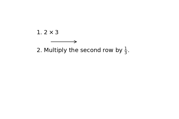
The image can be generated using the following Python code:
```python
import matplotlib.pyplot as plt
import matplotlib.patches as patches

# Create a figure and axis
fig, ax = plt.subplots(figsize=(6, 4))

# Set limits and hide axes
ax.set_xlim(0, 10)
ax.set_ylim(0, 5)
ax.axis('off')

# Add text items with LaTeX formatting
ax.text(1, 4, r'1. $2 \times 3$', fontsize=14, ha='left', va='center')
ax.text(1, 3, r'2. Multiply the second row by $\frac{1}{3}$.', fontsize=14, ha='left', va='center')

# Add an arrow from one point to another
arrow = patches.FancyArrowPatch((2, 3.5), (4, 3.5), mutation_scale=15, color='black', arrowstyle='->')
ax.add_patch(arrow)

# Show the plot
plt.show()
```
|
mathpix
|